A couple quick programs (polarGraphs.py) to create animations of the drawing of functions in polar coordinates (for my pre-Calculus class).
Graph of the function: r = 4 cos(θ)
It can export as a movie (mp4 as above). W can also transform functions (using: polarToCartesianGraph.py ) from rectangular to polar coordinates (and back: you can choose the settings).
Coordinate transforms Cartesian to Polar and back again for r = 4 cos(θ)
A Note on using ChatGPT
This python program uses the matplotlib library, and, for the first time for me, I used ChatGPT to figure out the syntax for things like drawing arcs and arrows, and exporting animation files, instead of googling my questions. ChatGPT worked great, and significantly speeded up the process. It does make me wonder, however, that since these models are based off of what they’ve scraped from the internet, are they going to run create problems for themselves if people stop asking questions on places like stackoverflow and rely on AI instead. Although, this might just mean that the AI will tend to be just be a little bit behind the cutting edge and there will continue to be a need for question and answer forums.
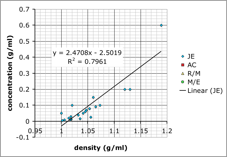
Calibration curves produced by different student groups to determine the relationship between density and concentration of salt (NaCl) solutions.
To start with chemistry class, we’re studying the properties of substances (like density) and how to measure and report concentrations. So, I mixed up four solutions of table salt (NaCl) dissolved in water of different concentrations, and put a drop of food coloring into each one to clearly distinguish them. The class as a whole had to determine the densities of the solutions, thus learning how to use the scales and graduated cylinders.
However, for the students interested in doing a little bit more, I asked them to figure out the actual concentrations of the solutions.
One group chose to evaporate the liquid and measure the resulting mass in the beakers. Others considered separating the salt electrochemically (I vetoed that one based on practicality.
Most groups ended up choosing to mix up their own sets of standard solutions, measure the densities of those, and then use that data to determine the densities of the unknown solutions. Their data is shown at the top of this post.
Finding the mass of solution in order to calculate its density.
The variability in their results is interesting. Most look like the result of systematic differences in making their measurements (different scales, different amounts of care etc.), but they all end up with curves where the concentration increases positively with density.
I showed the graph above to the class so we could talk about different sources of error, and how scientists will often compile the data from several different studies to get a better averaged result.
Then, I combined all the data and added a linear trend line so they could see how to do it using Excel (many of these students are in pre-calculus right now so it ties in nicely):
Trend line from combined data.
What we have not talked about yet–I hope to tomorrow–is how the R-squared value, which gives the goodness of the fit of the trend line to the data, is more a measure of precision rather than accuracy. It does say something about how internally consistent the data are, but not necessarily if the result is accurate.
It’s also useful to point out that the group with the best R-squared value is the one with only two data points because two data points will necessarily give a perfectly straight line. However, the groups that made more solutions might not have as good of an R-squared value, but, because of the multiple measurements, probably have more reliable results.
As for which group got the most accurate result: I added in some data I found by googling–it came off a UCSD website with no citation so I’m going to need to find a better reference. Comparing our data to the reference we find that team AC (the red squares) best match:
The straight line shows my (currently) accepted values for the concentration/density relationship.
Here’s another attempt to create embeddable graphs of mathematical functions. This one allows users to enter the equation in text form, has the option to enter the domain of the function, and expects there to be multiple functions plotted at the same time. Instead of writing the plotting functions myself I used the FLOT plotting library.
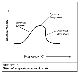
While discussing homeostasis in biological systems, one of my biology students asked why humans could only survive with only a very narrow range of body temperature. Part of the answer is that the human body is a complex system, and the chemical reactions rely on enzymes that only work effectively within a narrow range of temperatures.
Worthington Biochemical has detailed (probably too much so for our purposes) introduction to enzymes: how they work, how they’re named, etc.
In particular, they have this useful graphical diagrams showing how enzymes have an optimum temperature and pH.
Enzymes work best within an optimum range of temperatures. Image from Worthington Biochemical.
At the moment, it just does polynomials and points, but polynomials can be used to teach quadratic functions (parabolas) and straight lines to pre-algebra and algebra students. Which I’ve been doing.
Based on my students’ feedback, I’ve made it so that when you change the equation of the line the movement animates. This makes it much easier to see what happens when, for example, you change the slope of a line.
P.S. You can also turn off the interactivity if you just want to show a simple graph. y = x2-1 is shown below:
If you recall, straight lines have a general equation that looks like this:
(1)
This is called the slope-intercept form of the equation, because m gives the slope, and b tells where the line intercepts the y-axis. For example the line:
(2)
looks like:
Now, in the slope-intercept form, m and b represent numbers. In our example, m = 2 and b = 3.
So what if, instead of calling them m and b we used the same letter (let’s use a) and just gave two different subscripts so:
and,
therefore equation (1):
becomes: (3)
Now, in case you’re wondering why we picked m = a1 instead of m = a0, it’s because of the exponents of x. You see, in the equation x has an exponent of 1, and the constant b could be thought to be multiplying x with an exponent of 0. Considering this, we could rewrite our equation of the line (2):
(4)
since: and,
we get:
So in equation (3) the subscript refers to the exponent of x.
Now we can expand this a bit more. What if we had a term with x2 in an equation:
(5)
Now we have three coefficients:
, and, ,
And the graph would look like this.
Because of the x2 term (specifically because it has the highest exponent in the equation), this is called a second-order polynomial — that’s why the graph above has a little input box where the order is 2. In fact, on the graph above, you can change the order to see how the equation changes. Indeed, you can also change the coefficients to see how the graph changes.
A second order polynomial is a parabola, while, as you’ve probably guessed, a first order polynomial is a straight line. What’s a zero’th order polynomial?
Finally, we can write a general equation for a polynomial — just like we have the slope-intercept form of a line — using the a coefficients like:
You can use the graphs to tinker around and see what different order polynomials look like, and how changing the coefficients change the graphs. I sort-of like the one below:
The introduction of snakes to Guam has reverberated through the ecosystem.
Accidentally introduced to the island in the 1940s, the snake decimated the island’s native bird species in one of the most infamous ecological disasters from an invasive species.
By the 1980s, 10 of 12 native bird species had been wiped out.
Since many birds consume spiders, compete with spiders for insect prey and utilize spider webs in their nests, their loss has led to a spider explosion on the island, researchers said.
Note (for the Algebra students): The scientific article includes a nice box and whisker plot showing how many more spiderwebs there are on Guam compared to other islands.
Number of spider webs on different islands. Guam is the only island shown that has had a severe reduction in birds. Image from Rogers et al., 2012.
What if the entire world population lived like the people in Bangladesh? The amount of land to produce the resources we’d need would take up most of Asia and some of Africa. On the other hand, if we lived like the people in the UAE we’d need 5.4 Earths to support us sustainably. That’s the result of Mathis Wackernagel’s work (Wackernagel, 2006) comparing resource availability to resource demand. Tim De Chant put this data into graphical form:
Ecological footprints needed to support the world population if everyone used resources at the rate of these different countries. Image by Tim De Chant, based on data from Wacknagel (2006).
I showed this image in Environmental Science class today when we talked about ecological footprints, as well as the one showing how much space the world population of seven billion would take up if everyone lived in one big city with the same density of a few different cities (Paris, New York, Houston etc.).
Wacknagel’s original article also includes this useful table of data for different countries that I think I’ll try to get a student to put into bar graph for a project or presentation.


 (1)
(1) (2)
(2) and,
and,
 (3)
(3) (4)
(4) and,
and,

 (5)
(5) ,
, and,
and, ,
,


