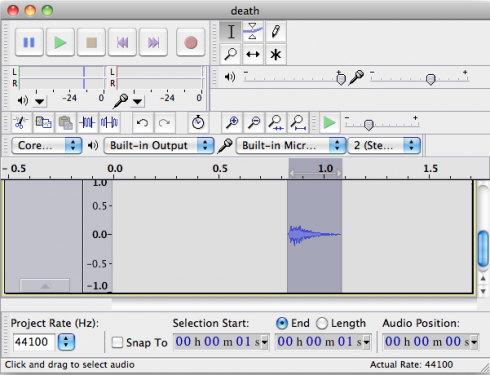
For free, easy editing of sound (audio) files, the free, open-source, program, Audacity, is excellent. It’s also a good complement to Switch for generating sound for the web.
Middle and High School … from a Montessori Point of View
Adding sound to webpages is pretty easy with HTML5’s Audio tag (as Jean-Baptiste Jung demonstrates), but since different browsers can only handle certain, different types of sound files, you’ll often need to convert your sound into .wav, .ogg, and .mp3 formats so they can work for everyone.
Switch Sound File Converter does just what it says, and is free for non-commercial use.
Brian Joseph Davis creates composite sketches of literary characters using the same software used by the police, and the descriptions of the characters in the books.

She was a fine and handsome girl—not handsomer than some others, possibly—but her mobile peony mouth and large innocent eyes added eloquence to colour and shape… The pouted-up deep red mouth to which this syllable was native had hardly as yet settled into its definite shape, and her lower lip had a way of thrusting the middle of her top one upward, when they closed together after a word…Phases of her childhood lurked in her aspect still. As she walked along to-day, for all her bouncing handsome womanliness, you could sometimes see her twelfth year in her cheeks, or her ninth sparkling from her eyes…a thick cable of twisted dark hair hanging straight down her back to her waist.
— description by Thomas Hardy, excerpted by Davis (2010): The Composites.

So I put together this interactive parabola program using VPython (code here) for students encountering these curves in Algebra.
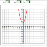
It’s a more interactive version of the Excel parabola program in that you can move the curve by dragging on some control points, rather than just having to enter the coefficients of the equation. The program is still in development, but it is at a useful stage right now, so I thought I’d make it available for anyone who wanted to try it.
The program is fairly straightforward to use. You can move the curve (translate it) up and down, and expand or tighten the area within the parabola.
The program also displays the equation of the curve in standard form:
![]()
.
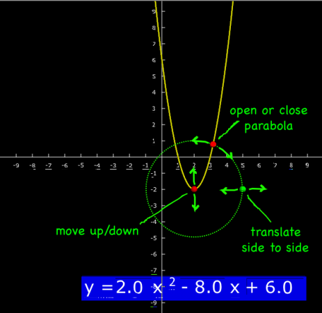
I’m also working making the standard equation editable by clicking on it and typing, and am considering showing the x-axis intercepts, which will give algebra students a nice, visual way to of checking their factoring.
Coffman, J., 2011 (accessed). Translating Parabolas. http://www.jcoffman.com/Algebra2/ch5_3.htm
Math Warehouse, 2011 (accessed). Equation of a Parabola
Standard Form and Vertex Form Equations, http://www.mathwarehouse.com/geometry/parabola/standard-and-vertex-form.php#
WolframAlpha.com, 2011 (accessed). http://www.wolframalpha.com/input/?i=a^2+x^4%2Bx^2-r^2%3D0

For those of us too cheap to buy Photoshop, or who want to support the open-source movement, the Gimp is a great little image manipulation program. I use the “Oilify” option a lot to obscure students’ faces. Gimp’s not as sophisticated as Photoshop, but if you’re not heavily into graphic design, and are not too picky, it does a good job.

As a Photoshop clone, Gimp shares many of its basic principles. It also comes from the ImageMagick command line tools, which I’ve used to automate image processing in the past.
Gimp itself is, however, pretty easy to learn. I’ve shown one student how to use it, and we’ll see if and how the knowledge propagates through the class.
I’m just testing out a simple image map created with the GIMP. The GIMP is a free image manipulation software, a bit like Photoshop, not quite as sophisticated, but free. I used GimpTalk‘s very helpful guide. I though it would be easiest if I used something from a previous post as a test.
You should be able to click on the cell walls, chloroplasts, vacuole and nucleus. The links take you to the associated Wikipedia pages, but that’s just because this is a quick and dirty example. Image maps have been around for a long time, but I believe this is the first time I’ve ever created one. Now I just need to animate it a bit.

Unfortunately, this image is not easily scalable, though it should not be too hard to find (or write) a script to do just that.
So now I want to use video games in the classroom. My head of school is politely opposed. I argued it would be useful for integrating our work on the themes of geography and needs of people. She allowed me to pick up a copy of SimCity if I could come up with some sort of evidence that it actually works. Quantitative evidence. You’ll be hearing more about that in a later post.
However, while I was shopping I also picked up a cheap copy of Civilization IV because while it also goes into city building, it does so from a more regional perspective. I’d played older versions of the Civilization games before (a long time ago in a galaxy far away) so I was somewhat favorably familiar with how it works.
Unfortunately, the fourth version is too sophisticated. There are so many variables to deal with that it would be difficult to use on the relatively short time-scale that I want students to spend on this. Whereas before, founding a city on a river gave very obvious benefits (a bonus in the productivity of the land around the river), there are so many different types of land surfaces and changes that can be done to them that the advantages of the river, while still there are much less obvious.
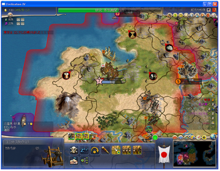
On the plus side, if students find the game enjoyable, succeeding will take a lot of historical research and understanding the geography of cities. It would also take a lot of time, not necessarily wasted time, but a lot of time nonetheless.
Sally, our school’s business manager, was kind enough to come in last month to help the financial department of the student run business organize its books. It was long overdue. We’d been improving our record keeping over the last couple years, but now we have much more detailed records of our income and expenses.
This is great for a number of reasons, the first of which is that students get some good experience working with spreadsheets. We use Excel, which in my opinion is far and away Microsoft’s best product (I’ve been using OpenOffice predominantly for the last year or so because, it improved quite a bit recently, and I’m a glutton for certain kinds of punishment.) I’ve been surprised by how many students get into college unable to do basic tables and charts, but hopefully this is changing.
The second reason is that the Finance committee can now use the data to give regular reports; income, expenses, profit, loss, all on a weekly basis. I expect the Bread division to benefit the most, since it has regular income and expenses, offering students frequent feedback on their progress. We’re now collecting a long-term, time-series data-set that will be very nice when we get to working on statistics in math later on.
In fact, we should be able to use this data to make simple financial projections. Linear projections of how much money we’ll have for our end-of-year trip will tie into algebra quite nicely, and, if we’re feeling ambitious, we can also get into linear regressions and the wave-like properties of the time series of data.