TimeGhost is an utterly amazing project. They’re currently going through World War II, week by week, in real time. That is, every week they post a really good summary of what happened in the corresponding week of the war.
They’ve also done WWI in the same way and have ancillary channels about other conflicts, like the Cuban Missile Crisis Day by Day.
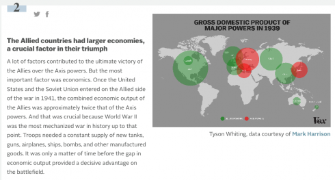
Vox does some great articles using maps to explain things like World War II (which is always a popular middle/high school topic for history papers). What the site does best, is that it accompanies each map with an explanation of what was going on. This results in a set of really interesting vignettes that stoke the curiosity bunkers.
Naill Ferguson gives a provocative talk about his thesis that there are six “Killer Apps” that made western civilization so successful over the last five centuries.
Ships tracks in black, plotted on a white background, show the outlines of the continents and the predominant tracks on the trade winds. Image and caption from Sapping Attention.
For an interesting historical contrast — that highlights the change from wind to engine powered ships and the opening of the Panama and Suez canals — above is Ben Schmidt’s image created from the log books of U.S. ships in the 19th century, while below is a figure by Ben Halpern showing modern shipping patterns.
This map shows the frequency of shipping traffic along shipping routes around the world, ranging from low (blue) to high (red). Image and caption from SeaWeb.
The first image also clearly shows the triangular trade routes between the Americas, Europe and Africa.
Schmidt also has some wonderful videos showing, among other things, the routes of whaling ships that are pushed farther and farther out as they drive whale populations toward extinction.
Go back in time and see who would have won the last presidential election. BuzzFeed has an excellent set of maps showing who would have won the election if voting was restricted as it was in the past.
2012: The actual voting map. (Image from BuzzFeed).
1970: Adults over 24 years old (before the voting age was lowered to 18). (Image from BuzzFeed).
1920: Women’s sufferage. Only white voters (men and women). (Image from BuzzFeed).
I was talking to Mr. E., one of the upper school history/geography teachers about the historical significance of tea. Then I ran into this: Alan Rickman makes a cup of tea (by David Michalek). Observe the awesome teacup.