Vox does some great articles using maps to explain things like World War II (which is always a popular middle/high school topic for history papers). What the site does best, is that it accompanies each map with an explanation of what was going on. This results in a set of really interesting vignettes that stoke the curiosity bunkers.
Ships tracks in black, plotted on a white background, show the outlines of the continents and the predominant tracks on the trade winds. Image and caption from Sapping Attention.
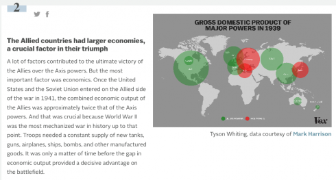
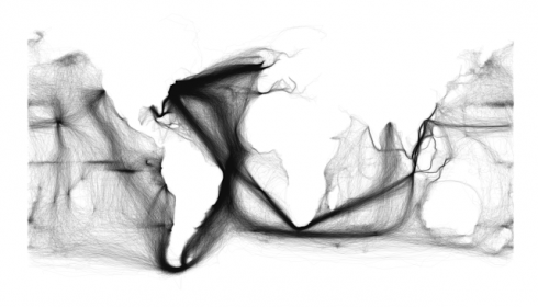
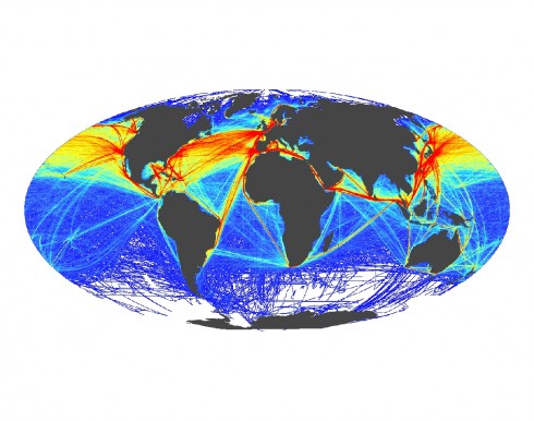
For an interesting historical contrast — that highlights the change from wind to engine powered ships and the opening of the Panama and Suez canals — above is Ben Schmidt’s image created from the log books of U.S. ships in the 19th century, while below is a figure by Ben Halpern showing modern shipping patterns.
This map shows the frequency of shipping traffic along shipping routes around the world, ranging from low (blue) to high (red). Image and caption from SeaWeb.
The first image also clearly shows the triangular trade routes between the Americas, Europe and Africa.
Schmidt also has some wonderful videos showing, among other things, the routes of whaling ships that are pushed farther and farther out as they drive whale populations toward extinction.
We covered the Millennium Development Goals in Environmental Science this past quarter. However, the big outstanding question was how close have we come to meeting any of the goals. Health Intelligence hosts an excellent, interactive map for tracking progress on the Millennium Development Goals.
I’ve been using Google Maps on this blog and for a lot of my applications (e.g. Mariner A.O.), but I’ve just come across OpenStreetMap, which I should be able to use instead. It has an API, nicely embedable maps (including significant topographic coverage), but most importantly, is free and open-source.
Now I just have to see if I can get it to work reliably.
Say I wanted to get from Alexandria, Egypt, to Constantinople, I don’t trust boats, and it’s 1800 years ago. Well, instead of mapping it with Google I’d have to use ORBIS instead. ORBIS tells me that it would take two and a half months and cost me 3000 denarii (about $30,000).
Route from Alexandria to Constantinopolis during the time of the Roman Empire (about 200CE). Map by ORBIS.
Which seems like a bit much. But, since I absolutely have to get to the capital, I think I’ll price out a coastal boat route. That reduces the price by 80%, and the time to three weeks.
If I was really cheap, and was willing to risk the open Mediterranean, the time could be chopped down to less than two weeks, at a cost of only 374 denarii.
In ORBIS, Walter Scheidel and Elijah Meeks have created a fascinating resource for the study of the geography and history of Roman civilization.
Enviromapper via the EPA. Image links to the map for St. Albans, MO, but you can find information for anywhere in the U.S..
The EPA’s Enviromapper website is great way to identify sources of hazardous materials and other types of pollution in your area, which might be a good way of stirring up student interest in the topic.
Not only can you map the broad category of pollution – air, water, radiation etc – but you can also find specific information about the different types of pollution or potential pollution the EPA has information about. I found a nearby site with sulfuric acid, for example.
And, if you want to slog through a lot of closely written reports, you can find a lot more details about any site you come across. Some of this information might also be useful – who knows?
The Opte Project has produced a number of excellent maps of the internet. There is a profound beauty in the immensity of the interconnections that’s reminiscent of the suffusion of stars that can be seen in Milky Way on a dark night on an isolated beach. Unfortunately, their website seems to have not been updated since 2005.