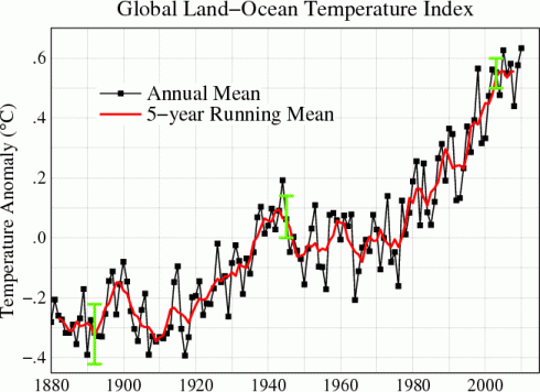
NASA’s Goddard Institute for Space Science has an excellent page that is updated every month, which shows graphs of global temperature changes.
IN addition to the global graphs, there are a lot of really neat graphs showing:
- separate graphs from the tropics versus the northern hemisphere versus the southern hemisphere (the different latitude bands);
- the difference between the northern and southern hemispheres;
- the U.S. only;
- seasonal changes.
The graphs typically show the temperature anomaly, which is the difference in temperature from the normal. The “normal” is taken to be the average temperature between 1951 and 1980.