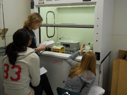
Though it might not sound much more interesting than watching paint dry, the relationships between phase changes, heat, and temperature are nicely illustrated by melting a beaker of snow on a hot plate.

This week’s snowfall created an opportunity I was eager to take. We have access to an ice machine, but closely packed snow works much better for this experiment, I think; the small snowflakes have larger surface-area to volume ratio, so they melt much more evenly, and demonstrate the latent heat of melting much more effectively.
Instructions
My instructions to the students are simple: collect some snow, and observe how it melts on the hot plate.
I also ask them to determine the mass and density of the snow before (and after) the melting, so I could show that throughout the phase changes and transformations the mass does not change (at least not a lot) and so they can practice calculating density1,2.
Procedure
I broke up my middle school students into groups of 2 or 3 and had them come up with a procedure and list of materials before they started. As usual I had to restrain a few of the over-eager ones who wanted to just rush out and collect the snow.
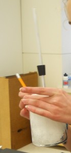
I guided their decision-making a little, so they would use glass beakers for the collection and melting. Because I wasn’t sure what the density of the packed snow would be, I suggested the larger, 600 ml beakers, which turned out to work very well. They ended up with somewhere between 350 and 400 grams of snow, giving densities around 0.65 g/ml.
When they put the beakers on the hot-plate, I specifically asked the students to observe and record, every minute or so, the changes in:
- temperature,
- volume
- appearance
I had them continue to record until the water was boiling. This produced the question, “How do we know when it’s boiling?” My answer was that they’d know when they saw the temperature stop changing.
They also needed to stir the water well, especially when the ice was melting, so they could get a “good”, uniform temperature reading.
Results
We ended up with some very beautiful graphs.
Temperature Change
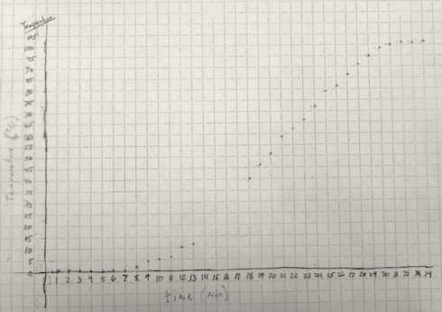
The temperature graph clearly shows three distinct segments:
- In the first few minutes (about 8 min), the temperature remains relatively constant, near the freezing/melting point of water: 0 ºC.
- Then the temperature starts to rise, at an constant rate, for about 20 minutes.
- Finally, when the water reaches close to 100 ºC, its boiling point, the temperature stops changing.
Volume Change
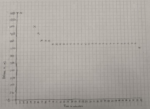
The graph of volume versus time is a little rougher because the gradations on the 600 ml beaker were about 25 ml apart. However, it shows quite clearly that the volume of the container decreases for the first 10 minutes or so as the ice melts, then remains constant for the rest of the time.
Analysis
To highlight the significant changes I made copies of the temperature and volume graphs on transparencies so they could be overlain, and shown on the overhead projector.
Melting Ice: Latent Heat of Melting/Fusion
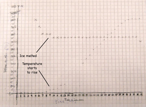
The fact that the temperature only starts to rise when the volume stops changing is no coincidence. The density of the snow is only about 65% of the density of water (0.65 g/ml versus 1 g/ml), so as the snow melts into water (a phase change) the volume in the beaker reduces.
When the snow is melted the volume stops changing and then the temperature starts to rise.
The temperature does not rise until the snow has melted because during the melting the heat from the hot plate is being used to melt the snow. The transformation from solid ice to liquid water is called a phase change, and this particular phase change requires heat. The heat required to melt one gram of ice is called the latent heat of melting, which is about 80 calories (334 J/g) for water.
Conversely, the heat that needs to be taken away to freeze one gram of water into ice (called the latent heat of fusion) is also 80 calories.
So if we had 400 grams of snow then, to melt all the ice, it would take:
- 400 g × 80 cal/g = 32,000 calories
Since the graph shows that it takes approximately 10 minutes (600 seconds) to melt all the snow the we can calculate that the rate at which heat was added to the beaker is:
- 32,000 cal ÷ 10 min = 3,200 cal/min
Constantly Rising Temperature
The second section of the temperature graph, when the temperature rises at an almost constant rate, occurs after all the now has melted and the beaker is now full of water. I asked my students to use their observations from the experiment to annotate the graphs. I also asked a few of my students who have worked on the equation of a line in algebra to draw their best-fit straight lines and then determine the equation.
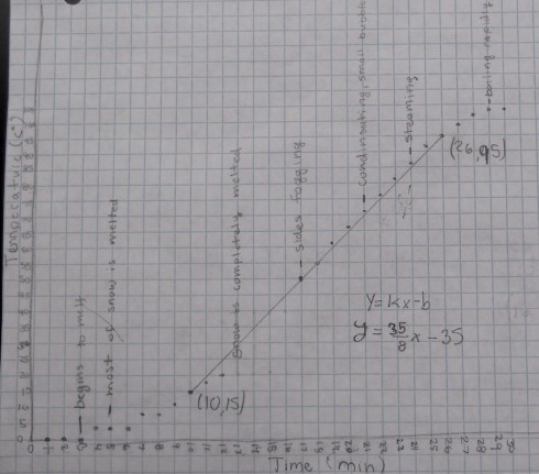
All the equations were different because each small group started with different masses of snow, we used two different hot plates, and even students who used the same data would, naturally, draw slightly different best-fit lines. However, for an example, the equation determined from the data shown in the figure above is:
- y = 4.375 x – 35
Since our graph is of Temperature (T) versus time (t) we should really write the equation as:
- T = 4.375 t – 35
It is important to realize that the slope of the line (4.375) is the change in temperature with time, so it has units of ºC/min:
- slope = 4.375 ºC/min
which means that the temperature of the water rises by 4.375 ºC every minute.
NOTE: It would be very nice to be able to have all the students compare all their data. Because of the different initial masses of water we’d only be able to compare the slopes of the lines (4.375 ºC/min in this case, but another student in the same group came up with 5 ºC/min).
Furthermore, we would also have to normalize with respect to the mass of the ice by dividing the slope by mass, which, for the case where the slope was 4.375 ºC/min and the mass was 400 g, would give:
- 4.375 ºC/min ÷ 400 g = 0.011 ºC/min/g
Specific Heat Capacity of Water
A better alternative for comparison would be to figure out how much heat it takes to raise the temperature of one gram of water by one degree Celsius. This can be done because we earlier calculated how much heat is being added to the beaker when we were looking at the melting of the ice.
In this case, using the heating rate of 3,200 cal/min, a mass of 400 g, and a rising temperature rate (slope from the curve) of 4.375 ºC/min we can:
- 3,200 cal/min ÷ 4.375 ºC/min ÷ 400 g = 1.8 cal/ºC/g
The amount of heat it takes to raise the temperature of one gram of a substance by one degree Celsius is called its specific heat capacity. We calculated a specific heat capacity of water here of 1.8 cal/ºC/g. The actual specific heat capacity of water is 1 cal/ºC/g, so our measurements are a wee bit off, but at least in the same ballpark (order of magnitude). Using the students actual mass measurements (instead of using the approximate 400g) might help.
Evaporating Water
Finally, in the last segment of the graph, the temperature levels off again at about 100 ºC when the water starts to boil. Just like the first part where the ice was melting into water, here the water is boiling off to create water vapor, which is also a phase change and also requires energy.
The energy required to boil one gram of water is 540 calories, which is called the latent heat of vaporization. The water will probably remain at 100 ºC until all the water boils off and then it will begin to rise again.
Conclusion
This project worked out very well, and there was so much to tie into it, including: physics, algebra, and graphing.
Notes
1 Liz LaRosa (2008) has a very nice density demonstration comparing a can of coke to one of diet coke.
2 You can find the density of most of the elements on the periodic table at periodictable.com.