The Ledger

The Boston Federal Reserve Bank publishes (occasionally) a newsletter with easy-to-read articles on economic subjects. Themes include: Immigration; Economic Resources on the web (as 2008); Coping with economic change; Varied Perspectives on the Global Economy; Are We Better Off Than We Were?; and, The Economics of Entertainment.

It’s a very informative, easy read.

Personal Mission Statement: Draft

Through modeling this behavior myself, my goal is to instill in students the sense of wonder and curiosity about this remarkable world and universe in which we live. That wonder will enable students to accord the planet and people who live on it, near and far, the respect that they deserve. As such, the classroom becomes a safe place with windows open to the environment and the community through which students can explore and study their world.

Well there’s a start. The question is, does that clearly and accurately define my vision and goals for self & classroom? Comments appreciated.

Learn math and economics using GeoFRED

The activity below was created as part of the St. Louis Federal Reserve Bank’s Summer School Program session on using Data and Primary Source Documents. I plan to use it as a whole-class activity during the upcoming year and I’ll post updates after I try it (check the economics tag).

Unemployment rate by state - 1977 to 2009. Maps from GeoFRED.

Averaging and Graphing with GeoFRED

Objectives:

  • Introduce GeoFRED as a tool for analyzing real economic data over space.
  • Learn/practice graphing.
  • Practice basic averaging using real data.
  • Prepare and deliver group presentations.

Resources:

Initial presentation to entire class

Show animation of unemployment in the US (by state) over their lifetimes (e.g. 1998-2009). The pdf file Geofred-annual-unemp-1995-2009 has the maps from 1995 to 2009 that you can click through to animate. Alternatively, you can create the pdf yourself from the GeoFRED Graph. A final option, if you’re desperate, is to use the animated gif above.

  • Note: point out the effect of Hurricane Katrina on Louisiana (compare 2005 and 2006).
  • See if students can identify interesting changes that they are curious about. The intention is to get students interested in the data and asking questions and give ideas about why the changes have occurred in general and for specific states.

Group/individual work

The class picks a state that they’re interested in (everyone has to do the same state to bring the data back together at the end) and:

  • each group/individual gets the 12 months of data for one year in the time series (from the website).
  • They create a graph (line or bar students get the choice) of their 12 months of data.
    • Note: If we provide students with poster paper and a uniform scale for their axes they could merge their data at the end to create one very long graph. Alternately, if they all produce their own, very different, graphs they might produce nicer graphs that they’re more invested in, and better appreciate the need to calculate the averages when combining all the data.)
  • They average their 12 months of data to get the annual average.
  • Discuss among themselves why things might have changed the way they did over the year
    • Do research (perhaps the beige book archive (very good regional summaries) or burgundy books (can’t find a long archive) and/or Wikipedia) to find out about why the changes may have occurred.
    • Prepare a short presentation about their year for the rest of the class based on what they found (including their graph).

Class reconvenes

Now for presentations, discussion and integration.

  • Each group gives a short presentation about what they found.
  • The groups bring their averages together to plot a graph for the entire 12 years.
  • Discuss how things changed over time – recessions when and why.

Advanced work

Now that students know how to use GeoFRED they can pose and answer a research question, perhaps one that came up during the initial presentation of the animation.

Additional suggestions

Instead of doing this by state, we could do it by Fed district to see how the regional economic systems are very different.

Sinkholes

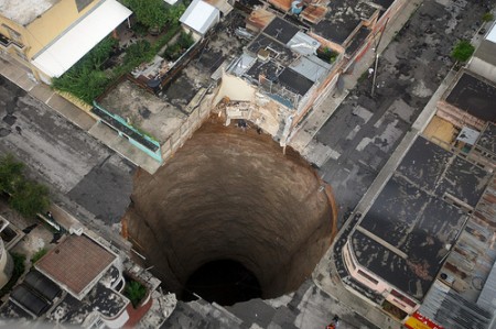
Image from Gobierno de Guatemala.

The caves at Meramec were created in dissolved carbonate rocks; that’s how most caves with interesting cave formation form. The recent storms in Guatemala, along with leaky sewage pipes, have helped speed the dissolution process producing some devastating sinkholes.

[googleMap name=”Guatemala City” description=”Guatemala City” width=”450″ height=”400″ mapzoom=”4″ mousewheel=”false”]Guatemala City[/googleMap]

Spelunking at Meramec

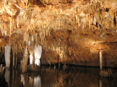
Stalactites dripping down into a subterranean pool at Meramec Caverns.

On the last day of our trip we drove an hour west of St. Louis to Meramec Caverns. If you’re ever on I44 heading out of St. Louis you can’t miss it. From 30 km away you start seeing billboards, sometimes in pairs, almost every 100 meters.

Largely this is because it is a privately owned cave. Privately owned also means that they can do things to “enhance” the cave that you would not see at a National Park like Mammoth Cave. The light shows in certain caves were particularly interesting. Our tour guide was pretty good, entertaining and scientifically accurate for a general audience.

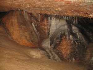
Colors created by different metal anion precipitates.

The presence of different colors in the rock formations (red, white and black) due to different metals in the carbonate precipitates could tie in very well with our discussion earlier this year of ionic bonding.

There are also historical tie-ins. The cave was the site of a skirmish during the civil war, because the bat guano was being used to produce gunpowder. Jesse James participated in that engagement and later used the cave as a hideout.

Still

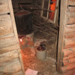
Finally, they have a reconstructed hut, which although it has nothing to do with the cave, has a bootlegger’s still does link with our discussion of steam distillation.

Fractured thinking – How the internet affects how you think

While many people say multitasking makes them more productive, research shows otherwise. Heavy multitaskers actually have more trouble focusing and shutting out irrelevant information, scientists say, and they experience more stress.

And scientists are discovering that even after the multitasking ends, fractured thinking and lack of focus persist. In other words, this is also your brain off computers. Richtel, 2010

Matt Richtel has an intriguing article in the New York Times on how multitasking on computers is affecting the way people think. I don’t have a whole lot of time to get into it is a well resourced article citing work from researchers such as Clifford Nass, Eyal Ophir and Melina Uncapher at Stanford, Steven Yantis at Johns Hopkins, Daphne Bavelier at the University of Rochester, Gary Small at UCLA and Adam Gazzaley at UCSF.

Other choice quotes:

[Multi-taskers] had trouble filtering out … the irrelevant information.

multitaskers tended to search for new information rather than accept a reward for putting older, more valuable information to work.

that people interrupted by e-mail reported significantly increased stress compared with those left to focus. Stress hormones have been shown to reduce short-term memory

Finally, the article ends with a thought about how technology use affects our ability to relate to others.

Mr. Nass at Stanford thinks the ultimate risk of heavy technology use is that it diminishes empathy by limiting how much people engage with one another, even in the same room.

“The way we become more human is by paying attention to each other,” he said. “It shows how much you care.”

That empathy, Mr. Nass said, is essential to the human condition. “We are at an inflection point,” he said. “A significant fraction of people’s experiences are now fragmented.”

This work of course ties in with Nicholas Carr’s thesis that asks the question, “Is Google Making Us Stupid“. Carr’s book, “The Shallows” takes up the argument that we should spend less time online. While I tend to agree with Carr that we would benefit from more time offline, I really think his explanation that the invention of the press, and cheap books, lead to more deeper concentration (and that’s what we’re loosing now) needs a lot more evidence to back it up.

Playing with real economic data (FRED)

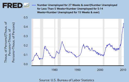
Long term unemployment

The Federal Reserve’s data website produces graphs using the same economic data that the Federal Reserve uses to make decisions about the nation’s economy. The above graph, showing long term unemployment in the U.S., combines the unemployment numbers based on how long people have been unemployed from four data series (<5 weeks, 5-14 weeks, >= 15 weeks, >27 weeks). You see howthe site makes the combinations you want, and produces the graph.