From our Eminence Immersion.
Middle and High School … from a Montessori Point of View
I was talking to Mr. E., one of the upper school history/geography teachers about the historical significance of tea. Then I ran into this: Alan Rickman makes a cup of tea (by David Michalek). Observe the awesome teacup.
Portraits in Dramatic Time (Alan Rickman) from Moving Portrait on Vimeo.

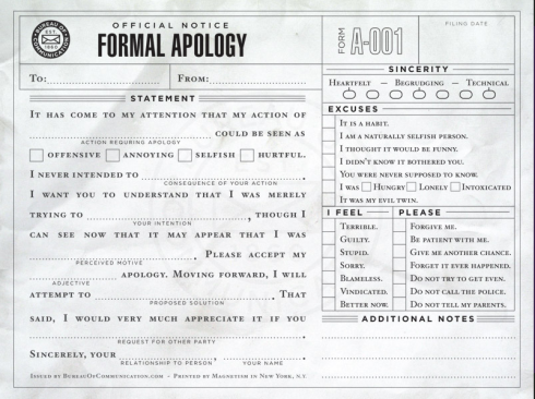
I may have to use this.
The The Bureau of Communication has a number of other useful forms that you can even fill out online.

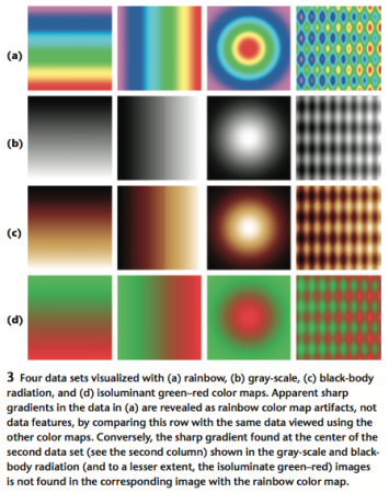
Even though rainbow color maps look pretty, Borland and Taylor (2007; pdf) argue that they’re rarely the best choice for showing data.
The rainbow color map confuses viewers through its lack of perceptual ordering, obscures data through its uncontrolled luminance variation, and actively misleads interpretation through the introduction of non-data-dependent gradients.
–Borland and Taylor (2007): Rainbow Color Map (Still) Considered Harmful in IEEE Computer Graphics and Applications.
They recommend the much more boring (but visually useful) greyscale and bi-colored schemes, for things like temperature maps and so on where the data is continuous.

Beethoven – Ode to Joy
Time to recharge.
Tool‘s Lateralus has the Fibonacci Sequence embedded into it. Ms. Wilson tells me that some of her Algebra II students were able to detect it out after listening to the song (a few times), but this video has the highlights where the sequence occurs.
↬ Ms. Wilson

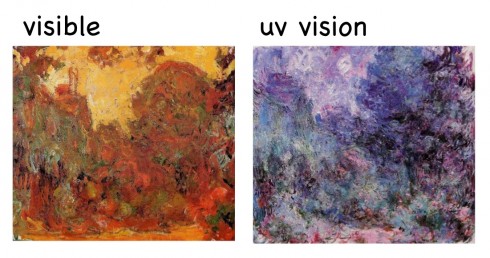
The eye’s lens is pretty good at blocking ultra-violet light, so when Claude Monet (whose works we visited earlier this year) had the lens of his eye removed he could see a little into the ultra-violet wavelengths of light.
Monet’s story is in a free iPad book put out by the Exploratorium of San Francisco called Color Uncovered (which I have to get). Carl Zimmer has a review that includes more details about Monet and how the eye works.
P.S.: All of Monet’s works can be found on WikiPaintings, a great resource for electronic copies of old paintings (that are out of copyright).
Silvia Pelissero (aka Agnes-Cecile) brings a face to life in watercolor. (She has more, excellent videos on her YouTube channel).