Using a sequence of connected shapes to introduce algebra and graphing to pre-Algebra students.
Make a geometric shape–a square perhaps–out of toothpicks. Count the sides–4 for a square. Now add another square, attached to the first. You should now have 7 toothpicks. Keep adding shapes in a line and counting toothpicks. Now you can:
make a table of shapes versus toothpicks,
write the sequence as an algebraic expression
graph the number of shapes versus the number of toothpicks (it should be a straight line),
figure out that the increment of the sequence–3 for a square–is the slope of the line.
show that the intercept of the line is when there are zero shapes.
Then I had my students set up a spreadsheet where they could enter the number of shapes and it would give the number of toothpicks needed. Writing a small program to do the same works is the next step.
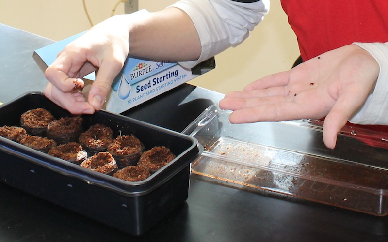
The Gardening Department of our Student-Run-Business sowed seeds in little coconut husk pellets. The question was: how many seeds should we plant per pellet.
Planting seeds in coconut pellets.
Since we’ll only let one seedling grow per pellet, and cull the rest, the more seeds we plant per pellet, the fewer plants we’ll end up with. On the other hand, the fewer seeds we plant (per pellet) the greater the chance that nothing will grow in a particular pellet, and we’ll be down a few plants as well. So we need to think about the probabilities.
Fortunately, I’d planted a some tomato seeds a couple weeks ago that we could use for a test case. Of the 30 seeds I planted, only 20 sprouted, giving a 2/3 probability that any given seed would grow:
So if we plant one seed per pellet in 10 pellets then in all probability, only two thirds will grow (that’s about 7 out of 10).
What if instead, we planted two seeds per pellet. What’s the probability that at least one will grow. This turns out to be a somewhat tricky problem–as we will see–so let’s set up a table of all the possible outcomes:
Seed 1
Seed 2
grow
grow
grow
not grow
not grow
grow
not grow
not grow
Now, if the probability of a seed growing is 2/3 then the probability of one not growing is 1/3:
So let’s add this to the table:
Seed 1
Seed 2
grow (2/3)
grow (2/3)
grow (2/3)
not grow (1/3)
not grow (1/3)
grow (2/3)
not grow (1/3)
not grow (1/3)
Now let’s combine the probabilities. Consider the probability of both seeds growing, as in the first row in the table. To calculate the chances of that happening we multiply the probabilities:
Indeed, we use the ∩ symbol to indicate “and”, so we can rewrite the previous statement as:
And we can add a new column to the table giving the probability that each row will occur by multiplying the individual probabilities:
Seed 1
Seed 2
And (∩)
grow (2/3)
grow (2/3)
4/9
grow (2/3)
not grow (1/3)
2/9
not grow (1/3)
grow (2/3)
2/9
not grow (1/3)
not grow (1/3)
1/9
Notice, however, that the two middle outcomes (that one seed grows and the other fails) are identical, so we can say that the probability that only one seed grows will be the probability that the second row happens or that the third row happens:
When we “or” probabilities we add them together (and we use the symbol ∪) so:
You’ll also note that the probability that neither seed grows is equal to the probability that seed one does not grow and seed 2 does not grow:
So we can summarize our possible outcomes a bit by saying:
Outcome
Probability
both seeds grow
4/9
only one seed grows
4/9
neither seed grows
1/9
What you can see here, is that the probability that at least one seed grows is the probability that both seeds grow plus the probability that only one seed grows, which is 8/9 (we’re using the “or” operation here again).
In fact, you can calculate this probability by simply taking the opposite probability that neither seeds grow:
Generalizing a bit, we see that for any number of seeds, the probability that none will grow is the multiplication of individual probability that one seed will not grow:
Probability that no seeds will grow
Number of seeds
Probability they wont grow
1
1/3
(1/3)1
2
(1/3)×(1/3) = 1/9
(1/3)2
3
(1/3)×(1/3)×(1/3) = 1/27
(1/3)3
n
(1/3)×(1/3)×(1/3)×…
(1/3)n
So to summarize, the probability that at least one plant will grow, if we plant n seeds is:
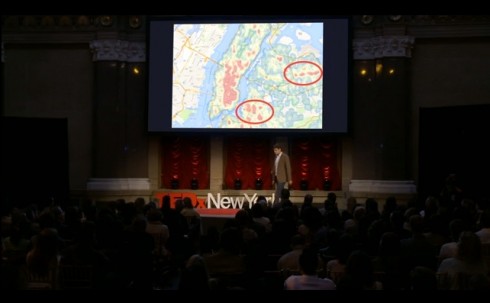
I’m having my students collect all sorts of data for Chicken Middle, their student-run-business. Things like the number of eggs collected per day and the actual items purchased at the concession stand (so we don’t have to wait until we run out of snacks). It takes a little explanation to convince them that it’s important and worth doing (although I suspect they usually just give in so that I stop harassing them about). So this talk by Ben Wellington is well timed. It not goes into what can be done with data analysis, but also how hard it is to get the data in a format that can be analyzed.
Doubly fortunately, Ms. Furhman just approached me about using the Chicken Middle data in her pre-Algebra class’ chapter on statistics.
We’re also starting to do quarterly reports, so during this next quarter we’ll begin to see a lot of the fruits of our data-collecting labors.
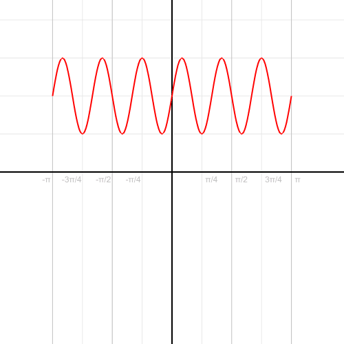
Converting a trigonometric function (sin curve) from Cartesian to polar coordinates. Source: “Cartesian to polar” by Kieff – Own work. Licensed under Public domain via Wikimedia Commons.
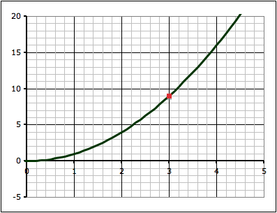
Following up on the project to find the volume (and surface area) of a guitar, and the slope at a point along the outline of the guitar, I asked students to use the same techniques to estimate the area under a curve (y = x2) and find the slope at a point along the curve. Specifically:
y = x2
Draw the function y = x2
Find the area bounded by the function, the lines x = 1 and x = 4, and the x-axis
Find the slope of a tangent to the y = x2 function at the point where x = 3.
The point of the second question is to test if students have internalized the idea that they can approximate curved shapes with trapezoids, but they have to weigh the time it will take to do a lot of trapezoids, versus the reduction in error that will result from more trapezoids. It’s interesting to see students’ character come through in this assignment: some choose to make one big trapezoid and are done, while other will go so many trapezoids that they run out of time to get them done.
It just occurs to me, however, that an interesting way to assess this assignment would be to give them a fixed time, and tell them that their score will be the 100 minus the percent error in their calculations.
Limits
The point on the function where x = 3.
The third question–about finding the slope of a tangent line at x = 3–is our jumping off point into the mathematics of limits and calculus.
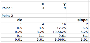
Some students do a single approximation–either forward or backward–, while others do both and take the average.
Finding the approximate slope using a forward difference.
The forward approximation involves finding the values for the function y = x2 at x = 3 and x = 4 and finding the slope between the two points:
when x = 3, y = 9, so we have the point (x1,y1) = (3, 9)
when x = 4, y = 16, so we have the point (x2,y2) = (3, 16)
The slope (m) between two points is found with the equation they learned back in algebra:
Where Δx = x2-x1 and Δy = y2-y1.
Using the two points above gives:
Those who use the backward approximation simply use the point when x = 2 instead of x = 4, and they end up with a value for the slope of 5.
Averaging the forward and backward approximations give a slope of 6.
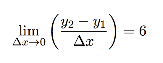
Now, since they know that the closer you make the points the better the approximation, I ask them to make a table to see what happens as they do so. This means reducing the value of Δx. In both the forward and backward approximation shown above, Δx = 1.
This can be done very quickly in Excel (or any other spreadsheet program), however, this time at least, most students chose to do it by hand. They end up with a table that looks like this:
As dx gets smaller the calculated slope approaches 6.As the difference in x gets smaller and approaches zero, the slope approaches 6.
As you plot slope versus the change in x (Δx), you can see that as Δx gets smaller and smaller and approaches zero, the slope gets closer and closer to 6. So we could say that:
the limit of the slope as Δx approaches zero is 6.
Mathematically this can be written as:
or using the equation for slope:
Now, we can work on taking the limit in a more general way to do differentiation.
Calibration curves produced by different student groups to determine the relationship between density and concentration of salt (NaCl) solutions.
To start with chemistry class, we’re studying the properties of substances (like density) and how to measure and report concentrations. So, I mixed up four solutions of table salt (NaCl) dissolved in water of different concentrations, and put a drop of food coloring into each one to clearly distinguish them. The class as a whole had to determine the densities of the solutions, thus learning how to use the scales and graduated cylinders.
However, for the students interested in doing a little bit more, I asked them to figure out the actual concentrations of the solutions.
One group chose to evaporate the liquid and measure the resulting mass in the beakers. Others considered separating the salt electrochemically (I vetoed that one based on practicality.
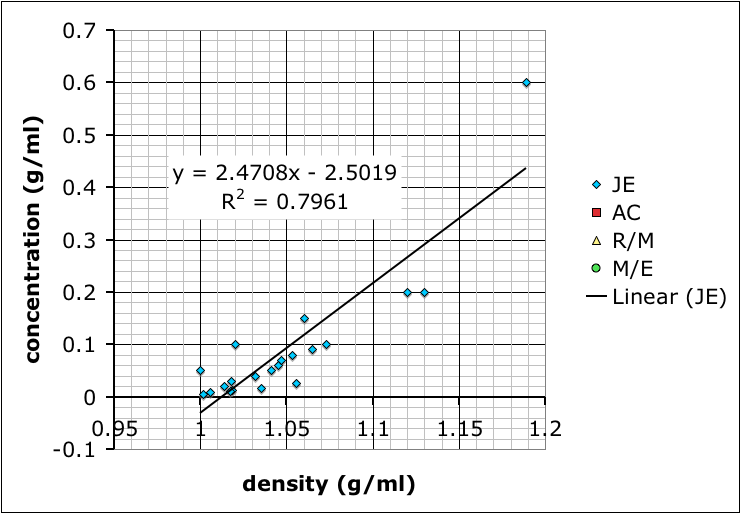
Most groups ended up choosing to mix up their own sets of standard solutions, measure the densities of those, and then use that data to determine the densities of the unknown solutions. Their data is shown at the top of this post.
Finding the mass of solution in order to calculate its density.
The variability in their results is interesting. Most look like the result of systematic differences in making their measurements (different scales, different amounts of care etc.), but they all end up with curves where the concentration increases positively with density.
I showed the graph above to the class so we could talk about different sources of error, and how scientists will often compile the data from several different studies to get a better averaged result.
Then, I combined all the data and added a linear trend line so they could see how to do it using Excel (many of these students are in pre-calculus right now so it ties in nicely):
Trend line from combined data.
What we have not talked about yet–I hope to tomorrow–is how the R-squared value, which gives the goodness of the fit of the trend line to the data, is more a measure of precision rather than accuracy. It does say something about how internally consistent the data are, but not necessarily if the result is accurate.
It’s also useful to point out that the group with the best R-squared value is the one with only two data points because two data points will necessarily give a perfectly straight line. However, the groups that made more solutions might not have as good of an R-squared value, but, because of the multiple measurements, probably have more reliable results.
As for which group got the most accurate result: I added in some data I found by googling–it came off a UCSD website with no citation so I’m going to need to find a better reference. Comparing our data to the reference we find that team AC (the red squares) best match:
The straight line shows my (currently) accepted values for the concentration/density relationship.
An interesting article by some researchers from the University College in London describes the equation they constructed and tested that predicts happiness.
A key part of the equation is that it relates happiness to the difference between people’s expectations of rewards and the actual rewards.
… we show that emotional reactivity in the form of momentary happiness in response to outcomes of a probabilistic reward task is explained not by current task earnings, but by the combined influence of recent reward expectations and prediction errors arising from those expectations.
Working on algebra over the summer, we tried a little programming. This is O’s first program, which gives the chirp rate of crickets based on the temperature.
t = float(raw_input('enter temperature> '))

n=4*t-160
print "number of chirps=", n
print "t=", t

![P[\text{grow}] = \frac{2}{3}](https://MontessoriMuddle.org/wp-content/ql-cache/quicklatex.com-5b793e69ccfc739a5d104f6e8adc9c41_l3.png "Rendered by QuickLaTeX.com")
![P[\text{not grow}] = 1 - P[\text{grow}] = 1 - \frac{2}{3} = \frac{1}{3}](https://MontessoriMuddle.org/wp-content/ql-cache/quicklatex.com-7cbd4b029e2943bd083b643859555c3b_l3.png "Rendered by QuickLaTeX.com")
![P[(\text{seed 1 grow}) \text{ and } (\text{seed 2 grow})] = \frac{2}{3} \times \frac{2}{3} = \frac{4}{9}](https://MontessoriMuddle.org/wp-content/ql-cache/quicklatex.com-0c09ac340f9097eea5dbd223157c0ecc_l3.png "Rendered by QuickLaTeX.com")
![P[(\text{seed 1 grows}) \cap (\text{seed 2 grows})] = \frac{2}{3} \times \frac{2}{3} = \frac{4}{9}](https://MontessoriMuddle.org/wp-content/ql-cache/quicklatex.com-991b70b4725e153d01bb98b9c9445766_l3.png "Rendered by QuickLaTeX.com")
![P[\text{only one seed grows}] = P[(\text{Row 2}) \text{ or } (\text{Row 3})](https://MontessoriMuddle.org/wp-content/ql-cache/quicklatex.com-ce7e1aca0e56079fcc72aec6cc63325b_l3.png "Rendered by QuickLaTeX.com")
![P[\text{only one seed grows}] = P[(\text{Row 2}) \cup (\text{Row 3}) \\ = \frac{2}{9} + \frac{2}{9} = \frac{4}{9}](https://MontessoriMuddle.org/wp-content/ql-cache/quicklatex.com-325ff73fa6cacd2f52eb1f9e4ef7e58f_l3.png "Rendered by QuickLaTeX.com")
![P[\text{neither seed grows}] = P[(\text{seed 1 does not grow}) \cap (\text{seed 2 does not grow}) = \frac{1}{3} \times \frac{1}{3} = \frac{1}{9}](https://MontessoriMuddle.org/wp-content/ql-cache/quicklatex.com-b7fc39cf4dcecb8e1a50cb3a9f74342a_l3.png "Rendered by QuickLaTeX.com")
![P[\text{neither seed grows}] = 1 - P[\text{neither seed grows}]](https://MontessoriMuddle.org/wp-content/ql-cache/quicklatex.com-2377f3ca949ff6911c10ec43b4ab42ee_l3.png "Rendered by QuickLaTeX.com")
![P[\text{at least one seed grows}] = 1 - P[\text{no seeds grow}]](https://MontessoriMuddle.org/wp-content/ql-cache/quicklatex.com-bbcfec87f0acb79bedb1cd47625b7a6d_l3.png "Rendered by QuickLaTeX.com")
![P[\text{at least one of n seeds grows}] = 1 - P[\text{1 seed grows}]^n](https://MontessoriMuddle.org/wp-content/ql-cache/quicklatex.com-95e0640d375ff90d70e449fabbac58ad_l3.png "Rendered by QuickLaTeX.com")


