Global Warming: We need new colors.

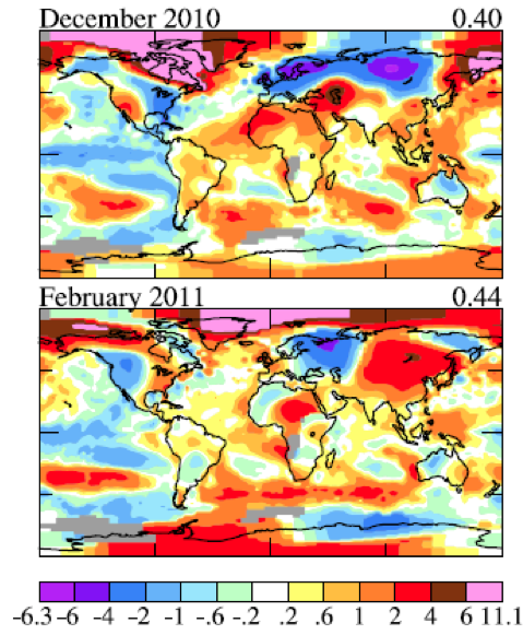
These maps show the difference between last winter's average temperatures and the long term average (from 1951-1980). Notice that the scale goes up to 11. Image from Hansen and Sato, 2011.

For much of the U.S., last winter was pretty cold. If you look at the maps above, you can see that the eastern United States was up to 4 °C colder than normal in December. However, if you look a little further north into Canada, you’ll see a broad, pink region, where the temperatures were up to 11 °C warmer than normal.

The rate at which the world has been warming has been accelerating. It’s been interesting watching the predictions of the relatively crude computer models of the 1980’s coming true.
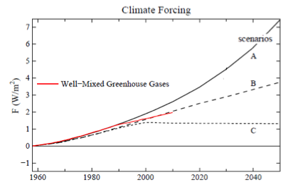
The red line show that the actual warming has been awfully close to the middle scenario predicted by climate modelers. The figure was slightly adapted from Hansen and Sato (2011).

Although, it’s really the broadest, more general predictions that tend to be more reliable. One of those predictions, that’s been consistent for a long time and with a lot of different models, is that the poles would warm significantly faster than the rest of the planet.

What’s also been interesting, if somewhat depressing, is seeing the political consensus lag behind the scientific consensus. Twenty years ago there was a real debate in the scientific community about if global temperatures were rising. Now scientists argue mainly about what to do: reduce greenhouse gas pollution, adapt to the inevitable, or some mix of the two. Yet two weeks ago the House Science Committee heard testimony from a professor of marketing, advocating for an end to all government funding of climate research. Perhaps the belief is that if we don’t look it won’t happen.

Curiously, even research teams funded by people who politically oppose global warming, are just confirming the results of all the other scientific groups. Unsurprisingly, they’re now getting heat from their former supporters.

At the same time, Kate (on climatesafety.org) observes that NASA’s James Hansen has had to add a new color (pink on the graphs at the top of the page) to his climate anomaly maps because of the unexpectedly large warming over last winter.
Global Warming update

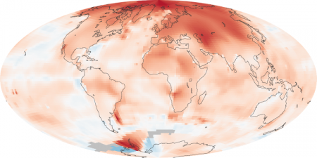
Global temperature difference (anomoly) of 2000-2009 compared to 1950-1980.

NASA’s Earth Observatory is not only a great place for pictures from space, it also posts regular scientific updates, including the most recent map of the change in temperature since 1980.

The most obvious observation from the map is that the poles are warming faster than the rest of the planet, especially the North Pole. This is a pattern that has been predicted since at least the 90’s, so the temperature observations tend to show that the scientists and computer modelers who do this research may just know what they’re doing.

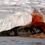
Blood Falls, Antarctica. Note the tent in the lower left for scale. From the U.S. Antarctic Program.

It’s also important to note that the Antarctic is not warming nearly as fast as the Arctic. The continental glaciers that would most significantly raise sea level (think 10’s of meters) are in Antarctica.

Image from the USGS.

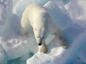
The northern hemisphere warming will likely be difficult for a number of species to deal with. Polar bears, the charismatic megafauna (I love that term) most associated with the effects of the melting Arctic sea-ice, are still in big trouble. Recent research, however, suggests that if something can be done to reduce global warming in the coming century, there will remain places with enough ice that the species may survive.

Update: Interesting article on global warming science and politics in the NY Times. It starts off talking about David Keeling, the scientist who came up with a reliable way to measure atmospheric carbon dioxide.