The equation of our straight line model (red line) matches the data (blue diamonds) pretty well.
One of the first things that my pre-Calculus students need to learn is how to do a least squares regression to match any type of function to real datasets. So I’m teaching them the most general method possible using MS Excel’s iterative Solver, which is pretty easy to work with once you get the hang of it.
Log, reciprocal and square root functions can all be matched using least squares regression.
I’m teaching the pre-Calculus using a graphical approach, and I want to emphasize that the main reason we study the different classes of functions — straight lines, polynomials, exponential curves etc.— is because of how useful they are at modeling real data in all sorts of scientific and non-scientific applications.
So I’m starting each topic with some real data: either data they collect (e.g. bring water to a boil) or data they can download (e.g. atmospheric CO2 from Mauna Loa). However, while it’s easy enough to pick two points, or draw a straight line by eye, and then determine its linear equation, it’s much trickier if not impossible when dealing with polynomials or transcendental functions like exponents or square-roots. They need a technique they can use to match any type of function, and least squares regression is the most commonly used method of doing this. While calculators and spreadsheet programs, like Excel, use least squares regression to draw trendlines on their graphs, they can’t do all the different types of functions we need to deal with.
The one issue that has come up is that not everyone has Excel and Solver. Neither OpenOffice nor Apple’s spreadsheet software (Numbers) has a good equivalent. However, if you have a good initial guess, based on a few datapoints, you can fit curves reasonably well by changing their coefficients in the spreadsheet by hand to minimize the error.
I’m working on a post on how to do the linear regression with Excel and Solver. It should be up shortly.
Notes
If Solver is not available in the Tools menu you may have to activate it because it’s an Add In. Wikihow explains activation.
Some versions of Excel for the Mac don’t have Solver built in, but you can download it from Frontline.
Microsoft Excel, like most graphical calculators and spreadsheet programs, has the built in ability to do linear regression of measured data using certain types of functions — lines, polynomials, logarithms, and exponents for example. However, you can get it to do any type of function — sinusoidal, natural log, whatever — if you work through the spreadsheet and can use the iterative Solver tool.
This more general approach is quite useful in teaching pre-Calculus, because the primary purpose of all the functions they have to learn is to create mathematical models (functions) based on data that can be used for predictions.
The Data
I started this year’s pre-calculus class by having them collect some data. In a simplification of the snow-melt experiment I did with the middle school last year, I had them put a beaker of water (about 300ml) on a hot plate and measure the temperature every minute as warmed up.
To make the experiment a little more interesting, I had each student in each group of four take just three consecutive measurements and try to find the equation of the straight line that best fit their data, and could be used to try to predict the other measurements of their peers in their group.
Figure 1. Scatter plot of measured temperatures during the warming of a beaker of water on a hot plate. Data given in Table 1.
It did not quite work out as I’d hoped. Since you only need two points to find the equation of a straight line, having three points produced a little confusion. I’d hoped to produce that confusion, but hadn’t realized that I’d need to do a review of how to find the equation of a straight line. A large fraction of the class was a little bit rusty after hot months of summer.
So, we pooled all the data and reviewed how to find the equation of a straight line.
Table 1: The Data
Time (minutes)
Measured Temperature (°C)
0
22
1
26
2
31
3
36
4
40
5
44
6
48
7
53
8
58
9
61
10
65
11
68
12
71
Finding the Equation for a Straight Line using Two Points
The general equation for a straight lines is:
(1)
and we need to determine the coefficients m and b. m is the slope, which can be calculated from two points using the equation:
(2)
using the points at t=6 and t=11 — the points (x1, y1) = (6,48) and (x2, y2) = (11,68) respectively — for example, gives a slope of:
so our general equation becomes:
to find b we substitute either one of the points into the equation for x and y. If we use the first point, x = 6, and y = 48, we get:
and the equation of our line becomes:
(3)
Now, since we’re actually looking at a relationship between temperature and time, with temperature on the y-axis and time on the x-axis, we could relabel the terms in the equation with T = temperature and t = time to have:
(4)
While this equation is more satisfying to me, because I think it better describes the relationship we have, the more vocal students preferred the equation in terms of x and y (Eqn 3). These are the terms they are more familiar with in the context of a math class, and I recall seeing some evidence that students seem to learn better with the more abstract representations sometimes (though I can’t quite remember the source; I should have blogged about it).
Plotting the Data and the Modeled Straight Line
The straight line equation we came up with (Eqn. 4) is our model of the data. It’s not quite perfect. All the data do not lie on the line, although, if we did everything right, only the points (6, 48) and (11, 68) are guaranteed to be on the line.
Figure 2. The equation of our straight line model (red line) matches the data (blue diamonds) pretty well.
I showed the class how to plot the scatter graph using MS Excel, and how to draw the line to show the modeled data. The measured data are represented as points since the measurements were made at discrete points in time. The modeled equation, however, is a continuous function, hence the straight line. The Excel sheet below (Resource 1) illustrates:
The Excel spreadsheet (Resource 1) was set up so that when I entered the slope (m) and intercept (b) values, the graph would quickly update. So I went through the class. Everyone called out their slope and intercept values, I plugged them in, and they could all see how the modeled line changed slightly based on the points used to calculate it. So I put the question to them, “How can we figure out which model equation is the best?”
That’s how I was able to introduce the topic of error. What if we compared the temperature predicted by the model for each data point, to the actual value. The smaller the difference in modeled versus measured temperatures, the better the fit of the model. Indeed, if we sum all the differences, or better yet take the average of the differences, we could get a single number, we’ll call the average error (ε), that could be used to compare the different models. I used this opportunity to introduce sigma notation, which the pre-calculus students had not seen much of before.
As a first pass (which, as we’ll see below, has a major problem), the error (ε) for each point (i) is:
The average error is the sum of all the errors divided by the number of points (n) (we have 12 points so n=12 in this example):
(5)
Now this works, but there is one problem. I was quite pleased and a little bit surprise that one of my students recognized what it was without any coaxing and also suggested a solution: by simply taking the difference to calculate the error, a point that is offset above the modeled line can be canceled out by a point offset by the same amount below the line. So what we really need is to use the absolute value of the error.
(6)
This works, and is what we went with, but I did also point that what’s usually done is to use the square of the error instead of the absolute value. Squaring makes any number positive, so it accomplishes the same goal as the absolute value, and is the approach we’ll use when I go into linear regression later on.
Setting up the Excel spreadsheet to calculate the average error is fairly straightforward as shown in Resource 2:
So once again, we went through the class and everyone called out their slope and intercept values and cheered when I plugged the numbers in and they saw if they had the lowest value.
It is important to remember, though, that the competition gives a somewhat random result: students’ average error is a function of the points they happened to pick, not how well they did the math (assuming everyone did the math correctly).
Figure 2. Showing the spreadsheet used to calculate the average error (Resource 2).
The video shows 300 seconds of purely exponential growth (uninhibited), captured from the exponential growth VAMP scenario. Like the exponential growth function itself, the video starts off slowly then gets a lot more exciting (for a given value of exciting).
The modeled growth is based on the exponential growth function:
(1)
where:
N = number of cells (or concentration of biomass);
N0 = the starting number of cells;
r = the rate constant, which determines how fast growth occurs; and
t = time.
Finding the Rate Constant/Doubling Time (r)
You can enter either the rate constant (r) or the doubling time of the particular organism into the model. Determining the doubling time from the exponential growth equation is a nice exercise for pre-calculus students.
Let’s call the doubling time, td. When the organism doubles from it’s initial concentration the growth equation becomes:
divide through by N0:
take the natural logs of both sides:
bring the exponent down (that’s one of the rules of logarithms);
remember that ln(e) = 1:
and solve for the doubling time:
Decay
A nice follow up would be to solve for the half life given the exponential decay function, which differs from the exponential growth function only by the negative in the exponent:
A useful calculus assignment would be to determine the growth rate at any point in time, because that’s what the model actually uses to calculate the growth in cells from timestep to timestep.
The growth rate would be the change in the number of cells with time:
starting with the exponential growth equation:
since we have a natural exponent term, we’ll use the rule for differentiating natural exponents:
So to make this work we’ll have to define:
which can be differentiated to give:
and since N0 is a constant:
substituting in for u and du/dt gives:
rearranging (to make it look prettier (and clearer)):
(2)
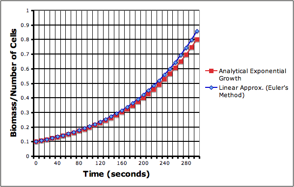
Numerical Methods: Euler’s method
With this formula, the model could use linear approximations — like in Euler’s method — to simulate the growth of the biomass.
First we can discretize the differential so that the change in N and the change in time (t$) take on discrete values:
Now the change in N is the difference between the current value Nt and the new value Nt+1:
Now using this in our differentiated equation (Eq. 2) gives:
Which we can solve for the new biomass (N^t+1):
to get:
This linear approximation, however, does introduce some error. The approximated exponential growth curve (blue line) deviates from the analytical equation. The deviation compounds itself, getting worse exponentially, as time goes on.
This is the first, basic but useful product of my summer work on the IMPS website, which is centered on the VAMP biochemical model. The VAMP model is, as of this moment, still in it’s alpha stage of development — it’s not terribly user-friendly and is fairly limited in scope — but is improving rapidly.
One of my pre-Calculus students convinced me that the best way for him to learn how to work with matrices was for him to program a matrix solver. I helped him create a Gaussian Elimination solver in Python (which we’ve been using since last year).
Gaussian Elimination Matrix Solver by Alex Shine (comments by me).
from visual import *

'''The coefficient matrix (m) can be any sized square matrix
   with an additional column for the solution'''
m = [ [1,-2,1,-4],[0,1,2,4],[2,3,-2,2]]

'''Convert the input matrix, m (which is a list) into an array'''
a = array(m,float)
print "Input matrix:"
print a
print

'''Get the shape of the matrix (number of rows and columns)'''
(r,c) = a.shape

rs = (1-r)

'''Solve'''
for j in range(r):

    print "Column #:", j
    for i in range(r):
        if a[i,j] <> 0:
            a[i,:] = a[i,:] / a[i,j]
    print a
    print

    for i in range(rs+j,j):
        if a[i,j] <> 0:
            a[i,:] = a[j,:] - a[i,:]
    print a
    print

print "Solution"
for i in range (r):
    a[i,:] = a[i,:] / a[i,i]
    print "Variable", i, "=", a[i,-1]

print
print "Solution Matrix:"
print a
The code above solves the following system of equations:
  x - 2y +  z = -4
       y + 2z =  4
 2x + 3y - 2z =  2
Which can be written in matrix form as such:
You use the solver by taking the square matrix on the left hand side of the equation and combining it with the column on the hand side as an additional column:
This is entered into the program as the line:
m = [ [1,-2,1,-4],[0,1,2,4],[2,3,-2,2]]
When you run the above program you should get the results:
The matrix you put in can not have any zeros on its diagonal, so some manipulation is often necessary before you can use the code.
Other notes:
The negative zeros (-0) that show up especially in the solution matrix may not look pretty but do not affect the solution.
The code imports the vpython module in the first line but what it really needs is the numpy module, which vpython imports, for the arrays.
The next step is to turn this into a function or a class that can be used in other codes, but it’s already proved useful. My calculus students compared their solutions for the coefficients of a quadratic equation that they had to solve for their carpet friction experiment, which was great because their first answers were wrong.
A calculus student uses the matrix solver. Mr. Shine is now trying to convert the solver into an iPhone app.
Say you have the equation that gives you the slope of a curve (let ) be the slope):
When you use integration to solve the equation, there are quite the number of possible solutions (infinite actually), because when you integrate:
you get:
where c is a constant. Unfortunately, you don’t know what c is without more information; it could be anything.
However, even without integrating, we can get a feel for what the curve will look like by plotting what the slope will look like at a bunch of different points in space. This comes in really handy when you end up with a equation for slope that is really hard — or even impossible — to solve.
The graph below show a curve of possible solutions to the slope equation. You should be able to see, as the graph slowly moves up and down, how the slope of the graph corresponds to the slope field.
[inline]
[script type=”text/javascript”]
var width=500;
var height=500;
var xrange=10;
var yrange=10;
mx = width/(2.0*xrange);
bx = width/2.0;
my = -height/(2.0*yrange);
by = height/2.0;
function draw9083b(ctx, polys) {
t9083b=t9083b+dt9083b;
//ctx.fillText (“t=”+t, xp(5), yp(5));
ctx.clearRect(0,0,width,height);
The effects of changing the constants in the equation of a line (y=mx+b). Image by Tess R.
My high school pre-Calculus class is studying the subject using a graphical approach. Since we’re half-way through the year I thought it would be useful to introduce some programming by building their own graphical calculators using Vpython.
Now, they all have graphical calculators, and Vpython does have its own graphing capabilities, but they’re fairly simple, only 2-dimensional, and way too automatic, so I prefer to have students program the calculators in full 3d space.
My approach to graphing is fairly simple too, but its nice because it introduces:
Co-ordinates: Primarily in 2d (co-ordinate plane), but 3d is easy;
Lists: in this case its a list of coordinates on a line;
Loops: (specifically for loops) to repeat actions and produce a sequence of numbers (with range); and
A sideways glance at matrix-like operations with arrays: A list of numbers can be treated like a matrix in some relatively simple circumstances. However, it’s not real matrix operations: multiplying a scalar by a list works like real matrix multiplication, but multiplying two lists multiplies the corresponding elements in the list.
A Simple Graphing Program
Start the program with the standard vpython header:
from visual import *
x and y axes: curves and lists
Next create the x and y axes. This introduces the curve object and lists, because Vpython draws its curve from a series of points held in a list.
To keep things simple, we’re letting the graph go from -10 to positive 10 along both axes, which makes the x-axis a line segment with only two points:
line_segment = [(-10,0), (10,0)]
The square brackets say that what’s inside as a list. In this case it’s a list of two coordinate pairs, (-10,0) and (10,0).
Now we create a line using Vpython’s curve and tell it that the positions of the points on the curve are the ones we just defined:
xaxis = curve(pos=line_segment)
To create the y-axis, we do the same thing but change the coordinate pair to (0,-10) and (0,10).
In order to be better able to keep track of things, we’ll need some tic-marks on the axes. Ideally we’d like to label them too, but I think it works well enough to save that for later.
I start by having students create the first few tic-marks and then look for the emerging pattern. Their first attempts usually look something like this:
However, instead of tediously writing out these lines we can automate it by noticing that the only things that change are the x-coordinate of the coordinate pairs: they go from -10, to -9, to -8 etc.
So we want to produce a set of numbers that go from -10 to 10, in increments of 1, and use those number to make the tic-marks. The range function will do just that: specifically, range(-10,10,1). Actually, this list only goes up to 9, but that’s okay for now.
We tell the program to go through each item in the list and give its value to the variable i using a for loop:
for i in range(-10,10,1):
mark = curve(pos=[(i,0.3),(i,-0.3)])
In python, everything indented after the for statement is within the loop.
Tic marks on the x-axis.
The y-axis’ tic-marks are similar, and its a nice little challenge for students to figure them out. They usually come up with a separate loop, eventually, that looks something like:
for i in range(-10,10,1):
mark = curve(pos=[(0.3, i),(-0.3,i)])
Our axes.
The Curve
Now to create a line we really only need two points. However, so that we can make other types of curves later on we’ll create a line with a series of points. We’ll create the x and y values separately:
First we set up the set of x values:
line = curve(x=arange(-10,10,0.1))
Note that I use the arange function which is just like the range function but gives you decimal values (so you can do fractions) instead of just integers.
Next we set the y values that go with the x values for the equation (in this example):
line.y = 0.5 * line.x + 2
Finally, to make it look better, we change the color of the line to yellow:
line.color = color.yellow
In Summary
The final code looks like:
from visual import *
line_segment = [(-10,0),(10,0)]
xaxis = curve(pos=line_segment)
line_segment = [(0,-10),(0,10)]
yaxis = curve(pos=line_segment)
mark1 = curve(pos=[(-10,0.3),(-10,-0.3)])
mark2 = curve(pos=[(-9,0.3),(-9,-0.3)])
mark3 = curve(pos=[(-8,0.3),(-8,-0.3)])
mark4 = curve(pos=[(-7,0.3),(-7,-0.3)])
for i in range(-10,10,1):
    mark = curve(pos=[(i,0.3),(i,-0.3)])
for i in range(-10,10,1):
    mark = curve(pos=[(0.3, i),(-0.3,i)])
line = curve(x=arange(-10,10,0.1))
line.y = 0.5 * line.x + 2
line.color = color.yellow
which produces: A first line: y=0.5x+2
Note on lists, arrays and matrices: You’ll notice that we create the curve, give it a list of x values (using arange), and then calculate the corresponding y values using matrix multiplication: 0.5 * line.x. This works because line.x actually stores the values as an an array, not as a list. The key difference between lists and arrays, as far as we’re concerned, is that we can get away with this type of multiplication with an array and not a list. However, an array is not a matrix, as is clearly demonstrated by the second part of the command where 2 is added to the result of the multiplication. In this case, 2 is added to each value in the array; if it were an actual matrix you need to add another matrix of the same shape that’s filled with 2’s. Right now, this is invisible to the students. The line of code makes sense. The concern is that when they do start working with matrices there might be some confusion. So watch out.
And to make any other function you just need to adjust the final line. So a parabola:
would be:
line.y = line.x**2
(The two stars “**” indicates an exponent).
An Assignment
So, to assess learning, and to review the different functions we’ve learned, I asked students to produce “studies” of the different curves by demonstrating what happens when you change the different constants and coefficients in the equation.
For a straight line the general equation is:
you what happens when:
m > 1;
0 < m < 1;
m < 0
and:
b > 1;
0 < b < 1;
b < 0
The result is, after you add some labels, looks something like the image at the very top of this post.
This type of exercise can be done for polynomials, exponential, trigonometric, and almost any other type of functions.


![\left[ \begin{array}{ccc} 1 & -2 & 1 \\ 0 & 1 & 2 \\ 2 & 3 & -2 \end{array} \right] \left[ \begin{array}{c} x \\ y \\ z \end{array} \right] = \left[ \begin{array}{c} -4 \\ 4 \\ 2 \end{array} \right]](https://MontessoriMuddle.org/wp-content/ql-cache/quicklatex.com-d7c93a4faec058d3b5dda1831bdeaca7_l3.png "Rendered by QuickLaTeX.com")
![\left[ \begin{array}{cccc} 1 & -2 & 1 & -4 \\ 0 & 1 & 2 & 4\\ 2 & 3 & -2 & 2\end{array} \right]](https://MontessoriMuddle.org/wp-content/ql-cache/quicklatex.com-d2316bca341c565fbeab22075f4e2d73_l3.png "Rendered by QuickLaTeX.com")

 ) be the slope):


