Raymond Cohn has a great table of immigration data on the Economic History Association website.
This data ties very nicely into the work we’re doing on graphing. The Excel file with the post 1820 data, and another with pre-1790 data, make it easier to work with (note the pre-1970 data comes from the Wikipedia page on the history of immigration; it was the easiest source to find a table of data).
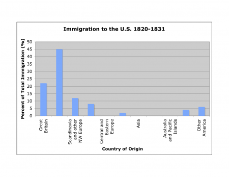
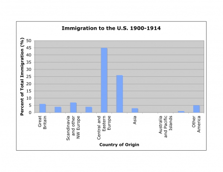
Since each small group of students is responsible for a different wave of immigration, the groups will create bar graphs showing the countries of origin for each wave. They should look like these:

and,

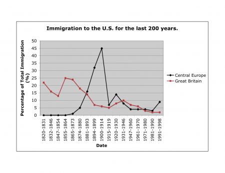
Plotting the time series as a line graph would be another great way to slice the data:

Note that the data in the table is as a percentage of total immigration, so the numbers do not compare directly from one time period to the next; however, the proportions still work to show the same patterns.