A couple days ago I had students present their physics lab reports to the class. They did a good job, but I think I need to emphasize the importance of including graphs in their results. It’s much harder to look for trends and patterns in the data without charts, especially when presenting to an audience.
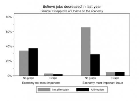
An interesting political science study (via Yglesias) found that it’s much easier to change people’s minds when you show them graphs, even when people don’t want to believe what you’re telling them.
[P]eople cling to false beliefs in part because giving them up would threaten their sense of self. Graphical corrections are … found to successfully reduce incorrect beliefs among potentially resistant subjects and to perform better than an equivalent textual correction.
–Nyhan and Reifler (2011): Opening the Political Mind? The effects of self-affirmation and graphical information on factual misperceptions

Teachers know how hard it can be to correct misconceptions – people tend to stick with the first thing they learned – so it’s good to see that graphical corrections can make a big difference.
Fortunately, my physics students are changing over to math next week, so we’ll be able to use their experimental data to draw lines, find gradients and do all sorts of interesting things.