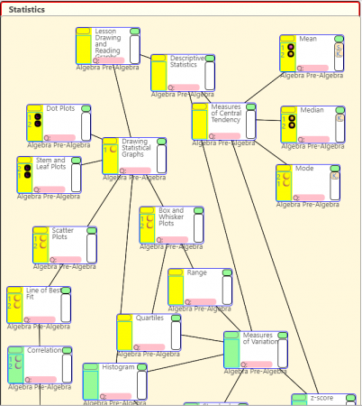
To help students track their progress in math we’ve started requiring them to map what they’re doing on flowcharts. Right now, they’re doing it on paper, but we’re working on getting it to be all electronic.
Tracking with the charts helps them see how what they’ve done fits into the bigger picture. It allows them to be able to go back up the chart to previous topics if they need to review, and look forward to what comes next (and to work ahead if they would like).
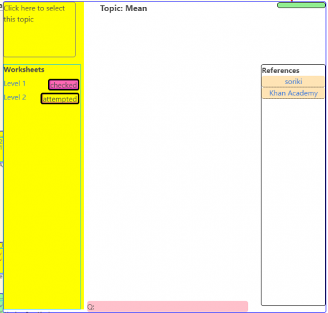
The image above shows a sample what a student’s flow chart would look like while they are working on a subject (statistics in this case). The topics they are working on at the moment are highlighted in yellow. The worksheets attached to each topic are linked on the left side in the highlighted area. Links to references (Khan Academy for example) are linked on the right–there are only a few on right now (see the Mean topic on the upper right of the flowchart).
The topics on the flowchart can be expanded (using the green button on the top right of each topic) to show more detail.

At the moment, I’m uploading the flowcharts that we’re currently using up on the website myself. Students can use the website to get worksheets and links to references, but if they mark what they’re doing on the webpage it’s not saved. We’re currently working on making it possible to create and edit flowcharts on the website itself. After that, we’ll be setting it up so students can log in with their school accounts and track their progress electronically. One ultimate goal is to map the entire upper school curriculum with these flow charts so a student might be able to track their work all the way from 7th to 12th grade.