I just discovered there’s an entire website dedicated to the dangers of dihydrogen monoxide. I particularly like their research page that includes the results from several middle and high school research projects.
Middle and High School … from a Montessori Point of View
I just discovered there’s an entire website dedicated to the dangers of dihydrogen monoxide. I particularly like their research page that includes the results from several middle and high school research projects.

This is an attempt to illustrate numerical integration by animating an HTML5’s canvas.
We’re trying to find the area between x = 1 and x = 5, beneath the parabola:
![]()
By integrating, the area under the curve can be calculated as being 17 ⅔ (see below for the analytical solution). For numerical integration, however, the area under the curve is filled with trapezoids and the total area is calculated from the sum of all the areas. As you increase the number of trapezoids, the approximation becomes more accurate. The reduction in the error can be seen on the graph: with 1 trapezoid there is a large gap between the shaded area and the curve; more trapezoids fill in the gap better and better.
The table below show how the error (defined as the difference between the calculation using trapezoids and the analytic solution) gets smaller with increasing numbers of trapezoids (n).
| Number of trapezoids | Area (units2) | Error (difference from 17.66) |
|---|---|---|
| 1 | 15.00 | 2.66 |
| 2 | 17.00 | 0.66 |
| 3 | 17.37 | 0.29 |
| 4 | 17.50 | 0.16 |
| 5 | 17.56 | 0.10 |
| 6 | 17.59 | 0.07 |
| 7 | 17.61 | 0.05 |
| 8 | 17.63 | 0.03 |
| 9 | 17.63 | 0.03 |
| 10 | 17.64 | 0.02 |
The area under the curve, between x = 1 and x = 5 can be figured out analytically by integrating between these limits.
![]()
![]()
![]()
![]()
![]()
![]()
(See also WolframAlpha’s solution).
Demonstration of this numerical integration using four trapezoids in embeddable graphs.
[inline]
[script type=”text/javascript”]
document.write(“hello world!”);
var c2=document.getElementById(“myCanvas2”);
var ctx2=c2.getContext(“2d”);
ctx2.moveTo(10,10);
ctx2.lineTo(150,50);
ctx2.lineTo(10,50);
ctx2.stroke();
[/script]
[/inline]
So I’m experimenting with creating drawings using HTML5. And it works (mostly)!! I have to hardwire in paragraph breaks, but otherwise it works so far.
The key references:

An excellent set of Soviet propaganda posters from How to be a Retronaut. The collection contains a fascinating blend of of triumphalism sprinkled with some attempts at modesty.

The posters make wonderful subjects for the study of propaganda and the space race.
My favorite:

Dana Goldstein posts a critique of liberal homeschooling (and, by inference, of private schooling as well).
The crux of her argument is collective (for the greater good); having middle class kids (who often have highly educated parents) benefits the poorer kids in the public schools and thus society at large.
… “peer effects” have a large impact on student achievement. Low-income kids earn higher test scores when they attend school alongside middle-class kids, while the test scores of privileged children are impervious to the influence of less-privileged peers. So when college-educated parents pull their kids out of public schools, whether for private school or homeschooling, they make it harder for less-advantaged children to thrive.
— Goldstein (2012): Liberals, Don’t Homeschool Your Kids in Slate
She backs up her argument with evidence (Schwartz, 2010) that mixed income schools show better outcomes. The fact that school funding and populations come from distinct geographic districts, some of which may be rich while others are poor, is a major part of the problem.
However reasonable the argument is for society at large, it’s going to be a hard argument to make to homeschooling parents who choose that option because of how bad they see the public schools as being. She’s not just asking for some shared sacrifice, but for having parents risk sacrifice their kids’ education.
Until the public schools change in the more progressive directions that these homeschooling parents have a problem with, I don’t think she’ll get much traction. For her idealism I’ll give her the last word, but I suspect that she’s got it backwards.
If progressives want to improve schools, we shouldn’t empty them out. We ought to flood them with our kids, and then debate vociferously what they ought to be doing.
— Goldstein (2012): Liberals, Don’t Homeschool Your Kids in Slate
Brian Joseph Davis creates composite sketches of literary characters using the same software used by the police, and the descriptions of the characters in the books.
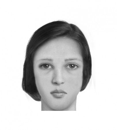
She was a fine and handsome girl—not handsomer than some others, possibly—but her mobile peony mouth and large innocent eyes added eloquence to colour and shape… The pouted-up deep red mouth to which this syllable was native had hardly as yet settled into its definite shape, and her lower lip had a way of thrusting the middle of her top one upward, when they closed together after a word…Phases of her childhood lurked in her aspect still. As she walked along to-day, for all her bouncing handsome womanliness, you could sometimes see her twelfth year in her cheeks, or her ninth sparkling from her eyes…a thick cable of twisted dark hair hanging straight down her back to her waist.
— description by Thomas Hardy, excerpted by Davis (2010): The Composites.
Usually, when new, more powerful predators evolve or come in from elsewhere, the local species can often adapt by themselves becoming better defended through a variety of means [larger sizes, thicker shells for example]; but this option seems to be closed when it comes to the evolution of humans as super-predators.
— Geerat Vermeij (2012), quoted in Walker (2012): Super-predatory humans on the BBC website.
Humans, using ingenuity and tools, have become an uniquely, irresistible predator species that the world has never seen before, and to which other species are finding it very difficult to adapt. That’s the premise of a paper by Geerat Vermeij that’s nicely summarized by Matt Walker on the BBC website.
Normally, predators and prey evolve and adapt to each other. Lions are better able to attack and kill smaller buffalo, which means the larger buffalo are more likely to survive, which results, over time, in the average size of the buffalo herds getting larger.
Humans, on the other hand, like to target the larger buffalo, creating a selective pressure the other way. Unfortunately, once the larger specimens are gone, humans will go after the smaller ones, and the intensity of the attacks have often been enough to drive entire species into extinction.
Though humans have been around for a couple hundred thousand years, we still have not seen our full impact on the environment. Which is somewhat interesting to consider.
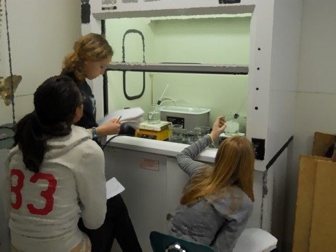
Though it might not sound much more interesting than watching paint dry, the relationships between phase changes, heat, and temperature are nicely illustrated by melting a beaker of snow on a hot plate.

This week’s snowfall created an opportunity I was eager to take. We have access to an ice machine, but closely packed snow works much better for this experiment, I think; the small snowflakes have larger surface-area to volume ratio, so they melt much more evenly, and demonstrate the latent heat of melting much more effectively.
My instructions to the students are simple: collect some snow, and observe how it melts on the hot plate.
I also ask them to determine the mass and density of the snow before (and after) the melting, so I could show that throughout the phase changes and transformations the mass does not change (at least not a lot) and so they can practice calculating density1,2.
I broke up my middle school students into groups of 2 or 3 and had them come up with a procedure and list of materials before they started. As usual I had to restrain a few of the over-eager ones who wanted to just rush out and collect the snow.
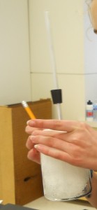
I guided their decision-making a little, so they would use glass beakers for the collection and melting. Because I wasn’t sure what the density of the packed snow would be, I suggested the larger, 600 ml beakers, which turned out to work very well. They ended up with somewhere between 350 and 400 grams of snow, giving densities around 0.65 g/ml.
When they put the beakers on the hot-plate, I specifically asked the students to observe and record, every minute or so, the changes in:
I had them continue to record until the water was boiling. This produced the question, “How do we know when it’s boiling?” My answer was that they’d know when they saw the temperature stop changing.
They also needed to stir the water well, especially when the ice was melting, so they could get a “good”, uniform temperature reading.
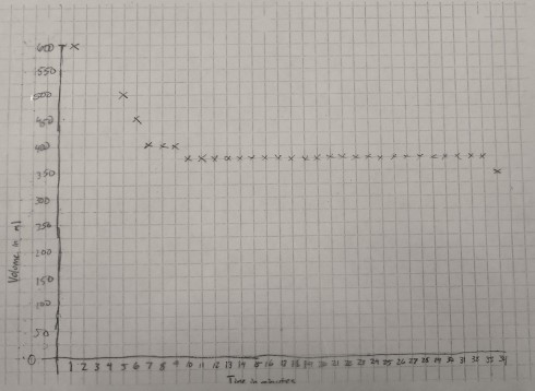
We ended up with some very beautiful graphs.
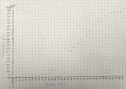
The temperature graph clearly shows three distinct segments:
The graph of volume versus time is a little rougher because the gradations on the 600 ml beaker were about 25 ml apart. However, it shows quite clearly that the volume of the container decreases for the first 10 minutes or so as the ice melts, then remains constant for the rest of the time.
To highlight the significant changes I made copies of the temperature and volume graphs on transparencies so they could be overlain, and shown on the overhead projector.
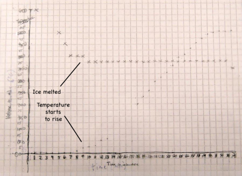
The fact that the temperature only starts to rise when the volume stops changing is no coincidence. The density of the snow is only about 65% of the density of water (0.65 g/ml versus 1 g/ml), so as the snow melts into water (a phase change) the volume in the beaker reduces.
When the snow is melted the volume stops changing and then the temperature starts to rise.
The temperature does not rise until the snow has melted because during the melting the heat from the hot plate is being used to melt the snow. The transformation from solid ice to liquid water is called a phase change, and this particular phase change requires heat. The heat required to melt one gram of ice is called the latent heat of melting, which is about 80 calories (334 J/g) for water.
Conversely, the heat that needs to be taken away to freeze one gram of water into ice (called the latent heat of fusion) is also 80 calories.
So if we had 400 grams of snow then, to melt all the ice, it would take:
Since the graph shows that it takes approximately 10 minutes (600 seconds) to melt all the snow the we can calculate that the rate at which heat was added to the beaker is:
The second section of the temperature graph, when the temperature rises at an almost constant rate, occurs after all the now has melted and the beaker is now full of water. I asked my students to use their observations from the experiment to annotate the graphs. I also asked a few of my students who have worked on the equation of a line in algebra to draw their best-fit straight lines and then determine the equation.
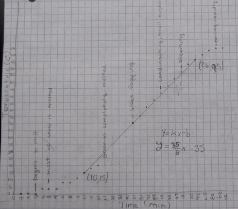
All the equations were different because each small group started with different masses of snow, we used two different hot plates, and even students who used the same data would, naturally, draw slightly different best-fit lines. However, for an example, the equation determined from the data shown in the figure above is:
Since our graph is of Temperature (T) versus time (t) we should really write the equation as:
It is important to realize that the slope of the line (4.375) is the change in temperature with time, so it has units of ºC/min:
which means that the temperature of the water rises by 4.375 ºC every minute.
NOTE: It would be very nice to be able to have all the students compare all their data. Because of the different initial masses of water we’d only be able to compare the slopes of the lines (4.375 ºC/min in this case, but another student in the same group came up with 5 ºC/min).
Furthermore, we would also have to normalize with respect to the mass of the ice by dividing the slope by mass, which, for the case where the slope was 4.375 ºC/min and the mass was 400 g, would give:
A better alternative for comparison would be to figure out how much heat it takes to raise the temperature of one gram of water by one degree Celsius. This can be done because we earlier calculated how much heat is being added to the beaker when we were looking at the melting of the ice.
In this case, using the heating rate of 3,200 cal/min, a mass of 400 g, and a rising temperature rate (slope from the curve) of 4.375 ºC/min we can:
The amount of heat it takes to raise the temperature of one gram of a substance by one degree Celsius is called its specific heat capacity. We calculated a specific heat capacity of water here of 1.8 cal/ºC/g. The actual specific heat capacity of water is 1 cal/ºC/g, so our measurements are a wee bit off, but at least in the same ballpark (order of magnitude). Using the students actual mass measurements (instead of using the approximate 400g) might help.
Finally, in the last segment of the graph, the temperature levels off again at about 100 ºC when the water starts to boil. Just like the first part where the ice was melting into water, here the water is boiling off to create water vapor, which is also a phase change and also requires energy.
The energy required to boil one gram of water is 540 calories, which is called the latent heat of vaporization. The water will probably remain at 100 ºC until all the water boils off and then it will begin to rise again.
This project worked out very well, and there was so much to tie into it, including: physics, algebra, and graphing.
1 Liz LaRosa (2008) has a very nice density demonstration comparing a can of coke to one of diet coke.
2 You can find the density of most of the elements on the periodic table at periodictable.com.