Robert DuGrenier blows glass shells for hermit crabs. They’re pretty amazing. Aquariums are also using them because they let you see all the parts of the crab that are usually hidden inside the shells.
Category: Art
It All Depends on Your Point of View-2
Here’s a neat little video, which holds the Milky Way (galactic-centric) steady as the Earth rotates relative to it.
For comparison, here’s the original video by Stephane Guisard and Jose Francisco Salgado, showing the geocentric view of the sky moving:
It is always revelatory to see things from unexpected perspectives. Brian Swimme was amazed by the immensity of it when he first truly recognized that he was standing on a planet that was rotating through space orbiting the Sun.

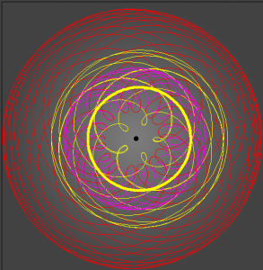
I’ve always been struck by the opposite point of view. To think that if you hold still enough, and think about it a bit, from one point of view you could be the central reference point for the entire universe, with everything else moving relative to you: the Earth still beneath your feet; the Sun (almost) orbiting around you; and the planets arcing through their epicycles.
Viruses in Glass
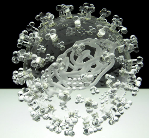
Some people knit bacteria, our students create models of plant and animal cells as an assignment, and Luke Jerram blows viruses in glass.
Interestingly, he does not use colors, just clear, transparent glass, because while almost all pictures you see of viruses, from scanning electron microscopic images to text-book diagrams, have color, the color is added for scientific visualization. So, he believes, his glass replicas are more realistic. This is described in this interview.
About the works:
The pieces, each about 1,000,000 times the size of the actual pathogen, were designed with help from virologists from the University of Bristol using a combination of scientific photographs and models.
— Caridad (2011): Harmful Viruses Made of Beautiful Glass
The video below shows how it’s done.
There is a lot more information on the art and the science at the Glass Microbiology website.
The Art of Specimen Preservation

After the joy of playing around with microscopy and staining last fall, it’s no surprise that someone has taken the science of staining and specimen preservation and turned it into art.
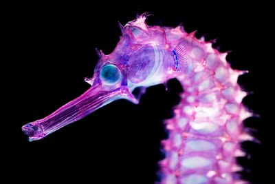
Iori Tomita has done an amazing job at making visible the internal organs of the specimens.
Using a method that dissolves an animals natural proteins, Tomita is able to preserve these deceased animals with striking detail–highlighting the finest and most delicate skeleton structures.
To further enhance the visual appeal of these ornate skeletons, Tomita selectively injects different colored dies into hard bones and soft bones to create a 3-d effect. Without the addition of the dye, the animals remain translucent.
— Michael (2010): New World Transparent Specimens Turns Preservation Into Modern Art
Tomita’s website has some excellent photographs, and there appear to be two books available from Amazon.com.jp. More pictures can be found online here and here. Lisa Stinson at Wired has more pictures and details on the method.
Storm: Life is Precious
I try not to post things with anything approaching obscene language, but sometimes, as in this piece, called “Storm” by Tim Minchin, it’s a small part in the service of a much bigger, more significant idea. Anyway, this one might not be for the kids.
Variations on a Theme
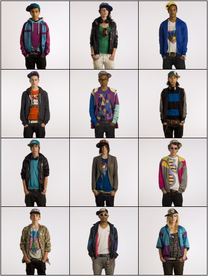
In seeking their identity, adolescents try out a wide variety of different personas. These are often closely associated with changing appearance and style. What I find interesting is how the different styles increasingly cross cultures and other traditional divides (like race). This is evident in Ari Versluis and Ellie Uyttenbroek’s photographic series Exactitudes.
There’s something sad about the loss of local cultural uniqueness to globalization; it’s a bit similar to the feeling you get when you hear about another interesting species becoming extinct. Curiously, however, when Versluis and Uyttenbroek tile together photographs of different people from the same subculture striking identical poses, they not only highlight the similarities between very different people, but also the minute variations that individuals employs to make the subgroup’s “uniform” their own.
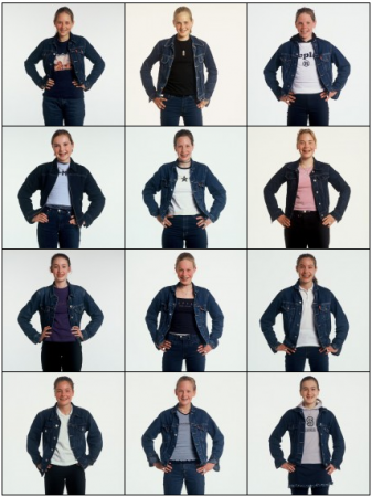
All 128 pictures sets are thought provoking and worth a look. I think they would make useful subjects for students to reflect on (though, warning, there is a little nudity in one of the sets).
(via Brain Pickings)
Physical Visualizations
Jose Duarte has an excellent Homemade Visualization Toolkit. It’s wonderfully innovative, and a perfect addition to the Montessori classroom. And you should also be able to find all the necessary pieces in a typical classroom.
Parting the Red Sea: Biblical Scenes from Space and Computer Modeling on the Earth
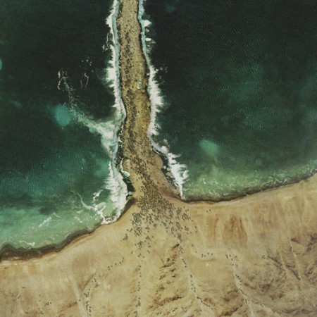
The Glue Society has a most interesting set of satellite images modified to look like major biblical scenes. CreativeReview has more pictures and details, including of the crucifixion and Noah’s Ark.
“We like to disorientate audiences a little with all our work. And with this piece we felt technology now allows events which may or may not have happened to be visualized and made to appear dramatically real,” say The Glue Society’s James Dive. “As a method of representation satellite photography is so trusted, it has been interesting to mess with that trust.”
— CreativeReview (2007): The Bible According To Google Earth
I think this topic came up when we were talking about atmospheric circulation. The question was about if the winds generated descending, diverging air could have parted the Red Sea. The answer was no, because the general atmospheric circulation system is a thing of climate — averages of the weather — while any winds strong enough to part the red sea would be actual weather, like the storms we seem to have been seeing every day for the last few weeks.
Oddly enough, just last year researchers from the University Corporation for Atmospheric Research (UCAR) did a computer model that showed that hurricane force winds from the northwest could have uncovered an underwater reef to allow Moses his passage (the article is Drews and Han, 2010).
However, the scientists found:
[The] reef would have had to be entirely flat for the water to drain off in 12 hours. A more realistic reef with lower and deeper sections would have retained channels that would have been difficult to wade through. In addition, Drews and Han were skeptical that refugees could have crossed during nearly hurricane-force winds.
— NCAR & UCAR News Center (2010): Parting the waters: Computer modeling applies physics to Red Sea escape route.
NPR’s article on the topic is worth a listen.