Concept Maps of Math

Introduction to algebra.

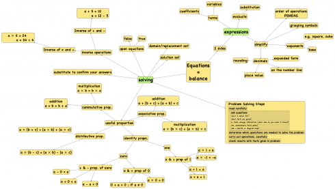
While it’s nice to have the math concepts arranged nicely based on their presentation in the textbook. Since my plan is to give just a few overview lessons and let students discover the details I’ll be presenting things a little differently based on my own conceptual organization. So I’ve created a second graphic map, which looks a bit disorganized, but gives links things by concept, at least in the way I see it.

Concept map for an introduction to pre-Algebra based on the first chapter of the textbook, Pre-Algebra an Accelerated Course, by Dolciani et al., (1996).

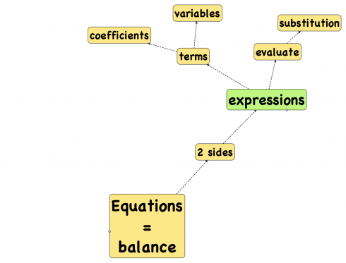
This morning I presented just the first branch, about equations, expressions and variables. The general discussion covered enough to give the students a good overview of the introduction to Algebra. Tomorrow the pre-Algebra and Algebra topics will start to diverge, but I think today went pretty well.

We’ll see how it goes as we fill in the rest of the map.

Mindmapping Online with Mind42

Excerpt from my pre-Algebra/Algebra mindmap created on Mind42.com

I was trying to figure out how I could create a graphic organizer/mindmap to outline my math class that my students could access online. Even better would be if they could also edit the map online. That way I could set up the outline of my lesson notes and they could fill in definitions for vocabulary words. Mind42 (pronounced mind for two) allows just that. It’s free to use and allows you to link to or embed your mindmaps (e.g. pre-Algebra/Algebra) into other websites:

It’s almost perfect, all it needs is for you to be able to save the state of the map, with certain branches collapsed for example, or with a set zoom level. Right now the best way to explore the above map is to collapse all the nodes (use the second button on the lower left) and gradually expand them out as you go through.

I do think the style of the nodes and lines on the maps are elegant and make it easy to read. It’s also really easy to create the maps.

Apart from putting your maps to other websites, you can also print them out as pdf’s or images (png), or you can save the map itself in a format that other mindmapping software, like Freemind, can use.

I really like this website, and as soon as they add the ability to save zoom levels and collapsed nodes I’m going to try using it for my classes.

Interactive Model showing the Kinetic Energy of a Gas

I really like this little video because it’s relatively dense with information but its visual cues complement each other quite nicely; the interactive model it comes from is great for demonstrations, but even better for inquiry-based learning. The model and video both show the motion of gas molecules in a confined box.

In the video, the gas starts off at a constant temperature. Temperature is a measure of how fast the particles are moving, but you can see the molecules bouncing around at different rates because the temperature depends on the average velocity (via Kinetic Energy), not the individual rates of motion. And if you look carefully, you notice the color of the particles depends on how fast they’re moving. A few seconds into the video, the gas begins to cool, and you can see the particles slow down and gradually the average color changes from blue (fast) to red and then some even fade out entirely.

In the interactive, VPython model I’ve put in a slider bar so you can control the temperature and observe the changes yourself. The model is nicely set up for introducing students to a few physics concepts and to the scientific method itself via inquiry-based learning: you can sit them down in front of the program, tell them it’s gas molecules in a box, have them observe carefully, record what they see, and then explain their observations. From there you can branch off into a lot of different places depending on the students’ interests.

Temperature (T) – a measure of the average kinetic energy (KEaverage) of the substance. In fact, it’s proportional to the kinetic energy, giving a nice linear equation in case you want to tie it into algebra:
! T = c {KE}_{average}
where c is a constant.

Of course, you have to know what kinetic energy is to use this equation.
! KE = \frac{1}{2} m v^2
Which is a simple parabolic curve with m being the mass and v the velocity of the object.

The color changes in the model are a bit more metaphoric, but they come from Wein’s Displacement Law, which relates the temperature of an object, like a star, to the color of light it emits (different colors of light are just different wavelengths of light).

! T = \frac{b}{l}

where b is another constant and l is the wavelength of light. This is one of the ways astronomers can figure out the temperature of different types of stars.

Notes

The original VPython model, from Chabay and Sherwood’s (2002) physics text, Matter and Interactions, comes as a demo when you install their 3D modeling program VPython.

I’ve posted about this model before, but I though it was worth another try now that I have the video up on YouTube.

93 Ways to Prove Pythagoras’ Theorem

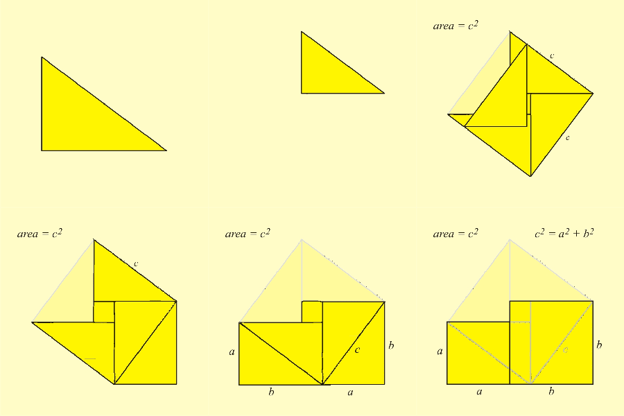
Geometric proof of the Pythagorean Theorem by rearrangemention from Wikimedia Commons' user Joaquim Alves Gat. Animaspar.

Elegant in its simplicity but profound in its application, the Pythagorean Theorem is one of the fundamentals of geometry. Mathematician Alexander Bogomolny has dedicated a page to cataloging 93 ways of proving the theorem (he also has, on a separate page, six wrong proofs).

Some of the proofs are simple and elegant. Others are quite elaborate, but the page is a nice place to skim through, and Bogomolny has some neat, interactive applets for demonstrations. The Wikipedia article on the theorem also has some nice animated gifs that are worth a look.

Cut the Knot is also a great website to peruse. Bogomolny is quite distraught about the state of math education, and this is his attempt to do something about it. He lays this out in his manifesto. Included in this remarkable window into the mind of a mathematician are some wonderful anecdotes about free vs. pedantic thinking and a collection of quotes that address the question, “Is math beautiful?”

Mathematics, rightly viewed, possesses not only truth, but supreme beauty — a beauty cold and austere, like that of sculpture, without appeal to any part of our weaker nature, without the gorgeous trappings of painting or music, yet sublimely pure, and capable of a stern perfection such as only the greatest art can show.

Bertrand Russell (1872-1970), The Study of Mathematics via Cut the Knot.

Adding Positive and Negative Numbers with Dice

We want students to become as involved as possible with their work, but a lot of math is going to be repetitively working similar questions. I believe that giving students any additional degree of control over the questions they’re answering will be helpful to some degree. So, for working with addition of positive and negative integers on a timeline, letting students generate their own problems might add a little interest, and be a little more engaging than just answering the questions in the text. There are a number of ways of doing this, but using two sets of differently colored dice might be fairly easy to put together and appeal to the more tactile-oriented students.

So give each student a set of dice, say six, of two different colors, say red and wooden-colored. Have them roll them then organize them in a line. Your red dice are positive integers and your wooden dice are negative integers.

Set of positive (red) and negative (wood) dice. Dice images assembled from Wikipedia user AlexanderDreyer.

The dice in the image above would produce the expression:

5 + (-1) + 3 + (-4) + (-6) + 1 =

It might make sense to start with two then move up to four and six (or even use odd numbers as long as you include different colors). You could use a more specialized dice with different numbers of sides, but I think the standard six-sided ones would be sufficient for this exercise.

How to Think Like a Mathematician

The epistemological approach to education suggests that the best way to learn a subject is to learn how to think like the experts in the field: how to think like a scientist; how to think like an historian; how to think like an engineer; etc.

How to think like a mathematician is Kevin Houston‘s attempt to explain how one mathematician at least approaches problems. To whet your appetite, he has a free pamphlet, 10 Ways To Think Like a Mathematician, which starts off with:

  1. Question everything, and
  2. Write in sentences

Logic is, apparently, quite important.

If you want to understand mathematics and to think clearly, then the discipline of writing in sentences forces you to think very carefully about your arguments.

— Kevin Houston: 10 Ways To Think Like a Mathematician

It’s an interesting introduction to how mathematicians see the world, and its a useful reminder that many of the ways of thought that apply to any field can be useful in other places, or even in life in general.

Malthusian Growth

I think I may fairly make two postulata.

First, That food is necessary to the existence of man.

Secondly, That the passion between the sexes is necessary and will remain nearly in its present state.

— Malthus (1798): An Essay on the Principle of Population via The Concise Encyclopedia of Economics

“Malthusian” is often used as a derogatory term to refer to alarmist predictions that we’re going to run out of some natural resource. I’m afraid I’ve used the term this way myself, however, according to Lauren Landsburg at the Concise Encyclopedia of Economics, Malthus is being unfairly maligned. He wasn’t actually predicting catastrophe but wondering why the catastrophes don’t usually happen.

What Thomas Malthus did, in 1798, was point out that while populations grow at a geometric rate – the U.S. population, he noticed, doubled every 25 years – but resources, like food, only increase at an arithmetic rate. As a result, any naturally growing population will eventually run out of resources.

The red line shows geometric growth. No matter how much you start off with, the red line will always end up crossing the blue line.

The linear equation has the form:

 y = m t + b

where y is the quantity produced, t is time (the independent variable), and m and b are constants. This should not look to unfamiliar to students who’ve had algebra.

The geometric equation is a little more complicated:

 y = a^{gt} + c

here a, g and c are constants. g is the most important, because it’s the growth rate – the higher g is the faster the curve will rise. You can play around with the coefficients and graph in this Excel spreadsheet .

At any rate, after the curves intersect, the needs of the population exceeds how much it can produce; this is the point of Malthusian catastrophe.

The intersection point is where the needs of the population exceeds the production.

The observation is, indeed, so stark that it is still easy to lose sight of Malthus’s actual conclusion: that because humans have not all starved, economic choices must be at work, and it is the job of an economist to study those choices.

— Landsburg (2008): Thomas Robert Malthus from The Concise Encyclopedia of Economics.