Paul Nicholas Worsey explains the physics and chemistry of how fireworks work. He’s cited in Sophie Bushwick great post compiling online resources that explain the science of fireworks.

Middle and High School … from a Montessori Point of View
Paul Nicholas Worsey explains the physics and chemistry of how fireworks work. He’s cited in Sophie Bushwick great post compiling online resources that explain the science of fireworks.

NASA has a nice, simple page showing the symbols astronomers use for the major bodies in the solar system and describing what they represent. The symbols are a shorthand that make it easier to take notes and draw diagrams. The Wikipedia page has a lot more detail if you need it.

Alas, despite their long history of use – 2500 years or more – these symbols can be the source of some very adolescent humor, so beware.
The Auroras are a great natural phenomena that relates to elements, the structure of atoms, and ionization. They also tie into the physics of charged particles in magnetic fields. The video below provides and excellent overview and also brings up nuclear fusion and convection.
The Aurora Borealis from Per Byhring on Vimeo.
This video explains how particles originating from deep inside the core of the sun creates northern lights, also called aurora borealis, on our planet.
See an extended multimedia version of this video at forskning.no (only in Norwegian):
http://www.forskning.no/artikler/2011/april/285324———–
This video is produced by forskning.no in collaboration with the Department of Physics at the University of Oslo.
Production, animation and music: Per Byhring
Script: Arnfinn Christensen
Scientific advisors: Jøran Moen, Hanne Sigrun Byhring and Pål Brekke
Video of the northern lights: arcticlightphoto.no
Video of coronal mass ejection: NASA

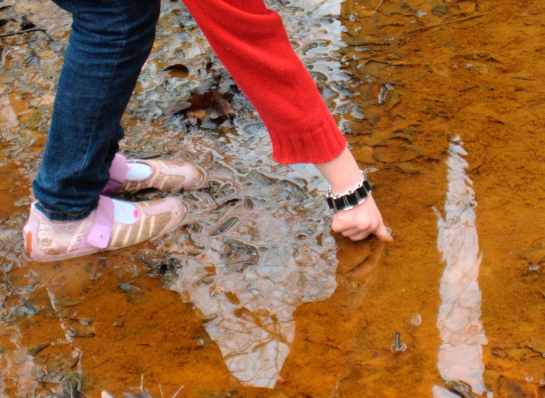
The western end of Deer Island extends a white, sandy, artificial, spit that partially covers the first of a series of riprap breakwaters that protect the waterfront development of the city of Biloxi. Although we’d landed there to pick up garbage as part of our coastal science camp, the beautifully developed beach profile was worth a few minutes.

The spit curves just ever so slightly northward, so it feels more of the direct force of waves blown all the way along the length of Biloxi Bay. The combination of unvegetated sand and stronger waves makes the beach along the spit looks very different from the beaches that parallel the shore. While the parallel beaches on Deer Island are covered in grass almost to the water’s edge (Fig. 2), the spit has a much wider beach, with a nicely developed sandbar protecting a shallow, flat-bottomed, water-saturated trough behind it (Fig. 1).
While the white beaches are pretty (that’s why they imported this sand after all), there are a number of fascinating features in the trough.

The first, and most obvious question is, why the reddish-orange color in the fine grained sediment at the bottom of the trough? A microscope and a little geochemical analysis would be useful here, however, lacking this equipment, we can try drawing parallels with some of our experiences in the past. In fact, we should remember seeing the same color in some of the streambeds when we were hiking in Natchez Trace State Park in Tennessee (Fig. 3). My best guess at that time was that the red was from iron in the groundwater being oxidized when it reached the surface.


This is probably not a bad guess for the red in the trough as well, since there is some fresh groundwater discharge from the shallow watertable on the island. However, I suspect that the story is a bit more complex, because the rich black color of the organic matter just beneath the surface (Fig. 4) suggest that the shallow water and surface sediment in the trough is lacking in oxygen. On the other hand, it’s not uncommon to have steep geochemical gradients in boundary environments like this one.
The physical and geochemical gradients extend horizontally as well as vertically. At the edges of the trough the organic matter just beneath the surface is green, not black (Fig. 5), because this is the color of the undecayed algae.
At the seaward side of the beach, the waves of Biloxi Bay lap against the sand bar. When the tide rises, and the wind picks up, these waves wash over the crest of the sand bar pushing water and sediment over the top into trough. When the sand washes evenly over the top it creates thin layers (possibly one layer with each high tide). If you cut into these layers you’ll see little the laminations in profile, which, because the layering is close to horizontal, look like the lines of topography on a map (Fig. 6). When the waves wash over small gaps in the sandbar the sediment it transports is deposited in a more concentrated area – these are called sand splays – that overlap and cover some of the fine-grained, orange sediment at the edge of the trough. These are both two of the small ways that the sand bar moves, slowly pushing inland.

The features on the bottom of the trough are a quite interesting because of the observable effects of bioturbation (disturbance by organisms) (Figs. 7, 8 & 9).


Plastic bottles take 100 years to break down; styrofoam cups – fifty years; aluminum cans – 200 years; glass bottles, which are made of silica, just like the beach’s white sand – who knows. So we took a little time out of our adventure trip to collect anthropogenic debris as we walked along the beach on Deer Island.


We picked up stuff on our way out, so we were able to enjoy the fruits of our labours on our walk back to the landing point.

The degradation times for marine garbage can be found on the SOEST website, but That Danny has an interesting compilation of data that tries to reconcile the different degradation times you can find on the web.
Here’s a neat little video, which holds the Milky Way (galactic-centric) steady as the Earth rotates relative to it.
For comparison, here’s the original video by Stephane Guisard and Jose Francisco Salgado, showing the geocentric view of the sky moving:
It is always revelatory to see things from unexpected perspectives. Brian Swimme was amazed by the immensity of it when he first truly recognized that he was standing on a planet that was rotating through space orbiting the Sun.

I’ve always been struck by the opposite point of view. To think that if you hold still enough, and think about it a bit, from one point of view you could be the central reference point for the entire universe, with everything else moving relative to you: the Earth still beneath your feet; the Sun (almost) orbiting around you; and the planets arcing through their epicycles.


65 million years ago, an asteroid hit the Earth just off the Yucatan Penninsula, kicking up enough dust in to the atmosphere (and perhaps setting off supervolcanos) to lead to the extinction of the dinosaurs. Geologists mark this mass extinction event as the end of the Cretaceous period and the beginning of the Tertiary; it’s called the K-T boundary. Paleontologists see a rapid change in the forms of life fossilized in the rocks above and below the boundary. The element iridium, which is relatively common on asteroids, but rare on Earth, can be found in a thin layer of the fallout from the asteroid impact all around the world.

Well, the Earth’s going through another mass extinction event right now. In fact, even if humans were to go extinct right now, the remains of our cities and our impact on the global chemical cycles, will leave a distinct signature that geologists millions of years from now will be able to detect.
Geologists refer to the last 10,000 years, the period starting when the Earth warmed after the last glacial maximum, as the Holocene. This time period saw the emergence of agriculture, the rise of human civilization, cities, nuclear weapons, the internet. Now, given the enormous environmental changes we’re wrecking on the planet, some say we’ve entered a new geologic epoch that they’re calling the Anthropocene.
The question is: How long will it last?
Regardless of your philosophy, the recognition that we have entered a geologic age of humanity raises the obvious question of just how long such an age will last.
In the infamous KT boundary geologists can see evidence for a rather short-lived event that also reshaped the planet. Sixty five million years ago an asteroid struck the Earth, driving one of only five mass extinctions in the planet’s history. The loss of the dinosaurs turned out to be an opportunity for our mammal ancestors and led directly to our own age.
Since the Anthropocene appears to mark a sixth great extinction, one has to wonder what it will take for us to make it out of own era with civilization intact.
— Frank (2011): The Anthropocene: Can Humans Survive A Human Age?


Jeff Masters has an impressively detailed post laying out the argument that 2010, with its record setting snowstorms, droughts, heatwaves, flooding, hurricanes, etc, had the most extreme weather since 1816, the year without a summer.
Looking back through the 1800s, which was a very cool period, I can’t find any years that had more exceptional global extremes in weather than 2010, until I reach 1816. That was the year of the devastating “Year Without a Summer”–caused by the massive climate-altering 1815 eruption of Indonesia’s Mt. Tambora, the largest volcanic eruption since at least 536 A.D. It is quite possible that 2010 was the most extreme weather year globally since 1816.
— Masters (2010): 2010 – 2011: Earth’s most extreme weather since 1816? on Weather Underground.

NOAA’s Historical Hurricane Tracks map is an excellent interactive webpage, and data source.