Osama bin Laden: A Montessori Discussion

[…] the whole idea of revenge and punishment is a childish daydream. Properly speaking, there is no such thing as revenge. Revenge is an act which you want to commit when you are powerless and because you are powerless: as soon as the sense of impotence is removed, the desire evaporates also.

Who would not have jumped for joy, in 1940, at the thought of seeing S.S. officers kicked and humiliated? But when the thing becomes possible, it is merely pathetic and disgusting.

–Orwell (1945): Sour Revenge in the Tribune. (Found via Megan McArdle).

Over the last couple of weeks, students have been reading and presenting newspaper articles every morning, so, inevitability, we had a few good opportunities to discuss the death of Osama bin Laden.

The discussions were remarkably mature, and quite edifying to hear, because it was pretty much what one would hope to occur among Montessori kids who’ve been dealing with the peace curriculum since pre-school.

There was remarkably little jubilation. So much so, that one student asked, “Are we not supposed to feel happy?”

The answer was that yes we can feel happy and relieved but we shouldn’t “spike the ball”, letting the celebration get so out of hand that it antagonizes bin Laden’s supporters even more, and makes us seem as arrogant as they caricature us to be. If we want to achieve peace we need to be better than that.

Their broader perspective is somewhat akin to what Thich Nhat Hanh, a Zen monk, expressed a couple weeks after the September 11th attack (thanks to Julie H. for the link to the interview by Anne A. Simkinson).

All violence is injustice. The fire of hatred and violence cannot be extinguished by adding more hatred and violence to the fire. The only antidote to violence is compassion. And what is compassion made of? It is made of understanding. When there is no understanding, how can we feel compassion, how can we begin to relieve the great suffering that is there? So understanding is the very real foundation upon which we build our compassion.

[…]

There are people who want one thing only: revenge. In the Buddhist scriptures, the Buddha said that by using hatred to answer hatred, there will only be an escalation of hatred. But if we use compassion to embrace those who have harmed us, it will greatly diffuse the bomb in our hearts and in theirs.

–Thich Nhat Hanh (2001): What I Would Say to Osama bin Laden (Interview by Anne A. Simpkinson on BeliefNet.com)

There’s also a poignant reflection by Megan McArdle, a New Yorker, who was, at first, extremely angry and eager for revenge, but has become much more reflective, and cognizant that we share both humanity and mortality with even Osama bin Laden.

McArdle elaborates more here.
Multi-modal IRP’s

If I present information to you orally, you’ll probably only remember about 10% 72 hours after exposure, but if I add a picture, recall soars to 65%.

–Alex Lundry (2009): Chart Wars: The Political Power of Data Visualization

How you present visual information is important. And my students are discovering this as they work up their Independent Research Projects (IRP’s) this week.

In the spring they are fairly free to pick their topic and style of IRP. Some choose research projects, others term papers, and a few do things that strike their fancy, like writing fiction or programming games.

In the end, they submit a written report and give a presentation.

For research projects, I have one student who did a great job of coming up with a hypothesis and testing it. He even compiled a nice table of his data for his results section, but was reluctant to go through the effort of making a graph. After all, he claimed, anyone reading his report (or watching his PowerPoint presentation) could just look at the table and read the data off there themselves.

My response was that people absorb the data much more effectively when it’s presented graphically. Fortunately, Alex Lundry has a nice little presentation that reinforces this point. It also gives a few tips about what to look out for in graphics, because they can be used to mislead.

The key quote (via The Dish) is this:

Vision is our most dominant sense. It takes up 50% of our brain’s resources. And despite the visual nature of text, pictures are actually a superior and more efficient delivery mechanism for information. In neurology, this is called the ‘pictorial superiority effect’ […] If I present information to you orally, you’ll probably only remember about 10% 72 hours after exposure, but if I add a picture, recall soars to 65%. So we are hard-wired to find visualization more compelling than a spreadsheet, a speech of a memo.

–Alex Lundry (2009): Chart Wars: The Political Power of Data Visualization

Here’s Lundry’s five minute presentation.

Parting the Red Sea: Biblical Scenes from Space and Computer Modeling on the Earth

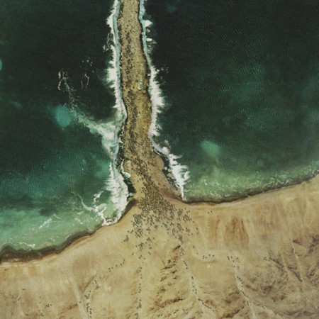
A God's Eye View of Moses parting the Red Sea. Image from the Glue Society.

The Glue Society has a most interesting set of satellite images modified to look like major biblical scenes. CreativeReview has more pictures and details, including of the crucifixion and Noah’s Ark.

“We like to disorientate audiences a little with all our work. And with this piece we felt technology now allows events which may or may not have happened to be visualized and made to appear dramatically real,” say The Glue Society’s James Dive. “As a method of representation satellite photography is so trusted, it has been interesting to mess with that trust.”
— CreativeReview (2007): The Bible According To Google Earth

I think this topic came up when we were talking about atmospheric circulation. The question was about if the winds generated descending, diverging air could have parted the Red Sea. The answer was no, because the general atmospheric circulation system is a thing of climate — averages of the weather — while any winds strong enough to part the red sea would be actual weather, like the storms we seem to have been seeing every day for the last few weeks.

Oddly enough, just last year researchers from the University Corporation for Atmospheric Research (UCAR) did a computer model that showed that hurricane force winds from the northwest could have uncovered an underwater reef to allow Moses his passage (the article is Drews and Han, 2010).

However, the scientists found:

[The] reef would have had to be entirely flat for the water to drain off in 12 hours. A more realistic reef with lower and deeper sections would have retained channels that would have been difficult to wade through. In addition, Drews and Han were skeptical that refugees could have crossed during nearly hurricane-force winds.
— NCAR & UCAR News Center (2010): Parting the waters: Computer modeling applies physics to Red Sea escape route.

NPR’s article on the topic is worth a listen.

Courage

Watch the full episode. See more FRONTLINE.

With the different outcomes of the protests in Tunisia and Egypt compared to Libya and Syria (and Bahrain), it’s important to recognize the courage of the protesters out there on the streets. It’s not really courage if there is nothing to risk. These men and women are risking everything.

Just like the lonely man who stood in front of a line of tanks during the Tiananmen Square protests in 1989. No one knows what happened to him.

About midday, as a column of tanks slowly moves along Chang’an Boulevard toward Tiananmen Square, an unarmed young man carrying shopping bags suddenly steps out in front of the tanks. Instead of running over him, the first tank tries to go around, but the young man steps in front of it again. They repeat this maneuver several more times before the tank stops and turns off its motor. The young man climbs on top of the tank and speaks to the driver before jumping back down again. Soon, the young man is whisked to the side of the road by an unidentified group of people and disappears into the crowd.

To this day, who he was and what became of him remains a mystery.

— FRONTLINE, 2006: The Tank Man: The Memory of Tiananmen June 4-5, 1989.

What does it take to show such courage? We’ve talked about how your situation in life, like poverty, can affect the ethical choices you make. We’ve also seen how different social and demographic conditions can force countries toward revolutions.

So it’s worth taking a moment to think about the protesters. And about ourselves. What do we value so much that it would overcome our fear to risk our lives?

Panyee F.C.: Soccer on the Lake

This cute, little, true story of how a bunch of kids (they look like adolescents) living on rafts in a lake built their own soccer field (on rafts), and eventually created the Panyee Football Club, is actually an advertisement for the Thai Military Bank (TMB), but it’s quite inspirational nonetheless. The setting and videography are also superb.

Tsunami

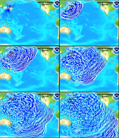
The tsunami spawned by the recent earthquake off Japan did most of the damage we know about so far. The U.S. National Oceanic and Atmospheric Administration’s Center for Tsunami Research uses computer models to forecast, and provide warnings about, incoming tsunami waves. They have an amazing simulation showing the propagation of the recent tsunami across the Pacific Ocean (the YouTube version is here).

Images captured from the NOAA simulation. The full resolution, 47Mb video can be found here, on NOAA's site.

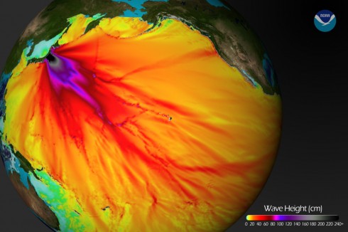
They’ve also posted an amazing graphic showing the wave heights in the Pacific Ocean.

Tsunami wave heights modeled by NOAA. Note the colors only go up to 2 meters. The maximum wave heights (shown in black in this image), near the earthquake epicenter, were over 6 meters.

Of course, these are the results of computer simulations. As scientists, the people at NOAA who put together these plots are always trying to improve. Science involves a continuous series of refinements to better understand the world we live in, so the NOAA scientists compare their models to what really happen so they can learn something and do better in the future. Perhaps the best way to do this for the tsunami is by comparing the predictions of their models to the actual water height measured by tidal gages:

The red line is the tsunami's water height predicted by the NOAA computer models for Honolulu, Hawaii, while the black line is the actual water height, measured at a tidal gauge. Other comparisons can be found here.

You’ll notice that NOAA did not do a perfect job. They did get the amplitude (height) of the waves mostly right, but their timing was a little off. Since it’s about 6000 km from the earthquake epicenter to Honolulu, being off by a few minutes is no mean feat. Yet I’ll bet they’re still working on making it better, particularly since some of the other comparisons were not quite as good.

Finally, if you were wondering, attempting to surf a tsunami is not a good idea. For one thing, there is no nice face to surf on:

… a tsunami wave approaching land is more like a wall of whitewater. …. Since the wave is 100 miles long and the tail end of the wave is still traveling at 500 mph, the shore end of the wave becomes extremely thick, and is forced to run far inland, over streets and trees and houses. …. And remember, the water isn’t clean, but filled with everything dredged up from the sea floor and the land the wave runs over–garbage, parking meters, pieces of buildings, dead animals.

— Natural Hazards Hawaii, University of Hawaii at Hilo: Why you can’t surf a tsunami

UPDATE: Terrifying video of the tsunami: