So we’re studying graphs (data representation) for math this cycle. Slate Labs has a neat scattergram showing Brett Farve’s vacillating comments about his likelyhood of retierment for the last three years.
Rewards and motivation
… tangible rewards tend to have a substantially negative effect on intrinsic motivation.
— Desi et al., 1999.
Edward Deci (and others) published a paper (pdf) in 1999 that analyzed a whole bunch of earlier studies on how extrinsic rewards affect motivation. Their conclusion is that rewards are generally bad because rewards prevent people from learning how to motivate themselves.
… the primary negative effect of rewards is that they tend to forestall self-regulation. In other words, [expectation of rewards] undermine people’s taking responsibility for motivating or regulating themselves
— Desi et al., 1999.
So while they may work in the short term, rewards do long-term damage.
When institutions—families, schools, businesses, and athletic teams, for example—focus on the short term and opt for controlling people’s behavior, they may be having a substantially negative long-term effect.
— Desi et al., 1999.
They also find that rewards can push you into a negative feedback loop, because to properly administer a reward you usually need increased monitoring and you produce more competition. Both of these undermine intrinsic motivation so you’re left with using more extrinsic rewards. (think also of high-stakes testing and No Child Left Behind).
So what to do? Desi et al. report that:
intrinsic motivation … requires environmental supports. …the necessary supports are opportunities to satisfy the innate needs for competence and self-determination.
(Note: I found out about this article while reading Daniel Pink’s, Drive).
North American English Dialects

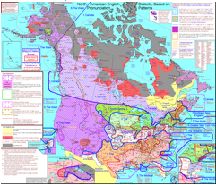
Linguist, Rick Aschmann, has wonderfully detailed maps of the various dialects of English used in North America. It includes lots of audio samples of speech, and is excellently annotated.
Given that dialects are great integrators of cultural history, including the history of immigration to the different regions, this may well be an excellent resource for this cycle’s work on U.S. immigration.
The r-dropping areas in the Lowland South … could be described as “Classical Southern”. This is the accent that Scarlett O’Hara is attempting to imitate in this clip from Gone with the Wind. This area represents the heart of the old plantation system, as can be seen on the map mentioned above. However, this feature seems to only occur in older settled areas, and does not occur in western areas on the Mississippi River or farther west that were settled after about 1825.
— from American English Dialects by Aschmann, (2010).
Drive: How to exploit intrinsic motivation.
So my holiday present from the Head of School was Daniel Pink’s 2009 book, Drive. I’m much happier reading scientific papers and books based directly on them, like Lillards’ Montessori: The Science Behind the Genius, than mass-market, self-help publications, but I’m supposed to get through it so we can have a discussion during our inservice. However, since I’d read a favorable review of the book last April I’m willing to give this one a chance, despite the desperate lack of information on the back and the sad pandering to business-minded readers in the blurb on the inside cover.
My antipathy toward self-help books, is based largely, I think, on the possibly erroneous belief that these books tend to be anecdotal, unsupported by science, or even to start with a scientific basis (however poorly understood) and stretch it into wonderful realms of possibility where it was never meant to go.
I also find it hard to credit books that tend to be awfully culture-specific. The worst ones come from certain myopic cultural niches that I find it hard to identify with. Even the stuff that based on rigorous science (as rigorous as far as the social sciences can be at least) tend to be based on the sub-population within the scientists’ easiest reach: WEIRD people from Western Educated Industrialized Rich Democracies.
Anyway, I’m in the middle of chapter one, and the book is actually quite good. Drive is well written for a general audience, so it lacks the concision that would make me happier; I’m already familiar with quite a bit about what he writes, and I’m a little crunched for time this break. The science so far is still based mostly on WEIRD people (though the first studies were done with other primates), but at least it’s an easy read.
Recessive X’s are not so quiet

Two X chromosomes (XX) makes women female. Men have an X and a Y, the latter of which is responsible for all the things that make them male. What we teach is that one of the X’s in the women’s XX’s dominates the other so that women’s physical characteristics (phenotype) is only determined by the dominant X. Recent research shows that’s not necessarily the case.
“Our study shows that the inactive X in women is not as silent as we thought,” said Laura Carrel, Ph.D., assistant professor of biochemistry and molecular biology, Penn State College of Medicine, Penn State Milton S. Hershey Medical Center. “The effects of these genes from the inactive X chromosome could explain some of the differences between men and women that aren’t attributable to sex hormones.” – From Penn State University, edited by Science Daily.
It’s a fascinating finding, but I don’t think I’ll go into it with the students except, in the very unlikely event, that a direct question comes up. At this point, simpler is better.
The cynic’s guide to argument
This guide, from a longtime commenter on Megan McArdle’s blog, does an excellent, if cynical, job of explaining how to win an online argument. It includes:
- Using allusions to make you look smarter (Wikipedia is a great resource for finding quick facts).
- Treating stupid questions as if they are serious (this one could actually help the conversation).
- Treating serious questions as though they’re stupid (great way to score points, but do not contribute to a good discussion).
- Admitting any and all faults you are accused of (this diffuses the bottom two argument styles in Graham’s hierarchy: name-calling and ad-hominem attacks.)
- Asking earnest questions instead of making arguments (which can be very useful in pointing out the complexities of a situation.)
- Never pulling rank. Let your credibility (ethos) be based on what your argue, not on how much education/training/experience you have (credibility is important, and so is experience, but pulling rank tends to annoy people and that will loose you friends.)
- Being brief (snappy one-liners may not have the depth of a well reasoned argument but are more likely to win friends).
Most of these techniques are appeals to the emotions (pathos). They can, and may sometimes need to, be used to support a good, well reasoned, argument (logos).
[B]efore some audiences not even the possession of the exactest knowledge will make it easy for what we say to produce conviction. – Aristotle in On Rhetoric
Be careful how you use these things, and watch out for them, because they don’t only occur online, you’ll see them often in any conversation.
Voyage of the Beagle
Wired has a brief but excellent article on the voyage of the Beagle.
Its goal was to survey the South American coastline. The captain invited along a young man named Charles Darwin, whose father thought the voyage would just be another excuse for him to slack off. The trip ended up taking five years.
This article would be a wonderful addition to our work on exploration of the Americas next time it comes around; however, it’ll also be a neat little footnote because we’ll be delving into evolution next cycle.
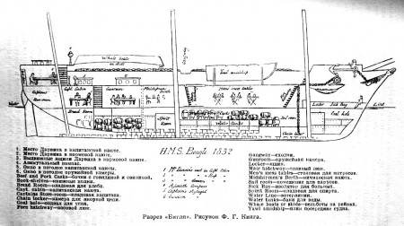
Wikipedia’s entry on the ship produced this wonderful cross-section. I particularly like the sketches of people and casks showing the use of of different cabins and spaces.

Small Worlds
Utterly amazing. Keith Loutit’s Small Worlds Project, uses time-lapse photographs, carefully adjusted focus, and color highlighting to create videos that look like a lot like claymation animations.
