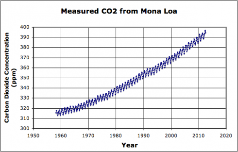
The carbon dioxide concentration record from Mona Loa in Hawaii is an excellent data set to work with in high-school mathematics classes for two key reasons.
The first has to do with the spark-the-imagination excitement that comes from being able to work with a live, real, scientific record (updated every month) that is so easy to grab (from Scrippts), and is extremely relavant given all the issues we’re dealing with regarding global climate change.
The second is that the data is very clearly the sum of two different types of functions. The exponential growth of CO2 concentration in the atmosphere over the last 60 years dominates, but does not swamp, the annual sinusoidal variability as local plants respond to the seasons.
Assignment
So here’s the assignment using the dataset (mona-loa-2012.xls or plain text mona-loa-2012.csv):
1. Identify the exponential growth function:
Add an exponential curve trendline in a spreadsheet program or manual regression. If using the regression (which I’ve found gives the best match) your equation should have the form:
![]()
while the built-in exponential trendline will usually give something simpler like:
![]()
2. Subtract the exponential function.
Put the exponential function (model) into your spreadsheet program and subtract it from data set. The result should be just the annual sinusoidal function.

If you look carefully you might also see what looks like a longer wavelength periodicity overlain on top of the annual cycle. You can attempt to extract if you wish.
3. Decipher the annual sinusoidal function
Try to match the stripped dataset with a sinusoidal function of the form:
![]()
A good place to start at finding the best-fit coefficients is by recognizing that:
- a = amplitude;
- b = frequency (which is the inverse of the wavelength;
- c = phase (to shift the curve left or right); and
- d = vertical offset (this sets the baseline of the curve.
Wrap up
Now you have a model for carbon dioxide concentration, so you should be able to predict, for example, what the concentration will be for each month in the years 2020, 2050 and 2100 if the trends continue as they have for the last 60 years. This is the first step in predicting annual temperatures based on increasing CO2 concentrations.