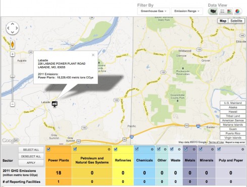
You can now find the major greenhouse gas emitters (as well as other large facilities that emit pollutants) on the EPA’s mappable website.
Middle and High School … from a Montessori Point of View
You can now find the major greenhouse gas emitters (as well as other large facilities that emit pollutants) on the EPA’s mappable website.


The website Influence Explorer has a lot of easily accessible data about the contributions of companies and prominent people to lawmakers. As a resource for civics research it’s really nice, but the time series data also makes it a useful resource for math; algebra and pre-calculus, in particular.
The National Snow and Ice Data Center has some interesting data-sets available, including a number of measures of the extent of Arctic sea-ice showing how fast it has been melting.
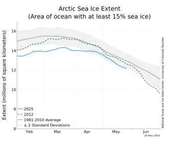
The Easy-to-use Data Products page has a lot of real data that middle and high school students can use for projects.
Jeff Masters has an impressively detailed post laying out the argument that 2010, with its record setting snowstorms, droughts, heatwaves, flooding, hurricanes, etc, had the most extreme weather since 1816, the year without a summer.
Looking back through the 1800s, which was a very cool period, I can’t find any years that had more exceptional global extremes in weather than 2010, until I reach 1816. That was the year of the devastating “Year Without a Summer”–caused by the massive climate-altering 1815 eruption of Indonesia’s Mt. Tambora, the largest volcanic eruption since at least 536 A.D. It is quite possible that 2010 was the most extreme weather year globally since 1816.
— Masters (2010): 2010 – 2011: Earth’s most extreme weather since 1816? on Weather Underground.
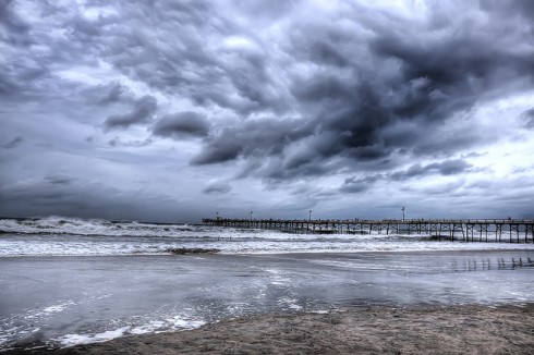
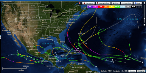
NOAA’s Historical Hurricane Tracks map is an excellent interactive webpage, and data source.
The Fund for Peace has been doing a lot of thinking about what it takes for a country to be considered peaceful, and what it takes for a state to fail. For the last seven years they’ve been putting together maps of the world with an index of how stable different countries are.
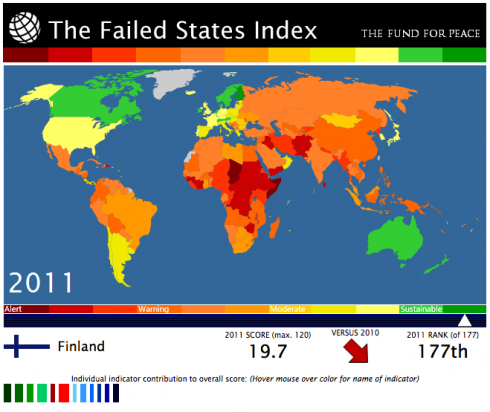
While it’s pretty in-depth and makes for rather sobering reading, it’s worth taking a look at the criteria they’ve come up with to determine a country’s stability. It may be useful to include some of this information in the cycle where we focus on peace.
Their criteria for instability include:
It’s also very nice that you can download their index data as a MS Excel spreadsheet, which you can let students analyze to answer their own research questions. For example, I was wondering what was the difference between the best, the worst and the USA, so I plotted this graph.
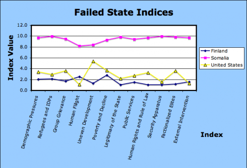
The USA is much closer to Finland than Somalia, thank goodness, but should probably watch out for that Uneven Development (wealth inequality).
I think something like this would make a good experiential exercise for the science of geography.
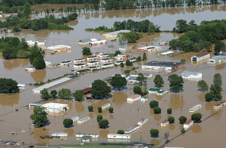
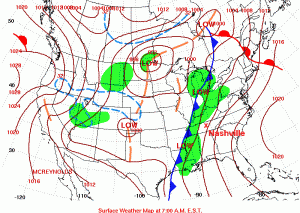
Over 30 cm of rainfall in just two days resulted in extensive flooding in Nashville, TN, last week. The precipitation was produced by one of those typical mid-latitude cyclones that sweep across the United States, from west to east, every spring and fall. The Boston Globe has some amazing picture of the flooding.
The news media tends to have the most dramatic photographs of disasters, but the Federal Emergency Management Agency (FEMA) also tends to have good images from their aerial surveys (like the image at the top of this post). And images produced by the government are in the public domain so you don’t have to worry about using them.
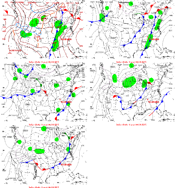
For discussing warm fronts, cold fronts and mid-latitude cyclones, NOAA‘s Hydrometeorological Prediction Center (HPC) is a great resource. You can find an archive of daily weather maps for the U.S. that you can click through to see the fronts move.
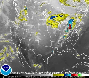
Satellite imagery usually complements to the frontal weather maps very well. Most satellites orbit around the Earth pretty quickly, at just the right orbital speed that the centrifugal force just balances the Earth’s gravity so the satellite does not crash into the atmosphere or escape into space. Some satellites are set into orbit a bit further out so that they can rotate with the Earth, effectively staying above the same place all the time. NOAA has a few of these geostationary satellites monitoring the weather around the world, and you can get real-time images from the Geostationary Satellite Server. There used to be archived satellite images but I can’t seem to find them at the moment.
The St. Louis Federal Reserve has a Summer School program for teachers. Two of the sessions deal with current events (banking crisis and jobs) but the third covers the data and primary source documents that bank makes available online (for free). These include the FRED and GeoFred websites.
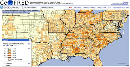
GeoFred produces graphs like the one above showing economic statistics across the country. It can do it on a state by state basis, by county (as above), or by even more refined areas.
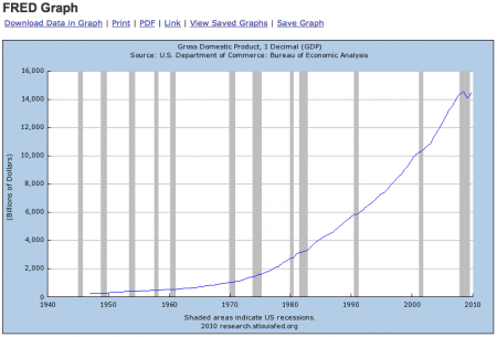
FRED plots graphs and even provides the data for economic statistics over time. The graph above shows GDP since they started collecting data in the 1940’s. It also has the times of recessions shaded in. The data in the graph can also be downloaded if you want to do your own analysis.
These seem to be handy little tools for teaching and for research projects, and are pretty easy to use.
The teachers’ training sessions are free though you have to get your own housing. They do provide breakfast and lunch. If you want graduate credit for them however, each three day session will cost around $306 and garner one credit.
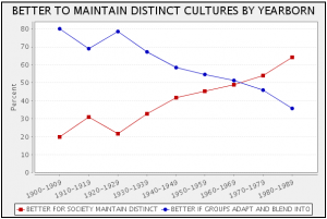
UC Berkley’s Survey Documentation and Analysis (SDA) website has a lot of potential as a research tool for the more advanced middle-schooler. I greatly encourage students to do original research in their semester-long Independent Research Projects. They pose questions, collect and/or analyze data and slog through the challenges of dealing with open ended questions. Middle school is the appropriate time for this as they are working on their formal thinking skills. With the increasing availability of websites like the SDA, everyone can gain access to research grade datasets.
The SDA is powerful because it has a lot of data from survey questions dealing with a large number of survey issues, from race relations, to perceptions of the economy, to use of the web. But with that power is a certain degree of complexity. It took me a while this morning to decipher the web interface and I’m no where near plumbing all the nuances of the statistical analysis, but it’s not too hard to do some basic plots.

On the left side of the window is a list of all the survey questions available. There are a lot but they each have the full question so it’s pretty easy to figure out what they mean. When you select one, such as the opposition to a family member bringing home a black/negro friend for dinner, it gives you the little code, “RACDIN” in this case that you enter as the Row on the right side of the window (see the above figure). Now I want to know how people’s answers to that question changed based on how old they are, so for the Column option I put in “AGE”. Of course what I actually put in is “AGE(c:10,1)” which tells the program to lump all the age data into 10 year sets, starting at age 1.
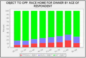
Students will certainly need help getting started, and I could add video instructions if anyone wants it.
Now comes the most interesting part, interpreting the graphs. I like the plot at the top of this post for this reason. It shows that the younger people are the more likely they are to think it’s better if racial and ethnic groups maintain their customs and traditions. Does this mean that younger people have more racist attitudes, trying to maintain separation, or does it mean that they are more accepting of different cultures?