Nashville flooding and mid-latitude cyclones

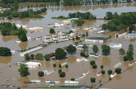
Nashville, TN, May 4, 2010. (photo by David Fine/FEMA)
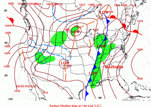
Daily weather map for May 2nd, 2010. Note the cold front heading toward Nashville. Map from the Hydrometeorological Prediction Center.

Over 30 cm of rainfall in just two days resulted in extensive flooding in Nashville, TN, last week. The precipitation was produced by one of those typical mid-latitude cyclones that sweep across the United States, from west to east, every spring and fall. The Boston Globe has some amazing picture of the flooding.

The news media tends to have the most dramatic photographs of disasters, but the Federal Emergency Management Agency (FEMA) also tends to have good images from their aerial surveys (like the image at the top of this post). And images produced by the government are in the public domain so you don’t have to worry about using them.
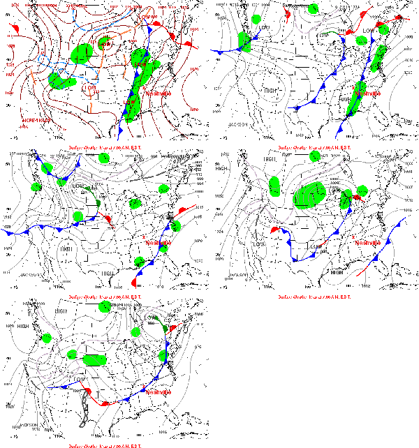
May 2-6 fronts. Animation generated using images from the HPC.

For discussing warm fronts, cold fronts and mid-latitude cyclones, NOAA‘s Hydrometeorological Prediction Center (HPC) is a great resource. You can find an archive of daily weather maps for the U.S. that you can click through to see the fronts move.
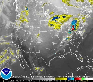
Infra-red satellite image of the continental U.S.. Note the alignment of the clouds and precipitation with the fronts in the first (static) weather map above. (Image from GOES).

Satellite imagery usually complements to the frontal weather maps very well. Most satellites orbit around the Earth pretty quickly, at just the right orbital speed that the centrifugal force just balances the Earth’s gravity so the satellite does not crash into the atmosphere or escape into space. Some satellites are set into orbit a bit further out so that they can rotate with the Earth, effectively staying above the same place all the time. NOAA has a few of these geostationary satellites monitoring the weather around the world, and you can get real-time images from the Geostationary Satellite Server. There used to be archived satellite images but I can’t seem to find them at the moment.

Greenhouse in a bottle

The BBC has an excellent video demonstration by Maggie Aderin-Pocock of how to demonstrate how additional carbon dioxide in the air results in global warming. She uses baking soda and vinegar to create the CO2 and lamps for light (putting the bottles in the sun would work just as well). You’d also probably want to use regular thermometers in the bottles if you don’t have ones that connect to your computer.

Snowfall

To accurately observe nature sometimes takes time. Land-labs are intended to get students out into nature for a week at a time throughout the entire year so that they can see the change in the seasons. But sometimes you need to winnow things down, speed things up, to observe the slow changes that you just miss. Time-lapse photography is one great way to do this.

Waves and earthquakes

There are a lot of Earth Science applications that deal with waves. Seismic waves from earthquakes are a major one that is particularly pertinent after the recent Haitian earthquake. There are quite a number of lesson plans dealing with seismic waves at Larry Braile’s website. Most of the lessons are as practical demonstrations pdf’s and some use downloadable software (Windows only unfortunately), but there are some online applications as well.

In terms of online resources, the IRIS network, produces nice maps of recent earthquake locations. It also has a good page with “Teachable Moments” regarding recent earthquakes. These include the above video of why the Haitian earthquake did not produce a tsunami.

Although it’s not directly related to waves, I particularly like the thermal convection experiment on Braile’s website. It provides, with a baking dish, a sterno can, some water and some thyme, a great example of the convection in the Earth’s mantle that drive plate tectonics.

iSeismo app

Those who know me know how much I like the iSeismo app for the iPhone. The phone as a built-in accelerometer and the iSeismo app uses it to show the movement of the phone in three dimensions. The app show three graphs (seismographs), the first two show horizontal motions and the third vertical motion. So, if you put the phone on the table and hit the table the third line should jump up and down.

You can also export the data from the phone (or iPod Touch), and since the phones’ times should be synchronized pretty well, there should be a way to use two phones to triangulate the location of an impact, say on the floor in a room, in the same way that seismologists use seismographs to locate earthquakes. That would make a great demo if it was easy enough to do.

Update: iSeismo can also be used as a heartbeat monitor.