Should Liberals Homeschool?

Dana Goldstein posts a critique of liberal homeschooling (and, by inference, of private schooling as well).

The crux of her argument is collective (for the greater good); having middle class kids (who often have highly educated parents) benefits the poorer kids in the public schools and thus society at large.

… “peer effects” have a large impact on student achievement. Low-income kids earn higher test scores when they attend school alongside middle-class kids, while the test scores of privileged children are impervious to the influence of less-privileged peers. So when college-educated parents pull their kids out of public schools, whether for private school or homeschooling, they make it harder for less-advantaged children to thrive.

— Goldstein (2012): Liberals, Don’t Homeschool Your Kids in Slate

She backs up her argument with evidence (Schwartz, 2010) that mixed income schools show better outcomes. The fact that school funding and populations come from distinct geographic districts, some of which may be rich while others are poor, is a major part of the problem.

However reasonable the argument is for society at large, it’s going to be a hard argument to make to homeschooling parents who choose that option because of how bad they see the public schools as being. She’s not just asking for some shared sacrifice, but for having parents risk sacrifice their kids’ education.

Until the public schools change in the more progressive directions that these homeschooling parents have a problem with, I don’t think she’ll get much traction. For her idealism I’ll give her the last word, but I suspect that she’s got it backwards.

If progressives want to improve schools, we shouldn’t empty them out. We ought to flood them with our kids, and then debate vociferously what they ought to be doing.

— Goldstein (2012): Liberals, Don’t Homeschool Your Kids in Slate
Wikipedia’s Green Skies

“If all historians save one say that the sky was green in 1888, our policies require that we write ‘Most historians write that the sky was green, but one says the sky was blue.’ … As individual editors, we’re not in the business of weighing claims, just reporting what reliable sources write.”

— Wikipedia editor quoted in Messer-Kruse (2012): The ‘Undue Weight’ of Truth on Wikipedia in The Chronicle of Higher Education.

You might be an expert on a subject, and you may have the facts and primary documents to back you up, but if the majority of sources (who are clearly wrong) disagree with you then the Wikipedia policy is to go with the majority.

For an openly edited encyclopedia this policy actually makes a lot of sense. Otherwise, anyone who calls themself an expert would be able to install their point of view. The downside, however, is that Wikipedia will trail current research by a significant margin.

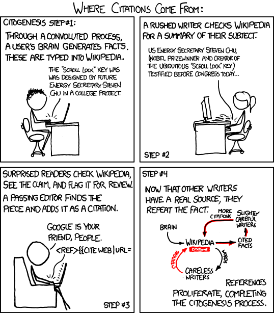
It’s a check against the citogenesis process:

Citogenesis by xkcd.com

Food for though when tempted to Wikipedia as a reference.

1984 or A Brave New World

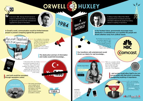
The future according to Orwell vs. Huxley. Image from world-shaker.tumblr.com.

World-shaker tries to draw the modern parallels to 1984 and Brave New World in graphic form.

Orwell’s (1948) distopian view of the future in 1984, warned against the government developing the ability to exert constant, repressive monitoring of everyone, controlling the means of communication and, perhaps more importantly, the use of language. Huxley’s (1932) Brave New World, on the other hand, saw a mass media using your apparent predilection for trivialities to distract you from the important things. These two books are staples of secondary school literature, and it’s easy to see modern parallels; “kinetic military action” is currently my favorite Orwellian term.

Unfortunately, drawing modern parallels to historic literature is fraught with difficulty because it’s so easy: the human brain is predisposed to seeing patterns. World-shaker’s attempt is interesting, but flawed. One of his commenter points out that he compares the entertainment website TMZ to Time.com’s news site, which only gets half as many visitors. However, the New York Times’ site gets three times as many visits as TMZ so perhaps he’s fudging the statistics a little to show the trend toward frivolous media.

There are other examples, but the graphic makes does provide a basis for an interesting conversation. The most interesting aspect is that it shows the U.S.A trending more toward Huxley, while repressive Middle-Eastern regimes seem to be trying to make Orwell’s vision more of a reality.

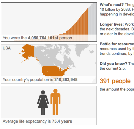
Your Place in the World (by Birth)

From the BBC's "The world at seven billion".

How many people were alive when you were born? How many people had lived before you were born? How many people were born while you were figuring this out?

The BBC’s The world at seven billion answers these questions.

(hat tip The Dish)

The Art of Specimen Preservation

Cover to the book New World Transparent Specimens by Iori Tomita.

After the joy of playing around with microscopy and staining last fall, it’s no surprise that someone has taken the science of staining and specimen preservation and turned it into art.

Iori Tomita has done an amazing job at making visible the internal organs of the specimens.

Using a method that dissolves an animals natural proteins, Tomita is able to preserve these deceased animals with striking detail–highlighting the finest and most delicate skeleton structures.

To further enhance the visual appeal of these ornate skeletons, Tomita selectively injects different colored dies into hard bones and soft bones to create a 3-d effect. Without the addition of the dye, the animals remain translucent.

— Michael (2010): New World Transparent Specimens Turns Preservation Into Modern Art

Transparent specimen by Iori Tomita. Note the exquisite detail (via Stinson (2011)).

Tomita’s website has some excellent photographs, and there appear to be two books available from Amazon.com.jp. More pictures can be found online here and here. Lisa Stinson at Wired has more pictures and details on the method.

Multi-modal IRP’s

If I present information to you orally, you’ll probably only remember about 10% 72 hours after exposure, but if I add a picture, recall soars to 65%.

–Alex Lundry (2009): Chart Wars: The Political Power of Data Visualization

How you present visual information is important. And my students are discovering this as they work up their Independent Research Projects (IRP’s) this week.

In the spring they are fairly free to pick their topic and style of IRP. Some choose research projects, others term papers, and a few do things that strike their fancy, like writing fiction or programming games.

In the end, they submit a written report and give a presentation.

For research projects, I have one student who did a great job of coming up with a hypothesis and testing it. He even compiled a nice table of his data for his results section, but was reluctant to go through the effort of making a graph. After all, he claimed, anyone reading his report (or watching his PowerPoint presentation) could just look at the table and read the data off there themselves.

My response was that people absorb the data much more effectively when it’s presented graphically. Fortunately, Alex Lundry has a nice little presentation that reinforces this point. It also gives a few tips about what to look out for in graphics, because they can be used to mislead.

The key quote (via The Dish) is this:

Vision is our most dominant sense. It takes up 50% of our brain’s resources. And despite the visual nature of text, pictures are actually a superior and more efficient delivery mechanism for information. In neurology, this is called the ‘pictorial superiority effect’ […] If I present information to you orally, you’ll probably only remember about 10% 72 hours after exposure, but if I add a picture, recall soars to 65%. So we are hard-wired to find visualization more compelling than a spreadsheet, a speech of a memo.

–Alex Lundry (2009): Chart Wars: The Political Power of Data Visualization

Here’s Lundry’s five minute presentation.

Haiku by an economist

Economist Stephen T. Ziliak’s reflections on poetry are quite appropriate for the moment, since we’re doing both poetry and economics this cycle.

Invisible hand;
Mother of inflated hope,
Mistress of despair!
–Stephen T. Ziliak: Haiku Economics

Zilak says that, “Poetry can fill the gap between reason and emotion, adding feelings to economics.”

He particularly loves the haiku, because it is such a wonderful metaphor for economics: “less is more, and more is better.”

Each poem is the length of about one human breath. This constraint, though severe, is more than offset by a boundless freedom to feel.
–Stephen T. Ziliak: Haiku Economics

Creativity is said to lie at the intersection on disciplines. This is an excellent example of it.