One of the librarians at Washington University played this video for our students. It was a great supplement to their lesson on how to use the internet for research.
Tag: research tools
Federal Reserve’s economic data
The St. Louis Federal Reserve has a Summer School program for teachers. Two of the sessions deal with current events (banking crisis and jobs) but the third covers the data and primary source documents that bank makes available online (for free). These include the FRED and GeoFred websites.

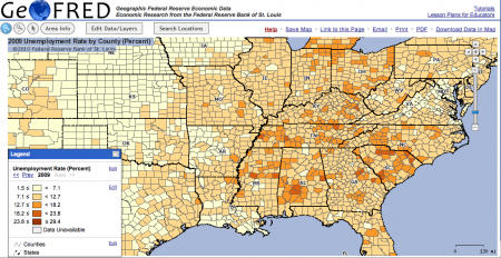
GeoFred produces graphs like the one above showing economic statistics across the country. It can do it on a state by state basis, by county (as above), or by even more refined areas.

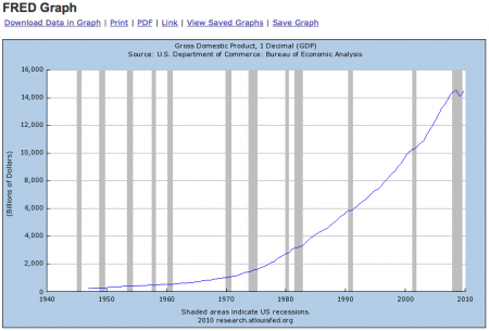
FRED plots graphs and even provides the data for economic statistics over time. The graph above shows GDP since they started collecting data in the 1940’s. It also has the times of recessions shaded in. The data in the graph can also be downloaded if you want to do your own analysis.
These seem to be handy little tools for teaching and for research projects, and are pretty easy to use.
The teachers’ training sessions are free though you have to get your own housing. They do provide breakfast and lunch. If you want graduate credit for them however, each three day session will cost around $306 and garner one credit.
The SDA

UC Berkley’s Survey Documentation and Analysis (SDA) website has a lot of potential as a research tool for the more advanced middle-schooler. I greatly encourage students to do original research in their semester-long Independent Research Projects. They pose questions, collect and/or analyze data and slog through the challenges of dealing with open ended questions. Middle school is the appropriate time for this as they are working on their formal thinking skills. With the increasing availability of websites like the SDA, everyone can gain access to research grade datasets.
The SDA is powerful because it has a lot of data from survey questions dealing with a large number of survey issues, from race relations, to perceptions of the economy, to use of the web. But with that power is a certain degree of complexity. It took me a while this morning to decipher the web interface and I’m no where near plumbing all the nuances of the statistical analysis, but it’s not too hard to do some basic plots.

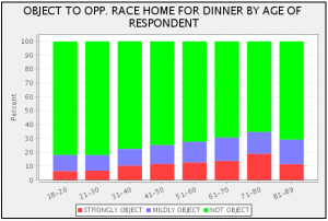
On the left side of the window is a list of all the survey questions available. There are a lot but they each have the full question so it’s pretty easy to figure out what they mean. When you select one, such as the opposition to a family member bringing home a black/negro friend for dinner, it gives you the little code, “RACDIN” in this case that you enter as the Row on the right side of the window (see the above figure). Now I want to know how people’s answers to that question changed based on how old they are, so for the Column option I put in “AGE”. Of course what I actually put in is “AGE(c:10,1)” which tells the program to lump all the age data into 10 year sets, starting at age 1.

Students will certainly need help getting started, and I could add video instructions if anyone wants it.
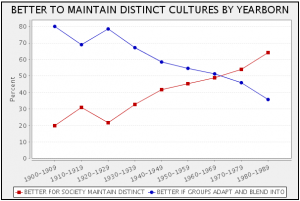
Now comes the most interesting part, interpreting the graphs. I like the plot at the top of this post for this reason. It shows that the younger people are the more likely they are to think it’s better if racial and ethnic groups maintain their customs and traditions. Does this mean that younger people have more racist attitudes, trying to maintain separation, or does it mean that they are more accepting of different cultures?