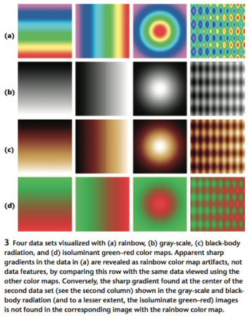
Even though rainbow color maps look pretty, Borland and Taylor (2007; pdf) argue that they’re rarely the best choice for showing data.
The rainbow color map confuses viewers through its lack of perceptual ordering, obscures data through its uncontrolled luminance variation, and actively misleads interpretation through the introduction of non-data-dependent gradients.
–Borland and Taylor (2007): Rainbow Color Map (Still) Considered Harmful in IEEE Computer Graphics and Applications.
They recommend the much more boring (but visually useful) greyscale and bi-colored schemes, for things like temperature maps and so on where the data is continuous.

