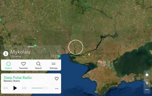
A wonderful website where you can peruse the world and hear local radio stations as you go.
Middle and High School … from a Montessori Point of View

A wonderful website where you can peruse the world and hear local radio stations as you go.
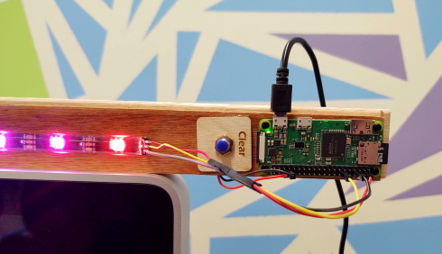
I wanted to set up a small (20 LEDs) light strip using a Raspberry Pi Zero, so students could learn how to remotely log in to a device, work with the Linux command line, run python programs, and get visible, real feedback on their progress.
Instructions and code are in the Github rpi-led-strip repository.
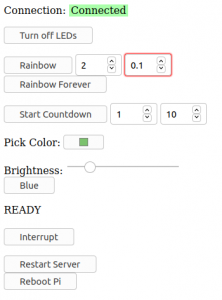
The repository also has instructions and code for setting up a local server on the Pi so you can control the LED strip via a webpage. Students working on their own LED projects in the Makerspace will appreciate this.
The main idea here was to make the project as simple as possible. The web page is basic with minimal styling, so it should be easy to edit, but I do test out some of the newer HTML input elements, like the color picker. The README in the repository also includes instructions on how to, step by step, add components to the webpage to control the Pi: the “Blue” button is used as the example (it sets the entire strip to blue).
With only 20 LEDs you don’t need an external power supply so everything can be run through the Pi.
Adafruit’s CircuitPython NeoPixel library makes controlling the lights really easy. There are a few example programs in the rpi-led-strip/pyLED/ directory of the repository.

I’ve also included a physical button (it’s optional) that I’m using right now to just clear the LED strip. I may change it to just reboot the Pi, because I anticipate that things will get interesting when I have an entire class trying to connect to one or two devices. So far, I’ve had a small group of four students try this with some success.
The student project that I keep revisiting the most is the Fortune Teller webpage created a couple years ago by former student Eve J.
You get a randomly generated fortune, and Eve built in enough combinations that I still see unique fortunes two years later.
I think what I like the most about it is how well it captures Eve’s “voice”. The style of the sentences and the little twists that pop up here and there. I can’t help reading this in her voice.
Eve is off in college right now, and gave me permission to post about the project, and to adapt the code as necessary, as long as I keep her informed (Hi Eve!).
I’ve ported the core of her program from JavaScript to PHP so you can now just get just the fortune telling text.
https://soriki.com/eve/fortune/fortune.php?name=Doc
I’ve also, sort of, memefied the fortunes but putting the text over a background image, which is what you see at the top of the post.
https://soriki.com/eve/fortune-m/meme-fortune.html?name=Doc
As an experiment, I now have a version that makes the image as an svg:
I have another student now who’s interested in making a smart mirror, and this will make it easier to include fortunes into that project.
I’ve also posted the project on Github: https://github.com/lurbano/fortune
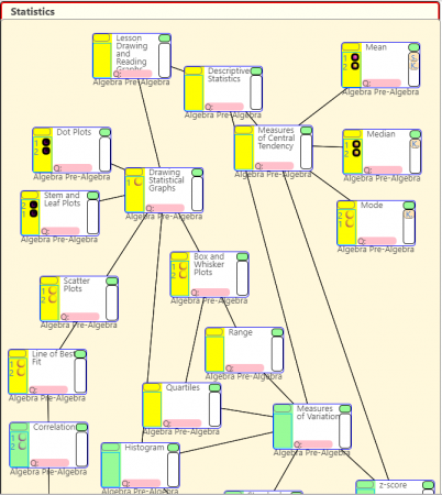
To help students track their progress in math we’ve started requiring them to map what they’re doing on flowcharts. Right now, they’re doing it on paper, but we’re working on getting it to be all electronic.
Tracking with the charts helps them see how what they’ve done fits into the bigger picture. It allows them to be able to go back up the chart to previous topics if they need to review, and look forward to what comes next (and to work ahead if they would like).
The image above shows a sample what a student’s flow chart would look like while they are working on a subject (statistics in this case). The topics they are working on at the moment are highlighted in yellow. The worksheets attached to each topic are linked on the left side in the highlighted area. Links to references (Khan Academy for example) are linked on the right–there are only a few on right now (see the Mean topic on the upper right of the flowchart).
The topics on the flowchart can be expanded (using the green button on the top right of each topic) to show more detail.
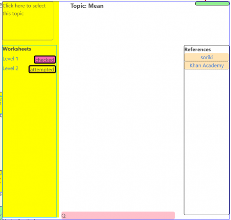
At the moment, I’m uploading the flowcharts that we’re currently using up on the website myself. Students can use the website to get worksheets and links to references, but if they mark what they’re doing on the webpage it’s not saved. We’re currently working on making it possible to create and edit flowcharts on the website itself. After that, we’ll be setting it up so students can log in with their school accounts and track their progress electronically. One ultimate goal is to map the entire upper school curriculum with these flow charts so a student might be able to track their work all the way from 7th to 12th grade.
<html>
	<head>

	</head>

	<body>

	</body>
</html>
I gave a quick introduction to writing HTML web pages over the last interim. The basic outline of a web page can be seen above (but there’s no content in there, so if you tried this file in a web browser you’d get a blank page). Everything is set between tags. The open html tag (<html>) starts the document, and the close html tag (</html>) ends it.
The head section (<head>) holds the information needed to set up the page, while the body section (<body>) holds the stuff that’s actually on the page.
For example, if I wanted to create a heading and a paragraph of text, I would just put it in the body, like so:
<html>
	<head>

	</head>

	<body>
		<h1>My Heading Here</h1>

		This is my text.

	</body>
</html>
Note that the heading is placed between h1 tags. And the result should look like this:
Now save this file as an html file, which means save it as a plain text file using a .html extension (e.g. test.html) and open the file in a browser.
Note on Editors: I’ve found that the best way to do this is by using a simple coding editor. I recommend my students use GEdit on Linux, Smultron (free version here) or GEdit on Mac, and Notepad++ on Windows. You don’t want to use something like Microsoft Word, because complex word processing software like it, LiberOffice and Pages need to save a lot of other information about the files as well (like the font style, who created the file etc.).
But we typically don’t want something so plain, so we’ll style our heading using CSS. Usually, we’ll want all of our headings to be the same so we set up a style to make all of our headings blue. So we’ll add a styling section to our header like so:
<html>
	<head>

		<style type="text/css">
			h1 { color: blue; }
		</style>

	</head>

	<body>

		<h1>My Heading Here</h1>

		This is my text.

	</body>
</html>
Which gives:
There are a few named colors like blue, but if you want more freedom, you can use the hexadecimal color codes like “#A3319F” to give a kind of purple color (hexadecimals are numbers in base 16).
Finally, we’ll often want pages with separate blocks of information, so let’s make a little column for our heading and paragraph. We’ll make the background yellowish, put a border around it, and give it a set width.
To do this we’ll place our heading and paragraph into a DIV tag, which does not do anything but encapsulate the part of the web page we want into sections.
<html>
	<head>

		<style type="text/css">
			h1 { color: blue; }
		</style>

	</head>

	<body>
		<div id="section1">
			<h1>My Heading Here</h1>

			This is my text.
		</div>
	</body>
</html>
Note that I’ve given the div tag an id (“section1), this is so that I can refer to that section only in the styling section using “#section”:
<html>
	<head>

		<style type="text/css">
			h1 { color: blue; }

			#section1 {
				background-color: #A2A82D;
				border: solid black 2px;
				width: 400px;
			}
		</style>

	</head>

	<body>
		<div id="section1">
			<h1>My Heading Here</h1>

			This is my text.
		</div>
	</body>
</html>
With that introduction, I set students loose to make their own web pages. They had to make two page, both linking to the other, and one of them being an “About Me” page.
There are lots of places on line to find out what HTML tags and CSS styles are available and how to use them, so my goal was to introduce students to the language they needed to know.
One issue that came up was the use of copyrighted images. Current adolescents see everything online as part of a sharing culture–most of my students for this lesson had Pintrest accounts–and it took some explanation for them to understand why they should not use that cute gif of a bunny eating a slice of pizza without getting permission from the author (or at least finding out if the artwork was free to use).
Finally, I did do a quick intro on how to using JavaScript (with Jquery) to make their pages more interactive, but given that we only had two days for this project, that was pushing things a little too far.
On the recommendation of Mr. Schmidt, two of my students have been quite fascinated over the last few days trying to solve problems on Project Euler. They’ve been working on them together to, I suspect, the detriment of some of their other classes, but as their math teacher I find it hard to object.
An example problem is something like this:
If we list all the natural numbers below 10 that are multiples of 3 or 5, we get 3, 5, 6 and 9. The sum of these multiples is 23.
Find the sum of all the multiples of 3 or 5 below 1000.
They’ve been solving them numerically using Python. It’s been quite fascinating to see.
One of the librarians at Washington University played this video for our students. It was a great supplement to their lesson on how to use the internet for research.
This morning I did a little presentation with the middle school on how to do research on the internet, and we actually had a very good discussion. I focused on two key things: assessing credibility and writing citations (giving credit).
[Henry] Hudson’s main goal as an explorer was to find a northern passage to the Orient. … He started his journey in May of 1607 and returned in September of the same year when his route was blocked by the Great Barrier Reef.
— All About Explorers (accessed Feb. 2012): Henry Hudson
I started by having the students to look up some explorers. If you prefix an explorer’s name with “all about explorers” (e.g. “all about explorers Christopher Columbus) the first link on google leads to the right website.
They were supposed to read the page and recorded three facts that they found interesting, but, in doing so, it pretty quickly becomes apparent that the information might not be very reliable; Columbus did not, after all, have to rely on infomercials to build support for his expedition.
The All About Explorers website was created by a group of teachers to be a tool for teaching about how to do research on the internet.
Having them see the site come up on google is, I think, better than sending them directly to the url. Google is usually their first recourse for researching anything, so it’s nice to see that google does not give information about credibility.
The discussion that ensued ranged pretty widely, but a key question that kept recurring was: how do you judge the credibility of a website. We talked a little bit about the possible biases of commercial .com and .net websites, and about the fact that .org’s may well also have their own biases, since it does not require any credentials to set one up (see montessorimuddle.org for example). On the other hand, while .gov and .edu domains (as well as most U.S. state and other country websites) are restricted to governments and colleges, that improves their credibility, but, in itself, is no guarantee of accuracy or being unbiased.
So much of assessing websites’ credibility comes from experience, which students just don’t have much of yet, so I recommended that checking with teachers and adults might be a good bet. Confirming data from multiple sources also helps, but you have to be careful, since so many websites now use Wikipedia as a source (or even reprint things directly from Wikipedia) that any errors in a Wikipedia page can spread far and wide pretty fast.
We did not get into how to use Wikipedia well (go for the sources at the bottom of the page), but we’ll get to that later.
For the second part of the lesson, I had them look up the same explorers they’d searched on the All About Explorers website. They had free range to search anywhere they wanted, but not only did they have to now collect facts but were to also find a good picture.
I’d wanted the pictures so we could talk about copyright and getting permissions to use media, but we did not get that far.
While they were satisfyingly more skeptical about where they got their information from, they were quite happy to give me the facts they’d found without attribution.
So I took the chance to talk about citing sources: to give credit where it is due; to avoid even the appearance of plagiarism; to give your reader an idea of how credible your sources are (and by extension how credible you are); and to let you readers know how up-to-date your information is.

For the next week or so the middle and high school are on an interim. This is our writing interim, so they’ll be working on research projects (including how to do research) and creating publications (I’m in charge of the science journal).
Since more and more research is going online, hopefully this was a good primer to get students started.