Exercise on Wealth Distribution

Using the actual U.S. wealth distribution data from Norton and Arieli (2011; pdf), I created a little addendum to our exercise on the distribution of wealth.

I started with the definition of wealth. Students tend to think you’re referring to annual income, so I gave the example of someone who does not have a job but owns a house; they have no income but some wealth in the value of the house. Alternately, someone who has $2 million in the bank, but owes $4 million, actually has negative wealth.

Then I drew a little stick figure diagram to represent the population of the United States. With ten figures, paired up, that gives five parts, aka quintiles.
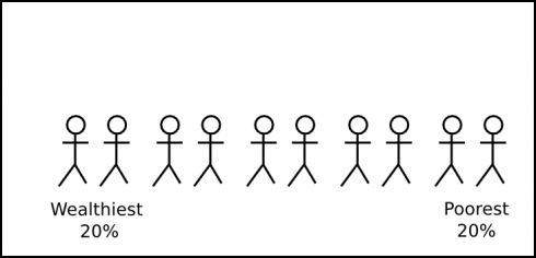
Breaking the population of the U.S. into five parts (quintiles) based on wealth. The least wealthy are to the right and the most wealthy are to the left.

Students were then presented with an empty bar graph and asked, “How much of the U.S.’s wealth is owned by the wealthiest 20% of the population?” Instead of asking in percentages (as are shown in the graph), I asked them to assume that the total wealth in the U.S. is $100 trillion.
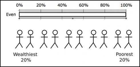
Population with empty bar graph.

The first suggestion was $35 trillion, which is shown below. Others offered different amounts, ranging up to $50 trillion. Someone even suggested $15 trillion, which is not possible, since that would mean that the wealthiest 20% have less than 20% of the total wealth of the country.
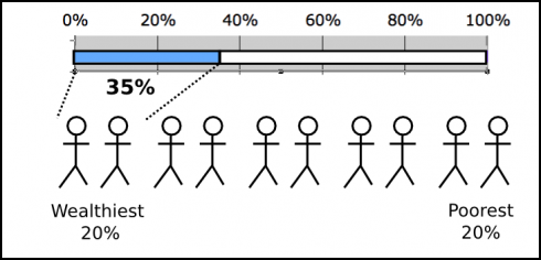
If the wealthiest 20% owned 35% of the wealth of the U.S. the graph would look like this.

Once they got the idea, I showed them what the graph would look like in an idealized socialist country, where everyone had the same wealth.
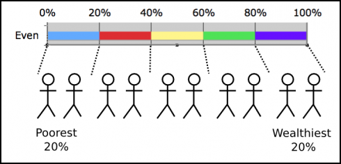
An even (socialist) distribution of wealth.

Finally, I asked my students to fill in what they believed to be the actual case for the U.S. for all five quintiles. The results had to add up to $100 trillion. They gave me their numbers individually before we broke up our meeting, and I entered it in the U.S. distribution of wealth spreadsheet to produce a graph.

After lunch, I showed them the results.
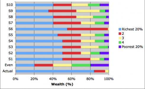
Students' beliefs about the distribution of wealth in the U.S. (S1 through S10 and the average student response), compared to an equal distribution and the actual distribution (bottom).

For dramatic effect, I hid the last two bars at first. We talked over their numbers, then I showed them the equal distribution case (which they’d seen before), and finally the actual distribution.
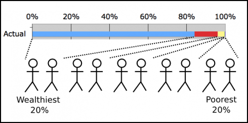
Actual U.S. distribution of wealth. Data from Holder and Arieli (2011)

The response was salutary; a moment of surprised silence and then whispers. What then followed was a nice, short discussion. I pointed out the pie charts showing the U.S. versus an equal distribution, versus Sweden and asked what they would do, if they were an autocratic monarch, or if they were the president to make the U.S.’s distribution more equal.
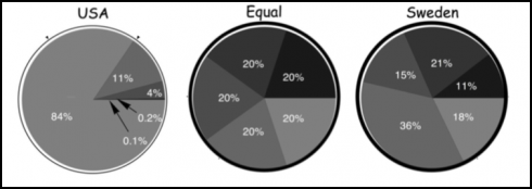
How wealth is shared in the U.S. compared to and equal distribution (middle), compared to Sweden. Image adapted from Norton and Aireli (2011).

We talked about the government just taking private property, like the communists did. Then we talked about progressive taxation. We ended by talking about the estate tax, and meritocracy, which we’d touched on in the morning.

I thought the exercise worked very well. Not only did we get into an interesting economic issue, but got some practice with math and interpreting graphs too.
Distribution of Wealth

One of our economics assignments this cycle asks students to divvy up $200,000 among a group of ten people. One is a divorced mom, another a playboy, a third a bank manager, you get the gist. The purpose is to compare what students think it should be, to what a socialist might believe, to students’ estimation of reality. I’m really curious to see what they come up with.

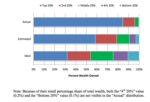
Michael Norton and Dan Ariely have some actual data on the wealth distribution in the United States that might really challenge some assumptions (Norton and Ariely, 2011 pdf). They asked survey respondents what percentage of wealth they thought was owned by the poorest 20% of U.S. citizens, the next 20% and so on. They also asked what kind of wealth distribution people though would be ideal. Finally, they compared what people thought to what was actually there.

The actual distribution of wealth in the U.S. (top), what people think is the case (middle), and people's ideal distribution (bottom). Figure from Norton and Ariely (2011).

People, apparently, really underestimate the income inequality in the U.S..

A second part of the same study gave people pie charts of wealth distribution in different societies and asked them to pick out which one they would prefer to live in if they were dropped at random into one of these societies. They compared the more socialist-like Sweden, to the U.S., and to a perfectly even distribution. People greatly preferred societies with a more equal sharing of wealth.

How wealth is shared in the U.S. compared to and equal distribution (middle), compared to Sweden. Image adapted from Norton and Aireli (2011).

I think I’m going to have to modify this assignment to use these graphs. I’ll also have to use their definition of wealth:

Wealth, also known as net worth, is defined as the total value of everything someone owns minus any debt that he or she owes. A person’s net worth includes his or her bank account savings plus the value of other things such as property, stocks, bonds, art, collections, etc., minus the value of things like loans and mortgages.

–Norton and Arieli (2011): Building a Better America – One Wealth Quintile at a Time in Perspectives on Psychological Science

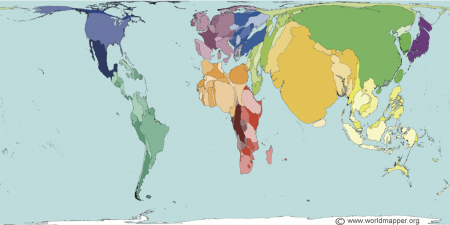
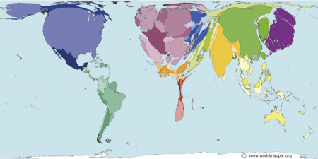
Maps of wealth and population

World population in 2000. (© Copyright SASI Group (University of Sheffield) and Mark Newman (University of Michigan).)
Wealth in 2002. Copyright SASI Group (University of Sheffield) and Mark Newman (University of Michigan).

In the coming year we’ll be looking at inequalities in wealth around the world. One way of looking at this is via the two maps above from the WORLDMAPPER website. Countries are scaled by the population, in the first image, and wealth in the second.

Worldmapper also has quite the number of very interesting maps, including maps related to health, violence, pollution, food and ecology. The species at risk map ties in well with the study of the Earth’s resources.

They also distribute some animated maps as well as free software, called ScapeToad, that you can use to make your own maps. I like the fact that their maps and software are clearly licensed and allow free educational use.