Tsunami Geometry: Calculating the Height of a Tsunami using Basic Geometry

Since we’re working on geometry this cycle, I thought it would be an interesting exercise to think about how we could use geometry to think about how the strength of tsunamis decreases with distance from the source.

Of course, we’ll have to do this using some intense simplification so we can actually apply the tools we have available. The first is to approximate the tsunami as a circular wall of water centered on the epicenter of the earthquake.

Simplified tsunami geometry.

This lets us figure out the volume of the wave pretty easily because we know that the volume of a cylinder is:

(1) ! V_c = \pi r^2 h

The size of the circular water wall we approximate from the reports from Japan. The maximum height of the wave at landfall was somewhere in the range of 14 m along the northern Japanese coast, which was about 80 km from the epicenter. Just as a wild guess, I’m assuming that the “effective” width of the wave is 1 km.

Typically, in deep water, a tsunami can have a wavelength greater than 500 km (Nelson, 2010; note that our width is half the wavelength), but a wave height of only 1 m (USSRTF). When they reach the shallow water the wave height increases. The Japanese tsunami’s maximum height was reportedly about 14 m.

At any rate, we can figure out the volume of our wall of water by calculating the volume of a cylinder with the middle cut out of it. The radius of our inner cylinder is 80 km, and the radius of the outer cylinder is 80 km plus the width of the wave, which we say here is 1 km.

Calculating the volume of the wave

However, for the sake of algebra, we’ll call the radius of the inner cylinder, ri and the width of the wave as w. Therefore the inner cylinder has a volume of:

(2) ! V_i = \pi r_i^2 h

So the radius of the outer cylinder is the radius of the inner cylinder plus the width of the wave:

(3) ! r_o = r_i + w

which means that the volume of the outer cylinder is:

(4) ! V_o = \pi (r_i + w)^2 h

So now we can figure out the volume of the wave, which is the volume of the outer cylinder minus the volume of the inner cylinder:

(5) ! V_w = V_o - V_i

(6) ! V_w = \pi (r_i + w)^2 h - \pi r_i^2 h

Now to simplify, let’s expand the first term on the right side of the equation:

(7) ! V_w = \pi (r_i ^2 + 2 r_i w + w^2) h - \pi r_i^2 h

Now let’s collect terms:

(8) ! V_w = \pi h \left( (r_i ^2 + 2 r_i w + w^2)  - r_i^2 \right)

Take away the inner parentheses:

(9) ! V_w = \pi h (r_i ^2 + 2 r_i w + w^2  - r_i^2)

and subtract similar terms to get the equation:

(10) ! V_w = \pi h ( 2 r_i w + w^2 )

Volume of the wave

Now we can just plug in our estimates of width and height to get the volume of water in the wave. We’re going to assume, later on, that the volume of water does not change as the wave propagates across the ocean.

(11) ! V_w =  \pi (14)  ( 2 r_i (1000) + (1000)^2 )

rearrange so the coefficients are in front of the variables:

(12) ! V_w =  14 \pi  ( 2000 r_i  + 1000000 )

So, at 80 km, the volume of water in our wave is:

(13) ! V_w =  14 \pi  ( 2000 (80000)  + 1000000 )

(14) ! V_w =  7081149841  m^3

Height of the Tsunami

Okay, now we want to know what the height of the tsunami will be at any distance from the epicenter of the earthquake. We’re assuming that the volume of water in the wave remains the same, and that the width of the wave also remains the same. The radius and circumference will certainly change, however.

We take equation (10) and rearrange it to solve for h by first dividing by rearranging all the terms on the right hand side so h is at the end of the equation (this is mostly for clarity):

(15) ! V_w = \pi ( 2 r_i w + w^2 )  h

Now we can divide by all the other terms on the right hand side to isolate h:

(16) ! \frac{V_w}{\pi ( 2 r_i w + w^2 )} = \frac{\pi ( 2 r_i w + w^2 )  h}{\pi ( 2 r_i w + w^2 )}

so:

(17) ! \frac{V_w}{\pi ( 2 r_i w + w^2 )} = h

which when reversed looks like:

(18) ! h = \frac{V_w}{\pi ( 2 r_i w + w^2 )}

This is our most general equation. We can use it for any width, or radius of wave that we want, which is great. Anyone else who wants to calculate wave heights for other situations would probably start with this equation (and equation (15)).

Double checking our algebra

So we can now figure out the height of the wave at any radius from the epicenter of the earthquake. To double check our algebra, however, let’s plug in the volume we calculated, and the numbers we started off with, and see if we get the same height (14 m).

First, we’ll use all our initial approximations so we get an equation with only two variables: height (h) and radial distance (ri). Remember our initial conditions:

w = 1000 m
ri = 80,000 m
hi = 14 m

we used these numbers in equation (10) to calculate the volume of water in the wave:

Vw = 7081149841 m3

Now using these same numbers in equation (18) we get:

(19) ! h = \frac{7081149841}{\pi ( 2 (r_i) (1000) + (1000)^2 )}

which simplifies to:

(20) ! h = \frac{7081149841}{ 2000 r_i \pi + 1000000 \pi }

So, to double-check we try the radius of 80 km (80,000 m) and we get:

h = 14 m

Aha! it works.

Across the Pacific

Now, what about Hawaii? Well it’s about 6000 km away from the earthquake, so taking that as our radius (in meters of course), in equation (20) we get:

(21) ! h = \frac{7,081,149,841}{ 2,000 (6,000,000) \pi + 1,000,000 \pi }

which is:

h = 0.19 m

This is just 19 cm!

All the way across the Pacific, Lima, Peru, is approximately 9,000 km away, which, using equation (20) gives:

h = 0.13 m

So now I’m curious about just how fast the 14 meters drops off to less than 20 cm. So I bring up Excel and put together a spreadsheet of tsunami height at different distances. Plot on a graph we get:

Tsunami heights with distance from earthquake, assuming a circular wall of water.

So the height of the tsunami drops off relatively fast. Within 1000 km of the earthquake the height has dropped by 90%.

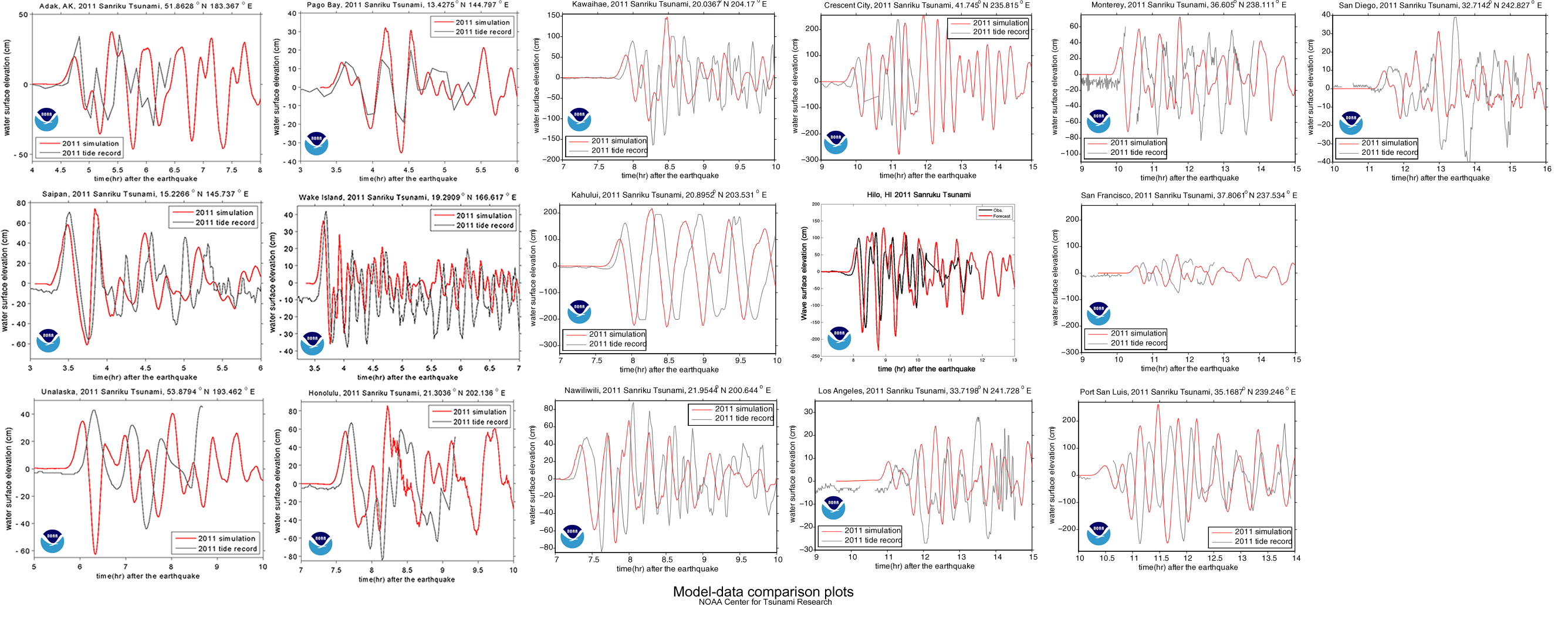
How good is this model

This is all very nice, a cute little exercise in algebra, but is it useful? Does it come anywhere close to reality? We can check by comparing it to actual measurements; the same ones used by NOAA to compare to their model (see here).

The red line is the tsunami's water height predicted by the NOAA computer models for Honolulu, Hawaii, while the black line is the actual water height, measured at a tidal gauge. Other comparisons can be found here.
Tsunami wave heights in the Pacific, as modeled by NOAA. Notice how the force of the tsunami is focused across the center of the Pacific.

The graph shows a maximum height of about 60 cm, which is about three times larger than our model. NOAA’s estimate is within 20% of the actual maximum heights, but they’ve spent a bit more time on this problem, so they should be a little better than us. You can find all the gruesome details on NOAA’s Center for Tsunami Research site’s Tsunami Forecasting page.

Notes

1. The maximum height of a tsunami depends on how much up-and-down motion was caused by the earthquake. ScienceDaily reports on a 2007 article that tried to figure out if you could predict the size of a tsunami based on the type of earthquake that caused it.

2. Using buoys in the area, NOAA was able to detect and warn about the Japanese earthquake in about 9 minutes. How do they know where to place the buoys? Plate tectonics.

The locations of the buoys in NOAA's tsunami warning system.

Update

The equations starting with (7) did not have the 2 on the riw term. That has been corrected. Note that the numerical calculations were correct so they have not changed. – Thanks to Spencer and Claude for helping me catch that.

Diverse bedrooms

Image from the book, Where Children Sleep by James Mollison.
Where Children Sleep by James Mollison.

To supplement our work on the fundamental needs of humans, we can add James Mollison’s poignant pictures in his book, Where Children Sleep. It ties in well with the Diverse China pictures.

You can find more of his images in LIFE.

Even without the text descriptions, the pictures are wonderfully composed and evocative. I think I’m going to have to add this one to our library.

An interesting project would be to have my students take their own pictures of their rooms. Just in the book, some of the contrasts are quite startling.

From Where Children Sleep by James Mollison (via Visual News).

Radiation dosages

Radiaton dosages from different sources. Graph by http://xkcd.com/radiation/.

xkcd has published an excellent graph showing where different dosages of radiation come from and how they affect health. It’s a complex figure, but it’s worth taking the time to look through. I find it easiest to interpret going backward from the bottom right corner that show the dosages that are clearly fatal.

One Seivert (1 Sv).

One red square of 100 red blocks is equal to one seivert, which is the radiation dosage that will kill you if you receive it all at once. Note:

  • If you were next to the reactor core during the Chernobyl nuclear accident, you would have gotten blasted by 50 Sv.
  • 8 Sv will kill you, even with treatment.
  • Getting 0.1 Sv over a year is clearly linked to cancer.
  • One hour on the grounds of the Chernobyl nuclear plant (in 2010) would give you 0.006 Sv.
  • Your normal, yearly dose is about 0.004 Sv, just about how much was measured over a day at two sites near Fukushima.
  • Eating a banana will give you 0.000001 Sv.

While I did not find equivalent exposure levels, the nuclear bombs dropped on Hiroshima and Nagasaki lead to many deaths and sickness from radiation created by the explosions. Within four months, there were 140,000 fatalities in Hiroshima, and 70,000 in Nagasaki (Nave, 2010). The Manhattan Engineer District, 1946 report describes the radiation effects over the first month:

Radiation effects for the month following the dropping of the nuclear bombs on Nagasaki and Hiroshima. (Table from The Manhattan Engineer District (1946) via atomicarchive.com).

The effects were not limited to the explosion itself, though. There is one estimate, that 260,000 people were indirectly affected:

Radiation dose in a zone 2 kilometers from the hypocenter of the atomic bomb was the largest. Also, those who entered the city of Hiroshima or Nagasaki soon after the atomic bomb detonation and people in the black rain areas were exposed to radiation. … some people were exposed to radiation from black rain containing nuclear fission products (“ashes of death”), and others to radiation induced by neutrons absorbed by the soil upon entering these cities soon after the atomic bomb detonation.

— Hiroshima International Council for Health Care for the Radiation Exposed (HICARE): Global Radiation Exposures.

HICARE also has a good summary of what happened at Chernobyl, where 31 people died at the time of the accident, about 400,000 were evacuated, and anywhere between 1.6 and 9 million people were exposed to radiation. Modern pictures of the desolation of Chernobyl are here. The Wikipedia article has before and after pictures of Hiroshima and Nagasaki.

Character Amid the Ruins

People are made of flesh and blood and a miracle fibre called courage.

— Mignon McLaughlin, The Neurotic’s Notebook, 1960 (quote via The Quote Garden.)

The character of an individual, and even of a people, is best identified in periods of adversity. That was one of the things that came up when my students discussed ethics, morality and poverty. With all the talk of how the Japanese people are reacting to last week’s earthquake, with a relative lack of looting and criminality, it is worth visiting Jesse Walker’s article in Reason last year that really looked at how people really respond to disasters. It turns out, that from Haiti to New Orleans to San Fransisco in 1906, people are much more restrained and disciplined than we’re lead to imagine.

Walker reviews Rebecca Solnit’s book “A Paradise Built in Hell: The Extraordinary Communities That Arise in Disaster” which points out the “little utopias” that arise in disaster hit communities.

Walker also points out the incongruity between our expectations and actual observations:

It isn’t unusual for a TV reporter to get his facts wrong. It’s rarer for the images that accompany his dispatch to flagrantly contradict what he says. But on January 21, broadcasting in the aftermath of the earthquake that devastated Haiti, CNN correspondent Ivan Watson fretted about “chaotic crowds” as the camera showed people who were calm and patient. When Watson announced that we were watching a “chaotic scramble” onto a rescue ship, this was illustrated by a group of refugees carefully, methodically passing a baby onto the boat.

–Walker (2010): Disaster Utopianism on Reason.com

Social Loafing: Getting Groups to Work Well Together

PsyBlog has an excellent summary of the research on social loafing, the phenomena where people working in a group work less compared to when they work alone. Because we do so much group work, this is sometimes an issue.

The first research on social loafing came from Max Ringelmann way back in 1913 (Ringelmann, 1913). He had people pulling on a rope, and compared the maximum they could have pulled, based on individual test, to how much each person actually pulled. The results were, kind of, sad; with eight people, each one only pulled half as much as their maximum potential strength. A graph of Ringelmann’s data is shown below. If everyone pulled at their maximum the line would have stayed horizontal at 1.

The relative loafing of people working in a group. As the group gets larger, the amount of work per person decreases from its maximum of 1. Data from Ringelmann (1913)

The PsyBlog article points out three reasons why people tend to loaf in groups:

  • We expect others to loaf so we do it, too.
  • We feel more anonymous the larger the group, so we feel less need to put in the effort.
  • We often don’t have a clear idea about how much we need to contribute, so we don’t put in as much as we could.

This can be summed up in Latane’s Social Theory:

If a person is the target of social forces, increasing the number of other persons diminishes the relative social pressure on each person.

— Latane et al., 1979: Many hands make light the work: The causes and consequences of social loafing in the Journal of Personality and Social Psycology. Quote via Keith Rolag’s Website.

How do we deal with this

The key is making sure students are motivated to do the work. We want self-motivated students, but creating the right environment, especially by training students in how to work in a group will help.

  • Make sure students realize the importance of their work; this makes them more motivated.
  • Build group cohesion; team members contribute more if they value the group they’re in.
  • Make sure the group clearly and fairly divides the work. Let everyone be part of the decision making process so students have choices in what to do will help them be more invested in their part of the work.
  • Make sure each group member feels accountable for their share of the work.

A Brief Excursion into Mathematics

Ringelmann’s data falls on a remarkably straight line, so I used Excel to plot a trendline. As my algebra students know, you only need two points to write the equation of a line, however, Excel uses linear regression to get the best-fit line through all the data. Not all the data points will be on the line (sometimes none of them will be on the line) but the sum of the distance from each point to the line is minimized.

Curiously, since the data is pretty close to a straight line, you can extend the line to the x-axis to find out how many people it would take for no-one to be exerting any force at all. Students should be able to determine the equation of the line on their own, but you can get Excel to give you the equation of the trendline. From the plot we see:

y = -0.0732 x + 1.0707

At the x-axis, y = 0, so;

0 = -0.0732 x + 1.0707

solving for x we first subtract the constant, 1.0707 from both sides to get:

0 – 1.0707 = -0.0732 x + 1.0707 – 1.0707

giving:

-1.0707 = -0.0732 x

then divide by -0.0732 to isolate x:

! \frac{-1.0707}{-0.0732} = \frac{-0.0732 x}{-0.0732}

which yields:

x = 14.63

This means that with 15 people, no-one will be pulling on the rope. In fact, according to this equation, they’ll actually start pushing on the rope.

It’s an amazing result, but if you can find flaws with my argument or math, please let me know.

Recipes for revolution

The Economist has come up with a neat little flash app that combines all the ingredients to see which Arab countries are ripest for revolution. They call it their “Shoe Thrower’s Index”.

We’ve seen how a combination of demographics (lots of young people), an educated middle class, and protests might lead to revolutions (which still often come as a surprise). With The Economist’s table you get to choose which factors you think are most important.

Move the slider bars on the right to set the “weight” of each indicator of revolution to what you think is most important, and the chart on the left will adjust itself to show which countries are more likely to have a revolution based on your parameters.

(found via The Dish)

Geography of data

OK. For someone like me this map is just ridiculously addictive. Produced by Revolver Maps, it shows the locations of everyone who’s visited the Muddle since March 5th (2011). If you click on the map it will take you to their page where you can find out more about the locations of all those dots.

The points on the map are a fascinating result of a combination of population distribution, language, technologic infrastructure (and wealth), and the miscellaneous topics on which I post.

Hits on the Muddle (blue circles) after two days, overlayed on a population density map of the U.S.. (Population density map from the USDA).

Overlaying at the location of hits after two days, on a population density map of the U.S. shows the obvious: the more people there are, the more likely it is that someone would stumble upon my blog. The eastern half of the U.S. with its higher populations are well represented, as is the west coast, while the hits in between come from the major population centers.

The pattern of hits from Australia shows very precisely that the major population centers are along the coast and not in the arid interior.

Map showing the hits on the Muddle (March 5-7) from Africa versus population density.

Africa, however, tells a much different story. The large population centers are along the equatorial belt of sub-Saharan Africa. But even now, there are very few if any hits from that region. I suspect that’s largely because of language and lack of access to the internet. The Muddle is not exactly the most popular on the internet, so it probably takes a lot of people on computers for a few to find their way to it. Contrast sub-Saharan Africa to South Africa, which is relatively wealthy, uses English as its lingua franca (working language), and has seen at least a few people hit the Muddle.

Members of the Commonwealth of Nations. Most of these countries were once part of the British Empire. (Image from Wikimedia Commons User:Applysense.)

Language also plays in big role in the pattern of hits from Europe and Asia. There are many English speakers in western Europe, a very high population density, and so a lot of hits, but the British Isles, as might be expected, are particularly well represented. Similarly in Asia, the members of the Commonwealth are show up disproportionately.

From the middle east, there have been a several hits from the wealthy small states like Bahrain and Qatar, but also a number from Egypt. The Egyptian interest in particular seems to stem from my posts on the recent revolution. No-one from that part of the world has commented on any of it so far, so I have no idea if they find the posts positive, negative, indifferent or whatever. I’d be curious to find out, since even negative feedback is important.

On the note of current events, my post on the plate tectonics of the earthquake in Japan has engendered quite a number of hits, and some positive feedback in the comments section and via email (one from a Japanese reader). In the week since the earthquake more than half the hits to the Muddle have been to that post, largely because it’s been popping up on the front page of the Google search for “plate tectonics earthquake Japan”.

Recent visitors to the Muddle on March 15th, 5:00 AM.

It has been fascinating seeing people from so many different countries hitting my blog. Since most don’t comment, or drop me a note, blogging often feels quite lonely, like I’m just talking to myself. Self-reflection was the original purpose for this blog, and I find that combining writing and graphics really works for me as a way of expressing myself.

Yet, this blog would not be public if I did not have an insatiable urge to share. So thanks for reading, and don’t be afraid to comment. I am a Montessori middle school teacher after all, so I tend not to bite. Although, if you do try to post a comment and it doesn’t show up it may be because it got caught in my spam filter; there is a 1000:1 ratio of spam to legitimate comments so it’s hard for me to catch any mistakes. Sending me an email should fix that though.