2010 – Most Extreme Weather Since the Year Without a Summer

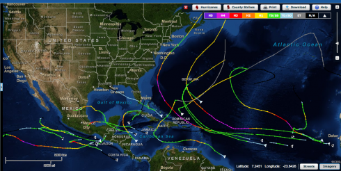
Paths of hurricanes in 2010. The North Atlantic hurricane season was the 3rd most active on record. Visualization from NOAA's excellent Historical Hurricane Tracks interactive map.
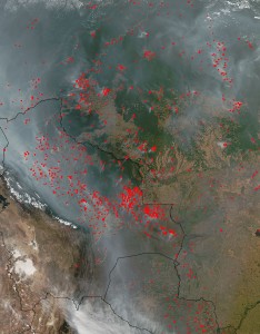
Forest fires in the Amazon. Image from NASA.

Jeff Masters has an impressively detailed post laying out the argument that 2010, with its record setting snowstorms, droughts, heatwaves, flooding, hurricanes, etc, had the most extreme weather since 1816, the year without a summer.

Looking back through the 1800s, which was a very cool period, I can’t find any years that had more exceptional global extremes in weather than 2010, until I reach 1816. That was the year of the devastating “Year Without a Summer”–caused by the massive climate-altering 1815 eruption of Indonesia’s Mt. Tambora, the largest volcanic eruption since at least 536 A.D. It is quite possible that 2010 was the most extreme weather year globally since 1816.

— Masters (2010): 2010 – 2011: Earth’s most extreme weather since 1816? on Weather Underground.

Hurricane Earl approaching the Carolinas. Image by Zach Frailey.

Notes

NOAA’s Historical Hurricane Tracks map is an excellent interactive webpage, and data source.
U.S. Immigration Data

Raymond Cohn has a great table of immigration data on the Economic History Association website.

This data ties very nicely into the work we’re doing on graphing. The Excel file with the post 1820 data, and another with pre-1790 data, make it easier to work with (note the pre-1970 data comes from the Wikipedia page on the history of immigration; it was the easiest source to find a table of data).

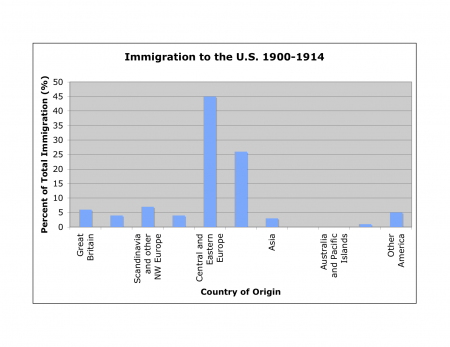
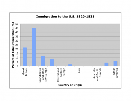
Since each small group of students is responsible for a different wave of immigration, the groups will create bar graphs showing the countries of origin for each wave. They should look like these:

U.S. Immigration from 1820 to 1831. Data from Cohn (2010).

and,

U.S. Immigration from 1900 to 1914. Data from Cohn (2010).

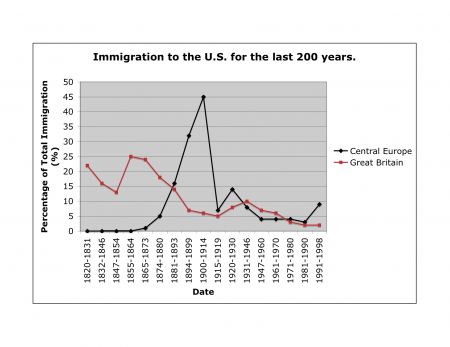
Plotting the time series as a line graph would be another great way to slice the data:

Comparison of U.S. Immigration Rates from Great Britain and Central Europe. Data from Cohn (2010).

Note that the data in the table is as a percentage of total immigration, so the numbers do not compare directly from one time period to the next; however, the proportions still work to show the same patterns.

Surveys say …

Another nice resource that provides neat graphs of real data that are easy for students to understand is Pollster.com. The graphs of survey results are constantly updated and, if you want to, you can go into how they were created (survey questions, averages etc.). They’re great for current event discussions and research projects.

In addition to the national polls, like the president’s job approval (see below), the site also has charts for state level races, like for governor, which are handy around election time.

Pollster.com aggregates polls, because, depending on how a question is phrased, each poll will have it’s own bias. However, since not all of the poll data is freely available to the public, the sites of the major polling organizations, like GALLUP, are also quite useful. The polling organizations tend to have a much wider variety of poll results available. Gallup in particular provides some very nice graphs.

Learn math and economics using GeoFRED

The activity below was created as part of the St. Louis Federal Reserve Bank’s Summer School Program session on using Data and Primary Source Documents. I plan to use it as a whole-class activity during the upcoming year and I’ll post updates after I try it (check the economics tag).

Unemployment rate by state - 1977 to 2009. Maps from GeoFRED.

Averaging and Graphing with GeoFRED

Objectives:

  • Introduce GeoFRED as a tool for analyzing real economic data over space.
  • Learn/practice graphing.
  • Practice basic averaging using real data.
  • Prepare and deliver group presentations.

Resources:

Initial presentation to entire class

Show animation of unemployment in the US (by state) over their lifetimes (e.g. 1998-2009). The pdf file Geofred-annual-unemp-1995-2009 has the maps from 1995 to 2009 that you can click through to animate. Alternatively, you can create the pdf yourself from the GeoFRED Graph. A final option, if you’re desperate, is to use the animated gif above.

  • Note: point out the effect of Hurricane Katrina on Louisiana (compare 2005 and 2006).
  • See if students can identify interesting changes that they are curious about. The intention is to get students interested in the data and asking questions and give ideas about why the changes have occurred in general and for specific states.

Group/individual work

The class picks a state that they’re interested in (everyone has to do the same state to bring the data back together at the end) and:

  • each group/individual gets the 12 months of data for one year in the time series (from the website).
  • They create a graph (line or bar students get the choice) of their 12 months of data.
    • Note: If we provide students with poster paper and a uniform scale for their axes they could merge their data at the end to create one very long graph. Alternately, if they all produce their own, very different, graphs they might produce nicer graphs that they’re more invested in, and better appreciate the need to calculate the averages when combining all the data.)
  • They average their 12 months of data to get the annual average.
  • Discuss among themselves why things might have changed the way they did over the year
    • Do research (perhaps the beige book archive (very good regional summaries) or burgundy books (can’t find a long archive) and/or Wikipedia) to find out about why the changes may have occurred.
    • Prepare a short presentation about their year for the rest of the class based on what they found (including their graph).

Class reconvenes

Now for presentations, discussion and integration.

  • Each group gives a short presentation about what they found.
  • The groups bring their averages together to plot a graph for the entire 12 years.
  • Discuss how things changed over time – recessions when and why.

Advanced work

Now that students know how to use GeoFRED they can pose and answer a research question, perhaps one that came up during the initial presentation of the animation.

Additional suggestions

Instead of doing this by state, we could do it by Fed district to see how the regional economic systems are very different.