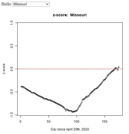
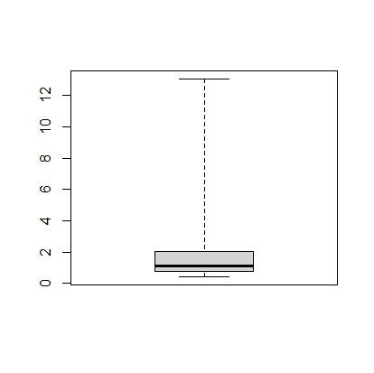
Missouri’s confirmed cases (z-score) compared to the other U.S. states from April 20th to October 3rd, 2020. The z-score is a measure of how far you are away from the average. In this case, a negative z-score is good because it indicates that you’re below the average number of cases (per 1000 people). For all the states.
Based on my students’ statistics projects, I automated the method (using R) to calculate the z-score for all the states in the U.S. We used the John Hopkins daily data.
The R functions (test.R) assumes all of the data is in a folder (COVID-19-master/csse_covid_19_data/csse_covid_19_daily_reports_us/), and outputs the graphs to the folder ‘images/zscore/‘ which needs to exist.
Let’s take a look at the summary statistics for the number of confirmed cases, which is in the column labeled “Confirmed”:
> summary(mydata$Confirmed)
   Min. 1st Qu.  Median    Mean 3rd Qu.    Max.
    317    1964    4499   15347   13302  253060
This shows that the mean is 15, 347 and the maximum is 253,060 confirmed cases.
I’m curious about which state has that large number of cases, so I’m going to print out the columns with the state names (“Province_State”) and the number of confirmed cases (“Confirmed”). From our colnames command above we can see that “Province_State” is column 1, and “Confirmed” is column 6, so we’ll use the command:
> mydata[ c(1,6) ]
The “c(1,6)” says that we want the columns 1 and 6. This command outputs
             Province_State Confirmed
1                   Alabama      5079
2                    Alaska       321
3            American Samoa         0
4                   Arizona      5068
5                  Arkansas      1973
6                California     33686
7                  Colorado      9730
8               Connecticut     19815
9                  Delaware      2745
10         Diamond Princess        49
11     District of Columbia      2927
12                  Florida     27059
13                  Georgia     19407
14           Grand Princess       103
15                     Guam       136
16                   Hawaii       584
17                    Idaho      1672
18                 Illinois     31513
19                  Indiana     11688
20                     Iowa      3159
21                   Kansas      2048
22                 Kentucky      3050
23                Louisiana     24523
24                    Maine       875
25                 Maryland     13684
26            Massachusetts     38077
27                 Michigan     32000
28                Minnesota      2470
29              Mississippi      4512
30                 Missouri      5890
31                  Montana       433
32                 Nebraska      1648
33                   Nevada      3830
34            New Hampshire      1447
35               New Jersey     88722
36               New Mexico      1971
37                 New York    253060
38           North Carolina      6895
39             North Dakota       627
40 Northern Mariana Islands        14
41                     Ohio     12919
42                 Oklahoma      2680
43                   Oregon      1957
44             Pennsylvania     33914
45              Puerto Rico      1252
46             Rhode Island      5090
47           South Carolina      4446
48             South Dakota      1685
49                Tennessee      7238
50                    Texas     19751
51                     Utah      3213
52                  Vermont       816
53           Virgin Islands        53
54                 Virginia      8990
55               Washington     12114
56            West Virginia       902
57                Wisconsin      4499
58                  Wyoming       317
59                Recovered         0
Looking through, we can see that New York was the state with the largest number of cases.
Note that we could have searched for the row with the maximum number of Confirmed cases using the command:
> d2[which.max(d2$Confirmed),]
Merging Datasets
In class, we’ve been editing the original data file to add a column with the state populations (called “Population”). I have this in a separate file called “state_populations.txt” (which is also a comma separated variable file, .csv, even if not so labeled). So I’m going to import the population data:
> pop <- read.csv("state_population.txt")
Now I’ll merge the two datasets to add the population data to “mydata”.
> mydata <- merge(mydata, pop)
Graphing (Histograms and Boxplots)
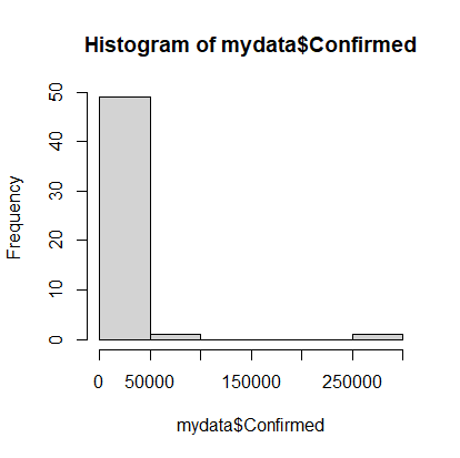
With the datasets together we can try doing a histogram of the confirmed cases. Note that there is a column labeled “Confirmed” in the mydata dataset, which we’ll address as “mydata$Confirmed”:
> hist(mydata$Confirmed)
Histogram of confirmed Covid-19 cases as of 04-20-2020.
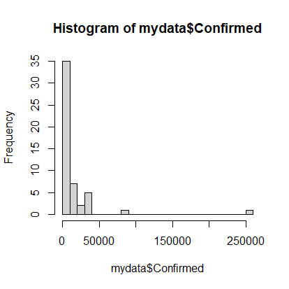
Note that on April 20th, most states had very few cases, but there were a couple with a lot of cases. It would be nice to see the data that’s clumped in the 0-50000 range broken into more bins, so we’ll add an optional argument to the hist command. The option is called breaks and we’ll request 20 breaks.
> hist(mydata$Confirmed, breaks=20)
A more discretized version of the confirmed cases histogram.
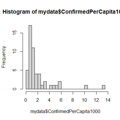
Calculations (cases per 1000 population)
Of course, simply looking at the number of cases in not very informative because you’d expect, with all things being even, that states with the highest populations would have the highest number of cases. So let’s calculate the number of cases per capita. We’ll multiply that number by 1000 to make it more human readable:
The dataset still has a long tail, but we can see the beginnings of a normal distribution.
The next thing we can do is make a boxplot of our cases per 1000 people. I’m going to set the range option to zero so that the plot has the long tails:
> boxplot(mydata$ConfirmedPerCapita1000, range=0)
Boxplot of US states’ confirmed cases per 1000 people.
The boxplot shows, more or less, the same information in the histogram.
Finding Specific Data in the Dataset
We’d like to figure out how Missouri is doing compared to the rest of the states, so we’ll calculate the z-score, which tells how many standard deviations you are away from the mean. While there is a built in z-score function in R, we’ll first see how we can use the search and statistics methods to find the relevant information.
First, finding Missouri’s number of confirmed cases. To find all of the data in the row for Missouri we can use:
> mydata[mydata$Province_State == "Missouri",]
which gives something like this. It has all of the data but is not easy to read.
   Province_State Population Country_Region         Last_Update     Lat
26       Missouri    5988927             US 2020-04-20 23:36:47 38.4561
      Long_ Confirmed Deaths Recovered Active FIPS Incident_Rate People_Tested
26 -92.2884      5890    200        NA   5690   29      100.5213         56013
   People_Hospitalized Mortality_Rate      UID ISO3 Testing_Rate
26                 873       3.395586 84000029  USA      955.942
   Hospitalization_Rate ConfirmedPerCapita1000
26             14.82173              0.9834817
To extract just the “Confirmed” cases, we’ll add that to our command like so:
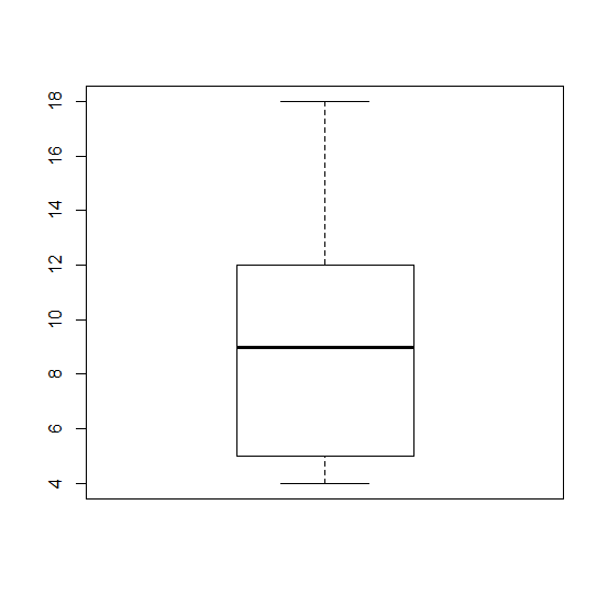
A box plot is a graph that helps you to analyze a set of data. It used to show the spread of the data. In it you use five data points: the minimum, the 1st quartile, the median, the 3rd quartile, and the maximum.
The minimum is the lowest point in your data set, and the maximum is the largest. The median is the number in the middle of the data set when you have the number lined up numerically.
For example if your data set was this:
5, 6 ,11, 18, 12, 9, 4
First you would put them in order lowest to highest.
4, 5, 6, 9, 11, 12, 18
Your median would be 9, because it is the middle number. The minimum would be 4, and the maximum would be 18.
The first quartile would be 5, the median of the numbers below 9, and the third quartile would be 12, the median of the numbers above 9.
So the data you would use in your boxplot would be
(4,5,9,12,18)
The boxplot would look like would look like this.
Example boxplot #1.
What is R?
R is a software program that is free to download that you can use for calculating statistics and creating graphics.
Here is their website: https://www.r-project.org/
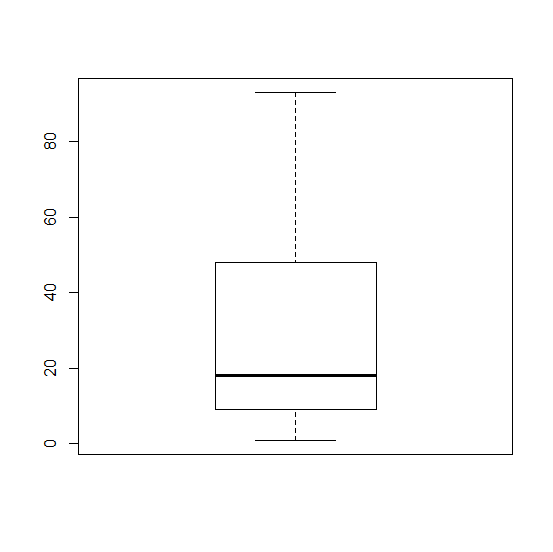
Boxplots in R
In R you can create a boxplot by using this formula.
> Name of data set <- c(minimum, quartile 1, median, quartile 3, maximum)
> boxplot(Name of data set)
First you have to name your data set. In our project where we analyzed the number of times people repeated their Shakespeare lines that they performed, I used the name Macbeth. So the formula looked like this:
> Macbeth <- c(1,9,18,48,93)
> boxplot(Macbeth)
Using this data set, your box plot should look like this
For my statistics students, as we approach the end of the course, to think about the power of statistics and how using them, even with the best intentions, can go wrong.
One of my students is taking an advanced statistics course–mostly online–and it introduced her to the statistical package R. I’ve been meaning to learn how to use R for a while, so I had her show me how use it. This allowed me to give her a final exam that used some PEW survey data for analysis. (I used the data for the 2013 LGBT survey). These are my notes on getting the PEW data, which is in SPSS format, into R.
Instructions on Getting PEW data into R
Go to the link for the 2013 LGBT survey“>2013 LGBT survey and download the data (you will have to set up an account if you have not used their website before).
There should be two files.
The .sav file contains the data (in SPSS format)
The .docx file contains the metadata (what is metadata?).
Load the data into R.
To load this data type you will need to let R know that you are importing a foreign data type, so execute the command:
> library(foreign)
To get the file’s name and path execute the command:
> file.choose()
The file.choose() command will give you a long string for the file’s path and name: it should look something like “C:\\Users\…” Copy the name and put it in the following command to read the file (Note 1: I’m naming the data “dataset” but you can call it anything you like; Note 2: The string will look different based on which operating system you use. The one you see below is for Windows):
> dataset = read.spss(“C:\\Users\...”)
To see what’s in the dataset you can use the summary command:
> summary(dataset)
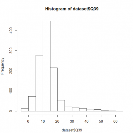
To draw a histogram of the data in column “Q39” (which is the age at which the survey respondents realized they were LGBT) use:
> hist(dataset$Q35)
If you would like to export the column of data labeled “Q39” as a comma delimited file (named “helloQ39Data.csv”) to get it into Excel, use:
> write.csv(dataset$Q39, ”helloQ39Data.csv”)
This should be enough to get started with R. One problem we encountered was that the R version on Windows was able to produce the histogram of the dataset, while the Mac version was not. I have not had time to look into why, but my guess is that the Windows version is able to screen out the non-numeric values in the dataset while the Mac version is not. But that’s just a guess.
Histogram showing the age at which LGBT respondents first felt that they might be something other than heterosexual.
David McRaney synthesizes work on luck in an article on survivorship bias.
… the people who considered themselves lucky, and who then did actually demonstrate luck was on their side over the course of a decade, tended to place themselves into situations where anything could happen more often and thus exposed themselves to more random chance than did unlucky people.
Unlucky people are narrowly focused, [Wiseman] observed. They crave security and tend to be more anxious, and instead of wading into the sea of random chance open to what may come, they remain fixated on controlling the situation, on seeking a specific goal. As a result, they miss out on the thousands of opportunities that may float by. Lucky people tend to constantly change routines and seek out new experiences.
McRaney goes also points out how this survivorship bias negatively affects scientific publications (scientists tend to get successful studies published but not ones that show how things don’t work), and in war (deciding where to armor airplanes).
The Correlated website asks people different, apparently unrelated questions every day and mines the data for unexpected patterns.
In general, 72 percent of people are fans of the serial comma. But among those who prefer Tau as the circle constant over Pi, 90 percent are fans of the serial comma.
Two sets of data are said to be correlated when there is a relationship between them: the height of a fall is correlated to the number of bones broken; the temperature of the water is correlated to the amount of time the beaker sits on the hot plate (see here).
A positive correlation between the time (x-axis) and the temperature (y-axis).
In fact, if we can come up with a line that matches the trend, we can figure out how good the trend is.
The first thing to try is usually a straight line, using a linear regression, which is pretty easy to do with Excel. I put the data from the graph above into Excel (melting-snow-experiment.xls) and plotted a linear regression for only the highlighted data points that seem to follow a nice, linear trend.
Correlation between temperature (y) and time (x) for the highlighted (red) data points.
You’ll notice on the top right corner of the graph two things: the equation of the line and the R2, regression coefficient, that tells how good the correlation is.
The equation of the line is:
y = 4.4945 x – 23.65
which can be used to predict the temperature where the data-points are missing (y is the temperature and x is the time).
You’ll observe that the slope of the line is about 4.5 ºC/min. I had my students draw trendlines by hand, and they came up with slopes between 4.35 and 5, depending on the data points they used.
The regression coefficient tells how well your data line up. The better they line up the better the correlation. A perfect match, with all points on the line, will have a regression coefficient value of 1.0. Our regression coefficient is 0.9939, which is pretty good.
If we introduce a little random error to all the data points, we’d reduce the regression coefficient like this (where R2 is now 0.831):
Adding in some random error causes the data to scatter more, making for a worse correlation. The black dots are the original data, while the red dots include some random error.
The correlation trend lines don’t just have to go up. Some things are negatively correlated — when one goes up the other goes down — such as the relationship between the number of hours spent watching TV and students’ grades.
The negative correlation between grades and TV watching. Image: ᔥLanthier (2002).
Correlation versus Causation
However, just because two things are correlated does not mean that one causes the other.
A jar of water on a hot-plate will see its temperature rise with time because heat is transferred (via conduction) from the hot-plate to the water.
On the other hand, while it might seem reasonable that more TV might take time away from studying, resulting in poorer grades, it might be that students who score poorly are demoralized and so spend more time watching TV; what causes what is unclear — these two things might not be related at all.
Which brings us back to the Correlated.org website. They’re collecting a lot of seemingly random data and just trying to see what things match up.
Curiously, many scientists do this all the time — typically using a technique called multiple regression. Understandably, others are more than a little skeptical. The key problem is that people too easily leap from seeing a correlation to assuming that one thing causes the other.