My setup for teaching online and in school students simultaneously requires me to mirror/share my iPad screen, which I’m using as a whiteboard, with a computer that’s doing video-conferencing for the online students and is hooked up to a projector for the in-class students.
I’ve been using X-Mirage on a Windows computer, but this week my Windows desktop started having trouble connecting to the internet in the middle of classes, and I’ve not been able to debug. Fortunately, I’d been setting up a donated laptop with Ubuntu Linux, mainly to use as a machine for programming, but a quick internet search lead me to Rodrigo Ribeiro’s UxPlay that allowed me to switch over to the Linux laptop for the last two days.
The installation instructions are straightforward, but I wanted to make a note to myself for future reference, because I did this on two different laptops and both times I had to run one of the commands I found in the comments.
The last command was redundant on at least one of the computers, but didn’t seem to hurt.
You then download the UxPlay program from his webpage, and follow his instructions to unzip the file, cd into the directory, make a ./build folder, cd into that, and then run the commands:
cmake ..
make
At this point you may be able to run the program, but I was not able to connect my iPad until I ran:
sudo apt-get install gstreamer1.0-plugins-bad
Then I could launch the program (while still in that build directory) with:
./uxplay
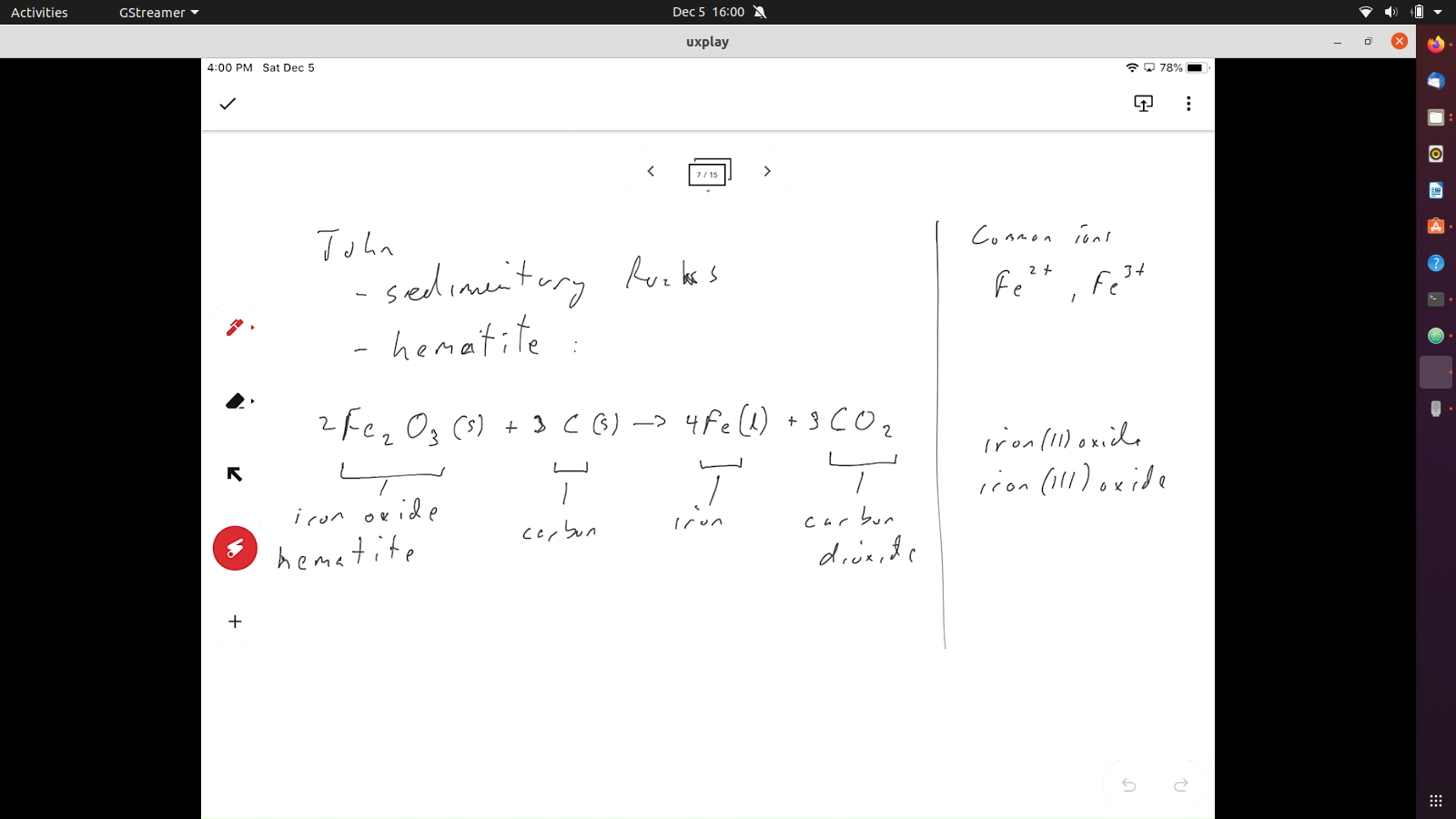
Screen mirrored using UxPlay showing my Jamboard notes that were written on the iPad.
Now, I just need to figure out the best way of streamlining the use of the program.
Update: I copied the “uxplay” executable into the “/usr/local/bin” folder so it’s now accessible from everywhere, and available to all users on the laptop.
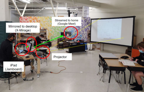
This year we’ve been doing a hybrid system with most students at school and a few, who’re more sensitive to the COVID risk, at home. Setting up the technology to accomplish this has been quite tricky, but we’ve settled on a system the works reasonably well.
Hardware
The standard system involves:
iPad: for notes that will normally be written on the board,
Computer: the iPad screen is mirrored on the computer and then,
Projector: to project what’s on the computer/iPad the kids in the classroom.
In practice it looks like this.
The iPad is mirrored to the computer which connects to the project and shares the screen with the kids at home.
If it looks a bit messy, that’s because it is.
Software
Video Conferencing
We’re using Google Meet for our video conferencing software, pretty much because we’re using Google Classroom for our classes and it’s built in. However, all you need is something that can share the computer screen with the kids at home, so Zoom, which we used in the spring, would probably work as well. One advantage of Meet is that it’s easy to set up a meeting for the class and the link is posted at the top of the page every time you log into Google Classroom.
Jamboard as a Whiteboard app.
After trying a few programs we’re using Google’s Jamboard as a whiteboard program for the iPad. Jamboards are shared documents, just like another Google Doc or Sheet, so in theory, if I shared the specific Jamboard document with them (which I do) the students at home could just follow along in the same document in real-time. In practice Jamboard can be extremely laggy, so I’ve given up on that approach and now I just share my entire computer screen over the video conferencing program.
One nice thing about Jamboard is that they are files, so the whiteboard notes can be saved and cataloged with other materials for a particular lesson or assignment. It’s also probably a good thing that you’re restricted to 20 slides otherwise I’d end up with some really large documents.
The ability to save them as files with all the other google documents, and the fact that it’s free, are the main reasons I prefer Jamboard to the other whiteboard options I’ve tried.
Mirroring the iPad (X-Mirage and UxPlay)
Mirroring the iPad to the computer turned out to be quite tricky. Since we’ve been working primarily with Windows PC’s, I ended up going with X-Mirage. I’ve set it up so X-Mirage automatically launches when you start up the computer, but it’s another piece of software to pay attention to. This program has a mac version as well. On the downside it costs about $14 for each computer it’s on.
I recently got my hands on a couple old (donated) laptops, and installed Linux (Ubuntu) on them for the operating system. In the few days I’ve been testing them they seem to work very well. For these I’ve used UxPlay as mirroring software, which has slotted into the system very, very well. Because it’s a command line program, setting up can be a little tricky.
In Summary
In summary, I have a system, and it works well enough that all of the other teachers have adopted it for their classes as well. This works for us because we can mostly use the hardware we have (we did have to buy iPads for the teachers who did not have them), and the software is fairly cheap. The kids at home appreciate it because it allows them to see and hear what’s going on in the classroom, especially what’s written on the board, pretty clearly. I’ve not heard many complaints from the kids at school.
As for the future, I am somewhat excited that I can effectively use the Linux computer now, and I’m always looking for ways to streamline.
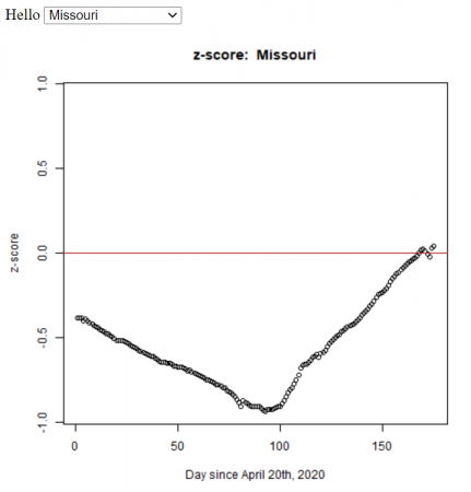
Missouri’s confirmed cases (z-score) compared to the other U.S. states from April 20th to October 3rd, 2020. The z-score is a measure of how far you are away from the average. In this case, a negative z-score is good because it indicates that you’re below the average number of cases (per 1000 people). For all the states.
Based on my students’ statistics projects, I automated the method (using R) to calculate the z-score for all the states in the U.S. We used the John Hopkins daily data.
The R functions (test.R) assumes all of the data is in a folder (COVID-19-master/csse_covid_19_data/csse_covid_19_daily_reports_us/), and outputs the graphs to the folder ‘images/zscore/‘ which needs to exist.
Let’s take a look at the summary statistics for the number of confirmed cases, which is in the column labeled “Confirmed”:
> summary(mydata$Confirmed)
   Min. 1st Qu.  Median    Mean 3rd Qu.    Max.
    317    1964    4499   15347   13302  253060
This shows that the mean is 15, 347 and the maximum is 253,060 confirmed cases.
I’m curious about which state has that large number of cases, so I’m going to print out the columns with the state names (“Province_State”) and the number of confirmed cases (“Confirmed”). From our colnames command above we can see that “Province_State” is column 1, and “Confirmed” is column 6, so we’ll use the command:
> mydata[ c(1,6) ]
The “c(1,6)” says that we want the columns 1 and 6. This command outputs
             Province_State Confirmed
1                   Alabama      5079
2                    Alaska       321
3            American Samoa         0
4                   Arizona      5068
5                  Arkansas      1973
6                California     33686
7                  Colorado      9730
8               Connecticut     19815
9                  Delaware      2745
10         Diamond Princess        49
11     District of Columbia      2927
12                  Florida     27059
13                  Georgia     19407
14           Grand Princess       103
15                     Guam       136
16                   Hawaii       584
17                    Idaho      1672
18                 Illinois     31513
19                  Indiana     11688
20                     Iowa      3159
21                   Kansas      2048
22                 Kentucky      3050
23                Louisiana     24523
24                    Maine       875
25                 Maryland     13684
26            Massachusetts     38077
27                 Michigan     32000
28                Minnesota      2470
29              Mississippi      4512
30                 Missouri      5890
31                  Montana       433
32                 Nebraska      1648
33                   Nevada      3830
34            New Hampshire      1447
35               New Jersey     88722
36               New Mexico      1971
37                 New York    253060
38           North Carolina      6895
39             North Dakota       627
40 Northern Mariana Islands        14
41                     Ohio     12919
42                 Oklahoma      2680
43                   Oregon      1957
44             Pennsylvania     33914
45              Puerto Rico      1252
46             Rhode Island      5090
47           South Carolina      4446
48             South Dakota      1685
49                Tennessee      7238
50                    Texas     19751
51                     Utah      3213
52                  Vermont       816
53           Virgin Islands        53
54                 Virginia      8990
55               Washington     12114
56            West Virginia       902
57                Wisconsin      4499
58                  Wyoming       317
59                Recovered         0
Looking through, we can see that New York was the state with the largest number of cases.
Note that we could have searched for the row with the maximum number of Confirmed cases using the command:
> d2[which.max(d2$Confirmed),]
Merging Datasets
In class, we’ve been editing the original data file to add a column with the state populations (called “Population”). I have this in a separate file called “state_populations.txt” (which is also a comma separated variable file, .csv, even if not so labeled). So I’m going to import the population data:
> pop <- read.csv("state_population.txt")
Now I’ll merge the two datasets to add the population data to “mydata”.
> mydata <- merge(mydata, pop)
Graphing (Histograms and Boxplots)
With the datasets together we can try doing a histogram of the confirmed cases. Note that there is a column labeled “Confirmed” in the mydata dataset, which we’ll address as “mydata$Confirmed”:
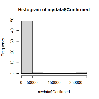
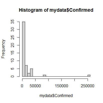
> hist(mydata$Confirmed)
Histogram of confirmed Covid-19 cases as of 04-20-2020.
Note that on April 20th, most states had very few cases, but there were a couple with a lot of cases. It would be nice to see the data that’s clumped in the 0-50000 range broken into more bins, so we’ll add an optional argument to the hist command. The option is called breaks and we’ll request 20 breaks.
> hist(mydata$Confirmed, breaks=20)
A more discretized version of the confirmed cases histogram.
Calculations (cases per 1000 population)
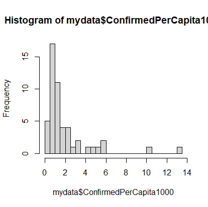
Of course, simply looking at the number of cases in not very informative because you’d expect, with all things being even, that states with the highest populations would have the highest number of cases. So let’s calculate the number of cases per capita. We’ll multiply that number by 1000 to make it more human readable:
The dataset still has a long tail, but we can see the beginnings of a normal distribution.
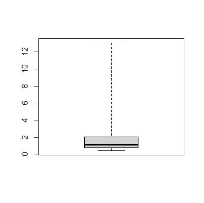
The next thing we can do is make a boxplot of our cases per 1000 people. I’m going to set the range option to zero so that the plot has the long tails:
> boxplot(mydata$ConfirmedPerCapita1000, range=0)
Boxplot of US states’ confirmed cases per 1000 people.
The boxplot shows, more or less, the same information in the histogram.
Finding Specific Data in the Dataset
We’d like to figure out how Missouri is doing compared to the rest of the states, so we’ll calculate the z-score, which tells how many standard deviations you are away from the mean. While there is a built in z-score function in R, we’ll first see how we can use the search and statistics methods to find the relevant information.
First, finding Missouri’s number of confirmed cases. To find all of the data in the row for Missouri we can use:
> mydata[mydata$Province_State == "Missouri",]
which gives something like this. It has all of the data but is not easy to read.
   Province_State Population Country_Region         Last_Update     Lat
26       Missouri    5988927             US 2020-04-20 23:36:47 38.4561
      Long_ Confirmed Deaths Recovered Active FIPS Incident_Rate People_Tested
26 -92.2884      5890    200        NA   5690   29      100.5213         56013
   People_Hospitalized Mortality_Rate      UID ISO3 Testing_Rate
26                 873       3.395586 84000029  USA      955.942
   Hospitalization_Rate ConfirmedPerCapita1000
26             14.82173              0.9834817
To extract just the “Confirmed” cases, we’ll add that to our command like so: