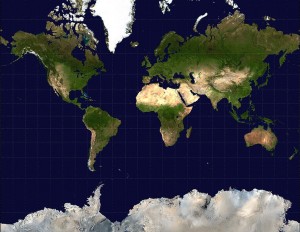
When introducing the x,y coordinate system using a world map it is most effective if you use the right type of map projection. Most maps use a Mercator projection which stretches thing out as you get closer to the poles. You can see this in how the latitude lines get further apart as you get closer to higher latitudes and Antarctica and Greenland get all stretched out.

The Mercator map is great for navigation, because if you measure angles on the map (bearings) between two places, you get the right bearing to sail your ship.
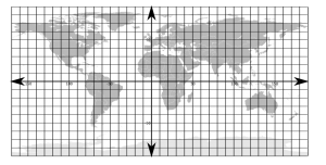
The better map to use for demonstrating the coordinate system would have an equirectangular projection, where all of the lines of latitude and longitude are equally spaced. These are harder to find, so I’m posting here a background map with the latitude and longitude marked on it (in 10 degree increments).

Notice the difference in sizes between the maps and the size of Greenland.
I’m also posting here, because it might be useful, a simple linear graph in Excel (or for OpenOffice) that simply plots lines if you enter the equation in slope-intercept form. There are lots of websites that let you do some really cool things (I’ll post about them later), but sometimes the simplest is what you want.