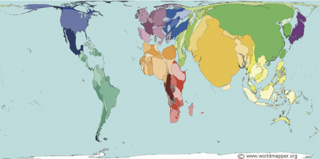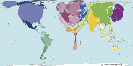

In the coming year we’ll be looking at inequalities in wealth around the world. One way of looking at this is via the two maps above from the WORLDMAPPER website. Countries are scaled by the population, in the first image, and wealth in the second.
Worldmapper also has quite the number of very interesting maps, including maps related to health, violence, pollution, food and ecology. The species at risk map ties in well with the study of the Earth’s resources.
They also distribute some animated maps as well as free software, called ScapeToad, that you can use to make your own maps. I like the fact that their maps and software are clearly licensed and allow free educational use.