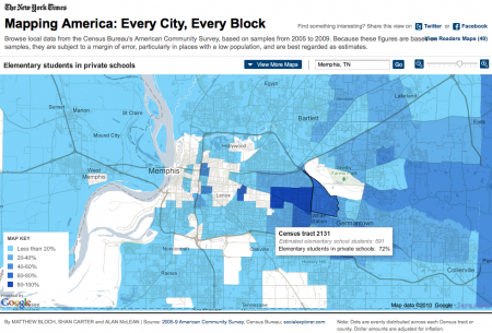
The New York Times has made data from the U.S. census available in an interactive map. This is an excellent tool to play with, since it has geographic information about income, race, education and more. The data is at the census tract level, so it is quite detailed.
I can see using this app being very useful for local research projects. Simply comparing the location of the different racial populations in a city like Memphis to the spatial distribution of income or education would probably tell a lot that we already intuitively know.