The Correlated website asks people different, apparently unrelated questions every day and mines the data for unexpected patterns.
In general, 72 percent of people are fans of the serial comma. But among those who prefer Tau as the circle constant over Pi, 90 percent are fans of the serial comma.
— ᔥ Correlated.org: March 23’s Correlation.
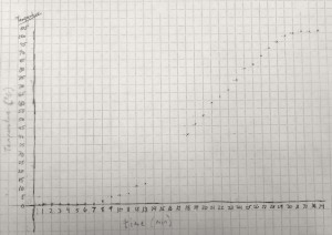
Two sets of data are said to be correlated when there is a relationship between them: the height of a fall is correlated to the number of bones broken; the temperature of the water is correlated to the amount of time the beaker sits on the hot plate (see here).

In fact, if we can come up with a line that matches the trend, we can figure out how good the trend is.
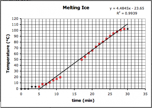
The first thing to try is usually a straight line, using a linear regression, which is pretty easy to do with Excel. I put the data from the graph above into Excel (melting-snow-experiment.xls) and plotted a linear regression for only the highlighted data points that seem to follow a nice, linear trend.

You’ll notice on the top right corner of the graph two things: the equation of the line and the R2, regression coefficient, that tells how good the correlation is.
The equation of the line is:
- y = 4.4945 x – 23.65
which can be used to predict the temperature where the data-points are missing (y is the temperature and x is the time).
You’ll observe that the slope of the line is about 4.5 ºC/min. I had my students draw trendlines by hand, and they came up with slopes between 4.35 and 5, depending on the data points they used.
The regression coefficient tells how well your data line up. The better they line up the better the correlation. A perfect match, with all points on the line, will have a regression coefficient value of 1.0. Our regression coefficient is 0.9939, which is pretty good.
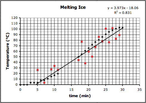
If we introduce a little random error to all the data points, we’d reduce the regression coefficient like this (where R2 is now 0.831):

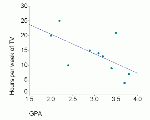
The correlation trend lines don’t just have to go up. Some things are negatively correlated — when one goes up the other goes down — such as the relationship between the number of hours spent watching TV and students’ grades.

Correlation versus Causation
However, just because two things are correlated does not mean that one causes the other.
A jar of water on a hot-plate will see its temperature rise with time because heat is transferred (via conduction) from the hot-plate to the water.
On the other hand, while it might seem reasonable that more TV might take time away from studying, resulting in poorer grades, it might be that students who score poorly are demoralized and so spend more time watching TV; what causes what is unclear — these two things might not be related at all.
Which brings us back to the Correlated.org website. They’re collecting a lot of seemingly random data and just trying to see what things match up.
Curiously, many scientists do this all the time — typically using a technique called multiple regression. Understandably, others are more than a little skeptical. The key problem is that people too easily leap from seeing a correlation to assuming that one thing causes the other.