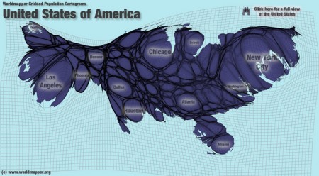
WORLDMAPPER has a nice interactive map that shows you how the population is distributed within different countries. The map above, of the United States, really shows how most of the population is located in the big cities. This map is a bit abstract, so I’m curious to see my students interpret it.
The BBC has a nice article explaining these maps, which includes animations showing how the maps were deformed.