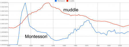
If you take all the books ever written and draw a graph showing which words were used when, you’d end up with something like Google’s Ngram. Of course I thought I’d chart “Montessori” and “muddle”.
The “Montessori” graph is interesting. It seems to show the early interest in her work, around 1912, and then an interesting increase in interest in the 1960’s and 1970’s. Like with all statistics, one should really be cautious about how you interpret this type of data, however, I suspect this graph explains a lot about the sources of modern trends in Montessori education. I’d love hear someone with more experience thinks.
Alexis Madrigal has an interesting collection of graphs, while Discover has an article with much more detail about what can be done with Google’s database.