The EPA's Surf Your Watershed site's Lower Missouri page.
The EPA has a number of excellent tools on its website that give access to a lot of environmental information. The Surf Your Watershed pages are particularly nice because they have specific links to citizen-based groups working in your watershed. Ours is the Lower Missouri Watershed, and the groups working there include schools, groups concerned about fish, and land trusts.
The site also links to the USGS streamflow data and some of their scientific research done in the area.
They’re a bit noisy, and would probably benefit from being reproduced in a more interactive format (Flash maybe), but they’re still a useful resource for talking about life cycles.
They’re a less dramatic presentation which can supplement the advocacy of the Story of Stuff video.
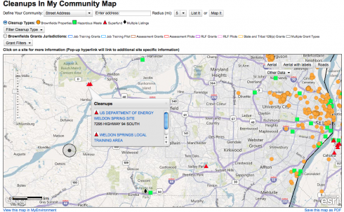
Enviromapper via the EPA. Image links to the map for St. Albans, MO, but you can find information for anywhere in the U.S..
The EPA’s Enviromapper website is great way to identify sources of hazardous materials and other types of pollution in your area, which might be a good way of stirring up student interest in the topic.
Not only can you map the broad category of pollution – air, water, radiation etc – but you can also find specific information about the different types of pollution or potential pollution the EPA has information about. I found a nearby site with sulfuric acid, for example.
And, if you want to slog through a lot of closely written reports, you can find a lot more details about any site you come across. Some of this information might also be useful – who knows?
The answer: maybe. There are just a lot of assumptions that have to be made. Is falling bird poop spherical? What’s its density? How does the bird poop deform on impact? What is the compressive strength of automobile glass?
This is however an excellent real-life application of back-of-the-envelope physics and algebra. It required calculating:
the volume of the poop – extrapolated from the diameter of the residue on the windshield;
the terminal velocity of the poop – the velocity where gravity’s force is exactly counterbalanced by wind resistance so the poop is at its maximum speed;
the force of impact – calculated using the work done as the poop splatters;
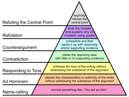
Andrew Sullivan highlights Daveed Gartenstein-Ross’ explanation of why it’s so important to be civil in any argument.
I’ve come to see civility as important for a variety of reasons, but honestly, practical reasons loom rather large. First of all, it’s generally hard to win a name-calling contest. If I call someone an America-hating pinko, they can fire back that I’m a right-wing tool of the military industrial complex. Those two insults seem essentially to cancel each other out: why give someone an area that can end up a draw if I believe that I can prove all of my other arguments to be correct? Second, I find that if I’m civil, I can actually (sometimes) persuade people I’m arguing against that they’re wrong about an issue. In contrast, if I begin a debate by insulting someone, it only further entrenches him in his initial position, thus making it more difficult to talk sense into him. …
Being polite isn’t the same as being a pushover, nor is it the same as false collegiality that needlessly avoids confrontation. Indeed, I think that kind of fake collegiality should be avoided: the review I published this year of Robert Pape and James Feldman’s Cutting the Fuse is probably one of the harshest critiques a graduate student has produced of a work of that stature. But again, it eviscerates their argument without really personalizing the matter.
A couple days ago I had students present their physics lab reports to the class. They did a good job, but I think I need to emphasize the importance of including graphs in their results. It’s much harder to look for trends and patterns in the data without charts, especially when presenting to an audience.
An interesting political science study (via Yglesias) found that it’s much easier to change people’s minds when you show them graphs, even when people don’t want to believe what you’re telling them.
[P]eople cling to false beliefs in part because giving them up would threaten their sense of self. Graphical corrections are … found to successfully reduce incorrect beliefs among potentially resistant subjects and to perform better than an equivalent textual correction.
Despite the fact that the number of jobs increased in the last year (according to the Bureau of Labor Statistics), many people who disapprove of President Obama believe that the economy lost jobs. A lot of people who were told this with text still believed that there was a net job loss, but when presented with a graph of the actual data the number decreases to close to zero. (Graph from Nyhan and Reifler (2011)
Teachers know how hard it can be to correct misconceptions – people tend to stick with the first thing they learned – so it’s good to see that graphical corrections can make a big difference.
Fortunately, my physics students are changing over to math next week, so we’ll be able to use their experimental data to draw lines, find gradients and do all sorts of interesting things.
If you pull apart an atom, the individual parts will weigh more than the atom you started with. The extra mass is the binding energy, which is released when the nucleus of atoms break apart (nuclear fission).
If you pull apart the nucleus of an atom, you’ll find that the mass of its parts is greater than the mass of the original nucleus. That extra mass is where nuclear energy comes from; it’s called the binding energy.
How so?
An alpha particle is the nucleus of a helium atom.
Take a helium atom for example. Its nucleus typically has two protons and two neutrons*, which in nuclear physics is usually called an alpha particle (α).
While we usually say that the mass of a proton is 1 atomic mass unit (u), its actually a little heavier. The mass of a proton is 1.00728 atomic mass units (u), while neutrons weigh 1.00866 u.
The alpha particle (helium nucleus) has less mass than sum of the masses of the individual particles that make it up.
The combined mass of the two protons and two neutrons in the helium nucleus is 0.03035 atomic mass units more than the mass of a helium nucleus made up of the very same particles.
Why?
The one equation that everyone remembers from Einstein (perhaps from all the t-shirts) is:
Energy (E) is equal to mass (m) times some constant (c is the speed of light) squared. What it means is that mass is energy, and vice-versa.
When the four nucleons combine, the extra mass is transformed into the energy that holds them together in the nucleus of the atom. The mass can be directly converted to energy, the binding energy of the atom.
How much energy is released?
Somewhere around 10,000 times more energy is released from a single nuclear reaction compared to a single chemical reaction (like the combustion of TNT).
Binding energy per neuleon for the naturally occuring elements. (image from Science in School).
Footnotes
* Helium with two neutrons would be written , where the bottom number is the number of protons and the upper number is the atomic mass, which is the sum of the number of protons and the number of neutrons.
Marketplace’s Jeff Horwich has an excellent article on the uses of the element phosphorus, where it comes from, why it’s getting scarce, and where we might get more.
The answers to these questions are:
It’s a key element in DNA, so the major use is fertilizer,
most of it comes from Morocco these days,
since Morocco supplies about 85% of the world supply, they’re developing a bit of a monopoly and the price is going up,
the main alternative sources are manure and urine that have lots of phosphorous. In fact, burning sewage leaves behind a phosphorous rich ash.