Video by Tobais Friedrich out of the University of Hawaii. It’s based on a recent paper that suggests that the large fluctuations in climate over the last 120,000 years opened and closed green corridors that allowed multiple pulses of migration out of Africa.
I’ve created a new Makerspace Blog for my students to post their projects. Sharing what you’ve learned and done is an important part of our learning. We always have a sharing session at the end of interims that we invite the rest of the school to take a look at what the makerspace students have accomplished.
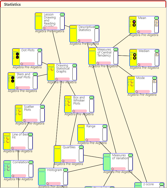
Flowchart in progress. Showing topics being covered in basic statistical graphing. The topics they are working on at the moment are highlighted in yellow. The worksheets attached to each topic are linked on the left side in the highlighted area.
To help students track their progress in math we’ve started requiring them to map what they’re doing on flowcharts. Right now, they’re doing it on paper, but we’re working on getting it to be all electronic.
Tracking with the charts helps them see how what they’ve done fits into the bigger picture. It allows them to be able to go back up the chart to previous topics if they need to review, and look forward to what comes next (and to work ahead if they would like).
The image above shows a sample what a student’s flow chart would look like while they are working on a subject (statistics in this case). The topics they are working on at the moment are highlighted in yellow. The worksheets attached to each topic are linked on the left side in the highlighted area. Links to references (Khan Academy for example) are linked on the right–there are only a few on right now (see the Mean topic on the upper right of the flowchart).
The topics on the flowchart can be expanded (using the green button on the top right of each topic) to show more detail.
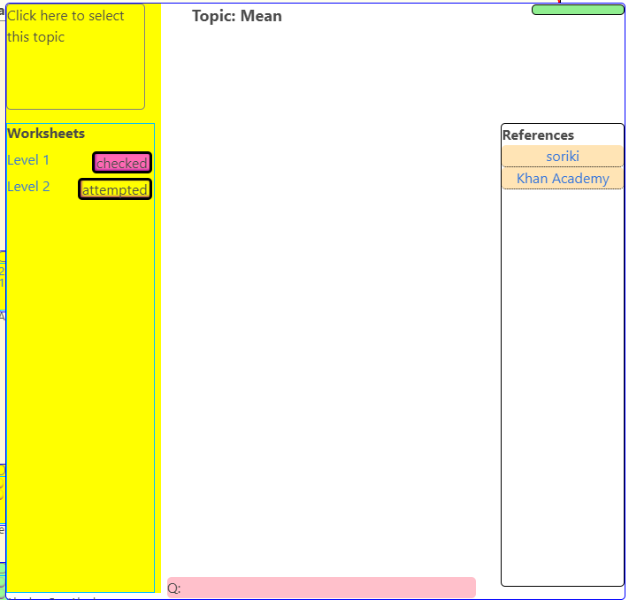
Expanded window for the topic “Mean”. Detail on the topics is a little sparse at the moment as we’re focusing on setting up all of the flowcharts first.
At the moment, I’m uploading the flowcharts that we’re currently using up on the website myself. Students can use the website to get worksheets and links to references, but if they mark what they’re doing on the webpage it’s not saved. We’re currently working on making it possible to create and edit flowcharts on the website itself. After that, we’ll be setting it up so students can log in with their school accounts and track their progress electronically. One ultimate goal is to map the entire upper school curriculum with these flow charts so a student might be able to track their work all the way from 7th to 12th grade.
Watch a single cell become a complete organism in six pulsing minutes of timelapse. A film by Jan van IJken (www.janvanijken.com).
More on this video: aeon.co/videos/watch-a-single-cell-become-a-complete-organism-in-six-pulsing-minutes-of-timelapse
Watch more on Aeon: aeon.co/video
Subscribe: vimeo.com/aeonvideo
An exceptional timelapse of the developing of an Alpine newt by Jan van IJken
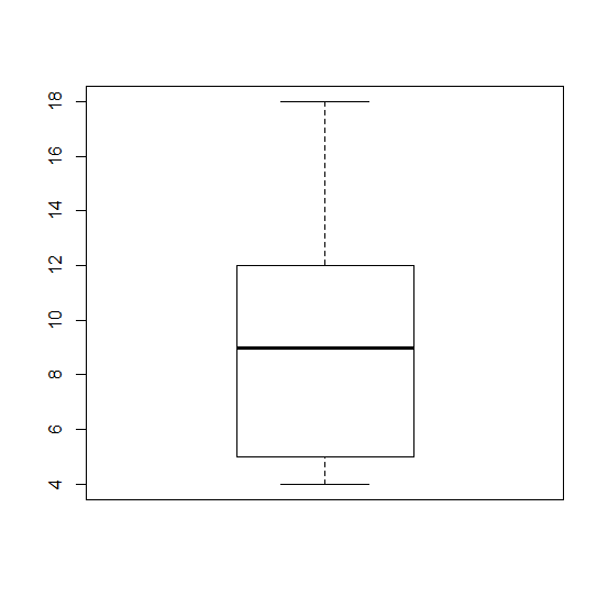
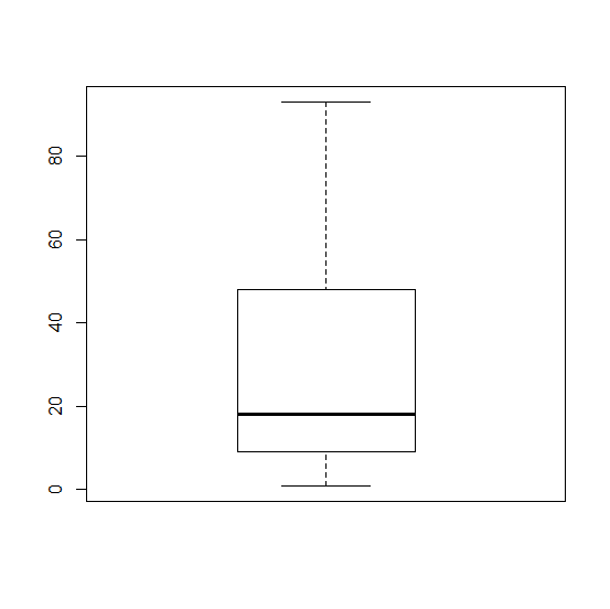
A box plot is a graph that helps you to analyze a set of data. It used to show the spread of the data. In it you use five data points: the minimum, the 1st quartile, the median, the 3rd quartile, and the maximum.
The minimum is the lowest point in your data set, and the maximum is the largest. The median is the number in the middle of the data set when you have the number lined up numerically.
For example if your data set was this:
5, 6 ,11, 18, 12, 9, 4
First you would put them in order lowest to highest.
4, 5, 6, 9, 11, 12, 18
Your median would be 9, because it is the middle number. The minimum would be 4, and the maximum would be 18.
The first quartile would be 5, the median of the numbers below 9, and the third quartile would be 12, the median of the numbers above 9.
So the data you would use in your boxplot would be
(4,5,9,12,18)
The boxplot would look like would look like this.
Example boxplot #1.
What is R?
R is a software program that is free to download that you can use for calculating statistics and creating graphics.
Here is their website: https://www.r-project.org/
Boxplots in R
In R you can create a boxplot by using this formula.
> Name of data set <- c(minimum, quartile 1, median, quartile 3, maximum)
> boxplot(Name of data set)
First you have to name your data set. In our project where we analyzed the number of times people repeated their Shakespeare lines that they performed, I used the name Macbeth. So the formula looked like this:
> Macbeth <- c(1,9,18,48,93)
> boxplot(Macbeth)
Using this data set, your box plot should look like this
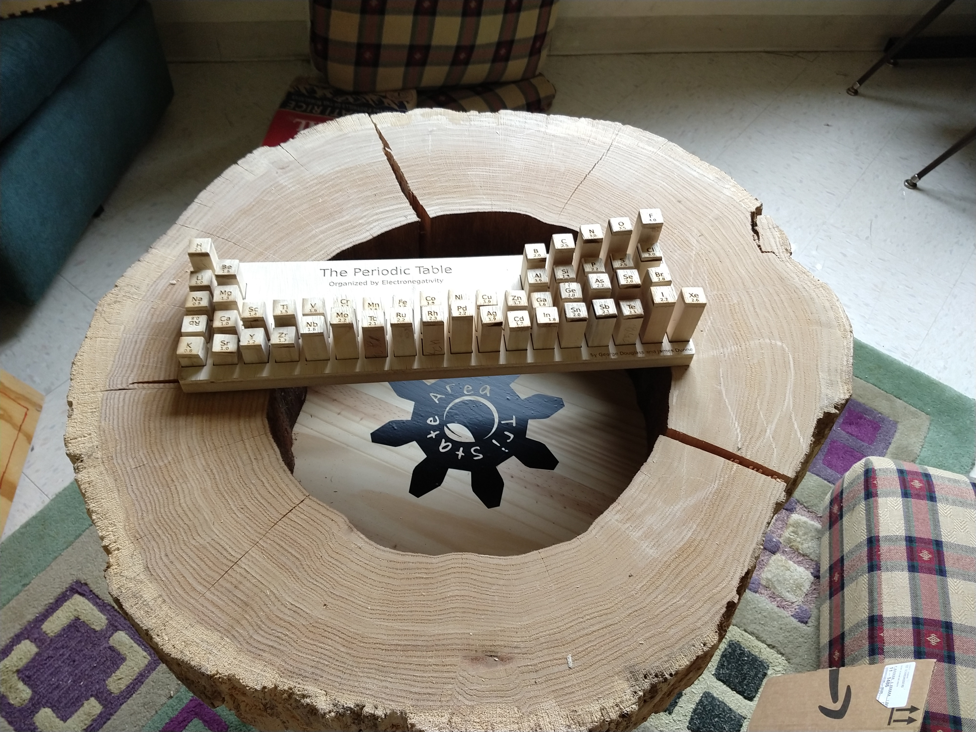
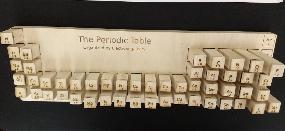
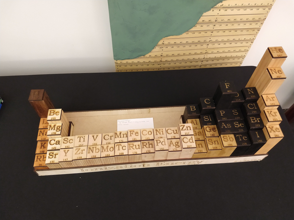
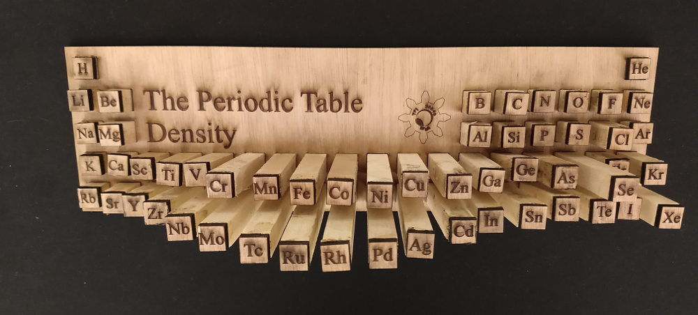
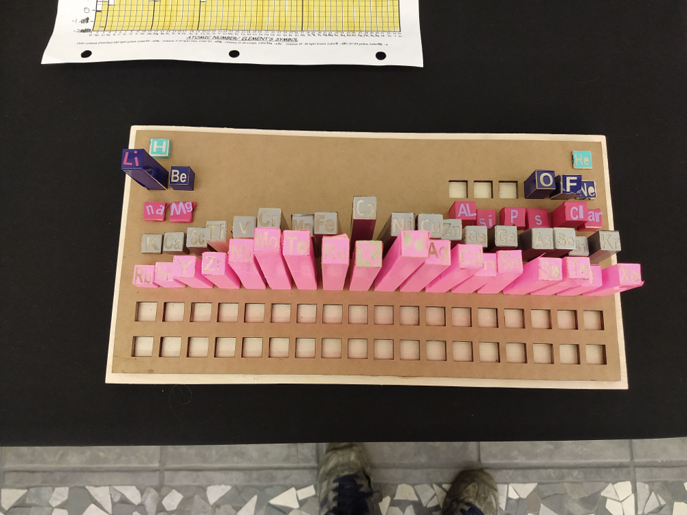
Ms. Fu’s chemistry class were given a project to make 3d periodic tables based on the properties of the elements. A few groups went with Makerspace options, using the new vinyl cutter and laser.
3d Periodic Table showing electronegativity. Laser cut.Periodic Table relief based on ionization energy. The blocks on this one have 1.5 inch square bases. The colors for the different regions use stains including tea (assam) and blackberry juice extracted from berries from the canes on campus.
The part that took the longest was marking all the columns for cutting. A worthwhile assignment would be to write a program to automatically make the cut-marks in an svg file that can be etched with the laser.
Periodic Table column heights based on density. Laser cut.Paper columns and vinyl cut lettering on this periodic table.
This year, as part of orientation, we showed a couple videos to students to get them thinking about the key questions:
Why are we here?
What do we want our culture to be like?
What do we need to do to make our culture the way we want it to be?
The one I showed, a TED talk by Tony Fadell focuses on how he sees the world as a designer: looking for those small nuisances to which we’ve become habituated by paying closer attention to detail, looking for the big picture, and trying to see things with new, childish eyes.
I think it was successful in that I’ve been hearing it come up–particularly the term habituation (although the students could often not remember the actual term)–a few times already this semester.