Ridiculously beautiful computer animation of a spider catching a moth by Polynoid.
They have more on their website and on their Vimeo page, including a few animations showing how they created these works of art.
Middle and High School … from a Montessori Point of View
The objective is to show the shape of the whole and to express the beauty and cosmic reach of the periodic system.
— Stewart (2006): The Chemical Galaxy
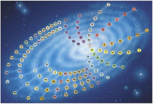
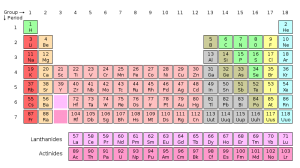
The traditional periodic table of the elements breaks the elements into rows as their chemical and physical characteristics repeat themselves. But since the sequence of elements is really a continuous series that gradually increases in mass, a better way of displaying them might be as the spiral, sort of like the galaxy.
When the chemical elements are arranged in order of their atomic number, they form a continuous sequence, in which certain chemical characteristics come back periodically in a regular way. This is usually shown by chopping the sequence up into sections and arranging them as a rectangular table. The alternative is to wind the sequence round in a spiral. Because the periodic repeats come at longer and longer intervals, increasing numbers of elements have to be fitted on to its coils. …
The resulting pattern resembles a galaxy, and the likeness is the basis of my design. It seems appropriate, as the chemical elements are what galaxies are made of.
…
The ‘spokes’ of the ‘galaxy’ link together elements with similar chemical characteristics. They are curved in order to keep the inner elements reasonably close together while making room for the extra elements in the outer turns.
— Stewart (2006): The Chemical Galaxy
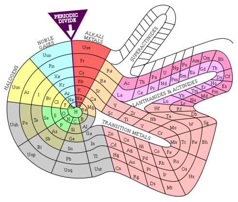
While the spiral version of the periodic table is not used a lot, it is scientifically valid. There are other ways of representing the spiral and the periodic table itself. It all depends on what you want to show.
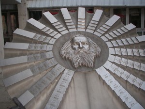
Indeed, Mendeleev’s monument in Bratislava, Slovakia has the elements arranged as the spokes in a wheel.

A number of my middle-school students seemed to believe that recycling is the be-all and end-all of environmentalism.

We were trying to determine what type of material would make for the best drink bottles.
I have a deep reluctance to reflexively consider anything, “good for the environment,” considering that the environmental impact of any particular product is a complex thing to assess. My students, on the other hand, seem to think that recycling is good and all the rest of it can go hang.
I’d want to add up all the environmental costs: the raw materials; the energy input; the sources of the energy input; and the emissions to the air and water, especially all the other external costs of pollutants that people tend not to want to pay for. To my students, these things have been invisible.
Perhaps it’s the success of the environmental movement that’s pushed things to the background. We’re not struggling through smog everyday – although we’ve had some bad days this summer – and even big issues, like the BP oil spill, are a bit remote and seem so far away.
So, I tried showing the Story of Stuff today. It’s definitely a piece with a “point-of-view”, but I was hoping it would be provocative.

And it was.
It certainly got a lot of the students agitated, ready to challenge its assertions about just how bad pollution problems really are today, which created a nice opening for me to point out the need for skepticism in the face of any information received. Of course, at that point they were probably a little skeptical about me too, but reasoned skepticism is at the heart of the scientific perspective I’d like them to learn as “apprentice” scientists.
I’d like them to read Orwell too, but that’s another battle.
One student was stimulated enough that, I hope, they’ll actually do a little research into the facts presented in the video and present their findings to the class.
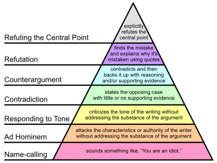
I’ll also have to do a little follow-up on how to argue. In particular I’ll need to post a picture of Paul Graham’s Hierarchy of Disagreement and point out that it’s better to try to refute the actual argument rather than attack the messenger.
We’ll see how it goes tomorrow.

The EPA has a number of excellent tools on its website that give access to a lot of environmental information. The Surf Your Watershed pages are particularly nice because they have specific links to citizen-based groups working in your watershed. Ours is the Lower Missouri Watershed, and the groups working there include schools, groups concerned about fish, and land trusts.
The site also links to the USGS streamflow data and some of their scientific research done in the area.
The EPA’s student resource page has a few interesting publications on the life cycles of a few common products: CD/DVD’s, cell phones, and soccer balls.
They’re a bit noisy, and would probably benefit from being reproduced in a more interactive format (Flash maybe), but they’re still a useful resource for talking about life cycles.
They’re a less dramatic presentation which can supplement the advocacy of the Story of Stuff video.

The EPA’s Enviromapper website is great way to identify sources of hazardous materials and other types of pollution in your area, which might be a good way of stirring up student interest in the topic.
Not only can you map the broad category of pollution – air, water, radiation etc – but you can also find specific information about the different types of pollution or potential pollution the EPA has information about. I found a nearby site with sulfuric acid, for example.
And, if you want to slog through a lot of closely written reports, you can find a lot more details about any site you come across. Some of this information might also be useful – who knows?
A couple days ago I had students present their physics lab reports to the class. They did a good job, but I think I need to emphasize the importance of including graphs in their results. It’s much harder to look for trends and patterns in the data without charts, especially when presenting to an audience.
An interesting political science study (via Yglesias) found that it’s much easier to change people’s minds when you show them graphs, even when people don’t want to believe what you’re telling them.
[P]eople cling to false beliefs in part because giving them up would threaten their sense of self. Graphical corrections are … found to successfully reduce incorrect beliefs among potentially resistant subjects and to perform better than an equivalent textual correction.
–Nyhan and Reifler (2011): Opening the Political Mind? The effects of self-affirmation and graphical information on factual misperceptions
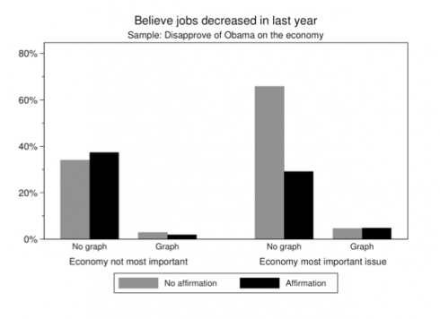
Teachers know how hard it can be to correct misconceptions – people tend to stick with the first thing they learned – so it’s good to see that graphical corrections can make a big difference.
Fortunately, my physics students are changing over to math next week, so we’ll be able to use their experimental data to draw lines, find gradients and do all sorts of interesting things.
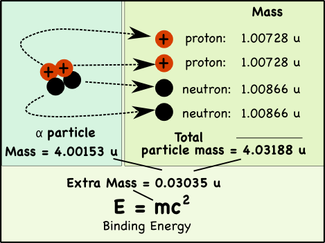
If you pull apart the nucleus of an atom, you’ll find that the mass of its parts is greater than the mass of the original nucleus. That extra mass is where nuclear energy comes from; it’s called the binding energy.
How so?
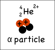
Take a helium atom for example. Its nucleus typically has two protons and two neutrons*, which in nuclear physics is usually called an alpha particle (α).
While we usually say that the mass of a proton is 1 atomic mass unit (u), its actually a little heavier. The mass of a proton is 1.00728 atomic mass units (u), while neutrons weigh 1.00866 u.
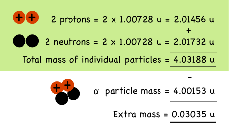
The combined mass of the two protons and two neutrons in the helium nucleus is 0.03035 atomic mass units more than the mass of a helium nucleus made up of the very same particles.
Why?
The one equation that everyone remembers from Einstein (perhaps from all the t-shirts) is:
![]()
Energy (E) is equal to mass (m) times some constant (c is the speed of light) squared. What it means is that mass is energy, and vice-versa.
When the four nucleons combine, the extra mass is transformed into the energy that holds them together in the nucleus of the atom. The mass can be directly converted to energy, the binding energy of the atom.
How much energy is released?
Somewhere around 10,000 times more energy is released from a single nuclear reaction compared to a single chemical reaction (like the combustion of TNT).
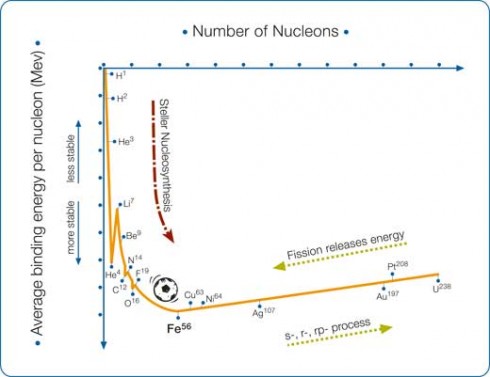
* Helium with two neutrons would be written ![]() , where the bottom number is the number of protons and the upper number is the atomic mass, which is the sum of the number of protons and the number of neutrons.
, where the bottom number is the number of protons and the upper number is the atomic mass, which is the sum of the number of protons and the number of neutrons.