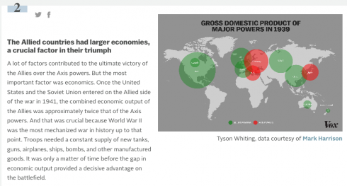
Vox does some great articles using maps to explain things like World War II (which is always a popular middle/high school topic for history papers). What the site does best, is that it accompanies each map with an explanation of what was going on. This results in a set of really interesting vignettes that stoke the curiosity bunkers.
Naill Ferguson gives a provocative talk about his thesis that there are six “Killer Apps” that made western civilization so successful over the last five centuries.
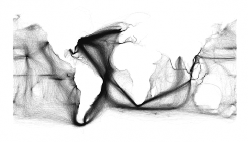
Ships tracks in black, plotted on a white background, show the outlines of the continents and the predominant tracks on the trade winds. Image and caption from Sapping Attention.
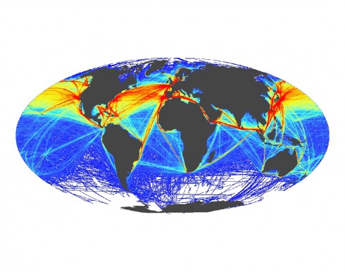
For an interesting historical contrast — that highlights the change from wind to engine powered ships and the opening of the Panama and Suez canals — above is Ben Schmidt’s image created from the log books of U.S. ships in the 19th century, while below is a figure by Ben Halpern showing modern shipping patterns.
This map shows the frequency of shipping traffic along shipping routes around the world, ranging from low (blue) to high (red). Image and caption from SeaWeb.
The first image also clearly shows the triangular trade routes between the Americas, Europe and Africa.
Schmidt also has some wonderful videos showing, among other things, the routes of whaling ships that are pushed farther and farther out as they drive whale populations toward extinction.
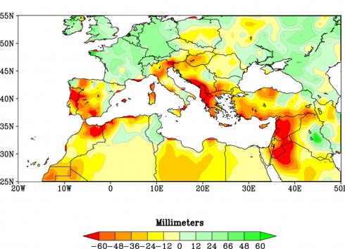
Reds and oranges highlight lands around the Mediterranean that experienced significantly drier winters during 1971-2010 than the comparison period of 1902-2010. Credit NOAA.
A 2011 article from the National Oceanic and Atmospheric Administration linked recent severe droughts in the Mediterranean to anthropogenic climate change. Now Francesco Femia and Caitlin Werrell assert that the drought (and agricultural mismanagement) lead to the displacement of a million and a half people in Syria, which helped spark the current civil war.
WikiLeaks, Drought and Syria by Thomas Friedman: Cables from 2008, outline Syria’s growing recognition of the potential for civil unrest because of the drought.
For talking about migration, here’s a short video showing one day’s worth of air traffic around the world from the Zurich School of Applied Sciences. It’s pretty amazing.
Making the figurative a little more literal: using the soccer field as a map.
One of the games Dr. A. plays with the middle school geography class is to have them use the soccer field as a large map. They chose a place and someone runs to its location on the field. What I like is that he insists that the map be all in their heads. They might have one or two control points, but they have to visualize the map mentally.
I saw them out on the soccer field today, and I thought I’d make their imaginary map a little more literal in Gimp.
UPDATE: Dr. A[ustin] clarifies the rules of the competitive game they were playing in the comments below, in case anyone wants to try it.
Update 2: Move your mouse over the image below to see the picture with or without the map (larger version here).