Sarajevo roses

Sarajevo rose. (Image from Wikipedia)

Mortar shells landing on concrete create a pattern almost like a floral arrangement. In Sarajevo, after the Bosnian War, the mortar scars in the sidewalks were filled in with red resin. The results are called Sarajevo Roses.

Flickr has a nice map that links to Rose pictures in downtown Sarajevo.

I found out about these from reading a recent set of View From Your Window Contest entries on Andrew Sullivan’s blog.

Oil does not come from dinosaurs.

Phytoplankton (image from NASA).

There’s a nice article in the New York Times on the fact that oil, petroleum, did not come form dead dinosaurs, but rather from the microscopic plankton that died and fell to the ocean floor.

The idea that oil came from the terrible lizards that children love to learn about endured for many decades. The Sinclair Oil Company featured a dinosaur in its logo and in its advertisements, and outfitted its gas stations with giant replicas that bore long necks and tails. The publicity gave the term “fossil fuels” new resonance. – Broad, 2010

It’s easy to forget how pervasive is the idea that oil comes from dinosaurs. Broad’s article is a nice reminder that:

Today, a principal tenet of geology is that a vast majority of the world’s oil arose not from lumbering beasts on land but tiny organisms at sea. It holds that blizzards of microscopic life fell into the sunless depths over the ages, producing thick sediments that the planet’s inner heat eventually cooked into oil. It is estimated that 95 percent or more of global oil traces its genesis to the sea. – Broad, 2010

How do we know?

[I]n the 1930s. Alfred E. Treibs, a German chemist, discovered that oil harbored the fossil remains of chlorophyll, the compound in plants that helps convert sunlight into chemical energy. The source appeared to be the tiny plants of ancient seas. – Broad, 2010

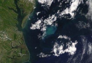
Phytoplankton bloom off the Carolina coast. (Image from NASA).

We tend to find a lot of oil in the deltas of the great rivers because the rivers provide nutrients for the microorganisms to survive and layers of sand and clay sediments that trap the oil and natural when they’re produced.

The article also ties the location of oil production to the geography of plate tectonics.

[W]hen Africa and South America slowly pulled apart in the Cretaceous period, forming the narrow beginnings of the South Atlantic. Big rivers poured in nutrients. A biological frenzy on the western shores of the narrow ocean ended up forming the vast oil fields now being discovered and developed off Brazil in deep water. – Broad, 2010

Nuclear explosions

The history of the second half of the 20th century is interlaced with the history nuclear weapons. From ending the Second World War in the Pacific to mutually assured destruction to the conflict between India and Pakistan. It’s fascinating how you can interpret that history from video above showing the relative timing of the nuclear explosions. It also interesting to note just how many nukes were exploded and by whom. Wired magazine has a good article about the video, and I’ve posted previously about tying nuclear weapons into both the Natural and Social sciences.

FreeRice – donate food with your vocabulary skills

Donate rice by answering vocabulary questions.

The UN World Food Program (WFP) has the site FreeRice.com where for each vocabulary question you answer correctly it donates 10 grains of rice to the WFP. The site is quite ingenious, it uses the money generated by the banner adds at the bottom of the page to buy the rice. It was created by John Breen and donated to the WFP.

The site is going beyond vocabulary into other subjects such as geography (identify country capitals and countries), identifying chemical symbols, art, language and math (pre-algebra).

They also have a nice video of the rice being distributed to refugees from Myanmar sheltering in Bangladesh.

Surveys say …

Another nice resource that provides neat graphs of real data that are easy for students to understand is Pollster.com. The graphs of survey results are constantly updated and, if you want to, you can go into how they were created (survey questions, averages etc.). They’re great for current event discussions and research projects.

In addition to the national polls, like the president’s job approval (see below), the site also has charts for state level races, like for governor, which are handy around election time.

Pollster.com aggregates polls, because, depending on how a question is phrased, each poll will have it’s own bias. However, since not all of the poll data is freely available to the public, the sites of the major polling organizations, like GALLUP, are also quite useful. The polling organizations tend to have a much wider variety of poll results available. Gallup in particular provides some very nice graphs.

Country population maps

Population distribution in the U.S. © Copyright SASI Group (University of Sheffield) and Mark Newman (University of Michigan).

WORLDMAPPER has a nice interactive map that shows you how the population is distributed within different countries. The map above, of the United States, really shows how most of the population is located in the big cities. This map is a bit abstract, so I’m curious to see my students interpret it.

The BBC has a nice article explaining these maps, which includes animations showing how the maps were deformed.