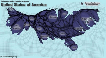
WORLDMAPPER has a nice interactive map that shows you how the population is distributed within different countries. The map above, of the United States, really shows how most of the population is located in the big cities. This map is a bit abstract, so I’m curious to see my students interpret it.
I remember playing the game with a rolled up spheroid of aluminum foil. For kids living in poverty in the developing world something as simple as a soccer ball is an expensive luxury. Jessica Hilltout has a coffee table book out called “Amen: Grassroots Football“, with photographs of the “balls” she’s seen used in Africa. The video above has just a small selection.
The pictures speak to, and help explain, the popularity of soccer around the world. Unfortunately, I’m not quite sure how to order the book, but the website does allow you to look inside.
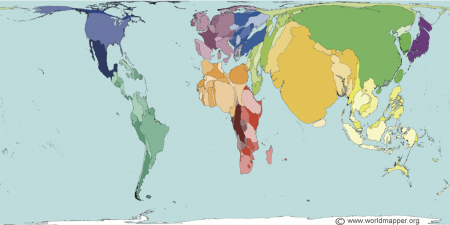
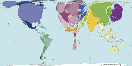
In the coming year we’ll be looking at inequalities in wealth around the world. One way of looking at this is via the two maps above from the WORLDMAPPER website. Countries are scaled by the population, in the first image, and wealth in the second.
They also distribute some animated maps as well as free software, called ScapeToad, that you can use to make your own maps. I like the fact that their maps and software are clearly licensed and allow free educational use.
The Omnivore’s dilemma has a version for young readers. The full version is a good read, but is a bit long. One of my student read the first chapter and did not get too excited, so maybe this one will be a more captivating read.
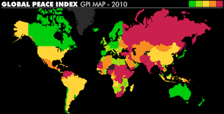
The peace index is based on quite the number of factors, some subjective, including, “Perceived criminality in society”, “Respect for human rights”, “Weapons exports” and “Number of conflicts fought”. All these factors were weighed and tabulated based on the input of an international team. It’s assembled by the Institute for Economics and Peace who have a number of downloadable peace education teaching materials designed for 14-16 year olds on their website.
They have an excellent video (see below) explaining what the peace index is all about and the effect that peaceful societies have on economic growth.
The maps and video would be excellent additions to our discussions of war and peace. I especially like that they try to directly link peace with economic growth, which offers something almost tangible whose importance and implications students can fairly easily understand. I really like these resources.
I’ve had a number of posts based on stuff I learned this summer at the Fed. Most of it has been about the resources and tools they have available on their website and it can be a little intimidating trying to figure out how to actually use all of this data.
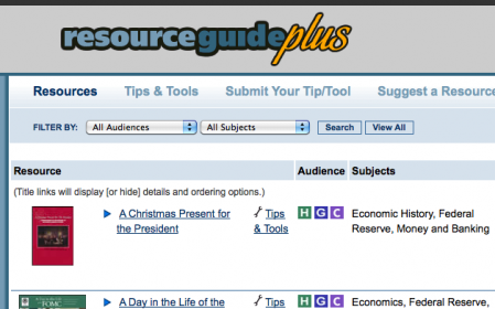
So the Fed has created Resource Guide Plus, a collection of activities, simulations, publications and tools for the classroom. The activities have pretty good instructions and use the resources available on the Fed’s website. They were kind enough to post the math and economics activity I worked on at the meeting (also posted here) in their Tips and Tools section.
The activities are searchable and geared mostly toward middle and high school though there are some elementary ones in there too.
The Boston Federal Reserve Bank publishes (occasionally) a newsletter with easy-to-read articles on economic subjects. Themes include: Immigration; Economic Resources on the web (as 2008); Coping with economic change; Varied Perspectives on the Global Economy; Are We Better Off Than We Were?; and, The Economics of Entertainment.