We just planted seeds using peat pellets. The students are always impressed by just how much they expand when you add water, so one student decided to record it on video. Since they recently acquired a new iPhone app that reverses the video, they posted the video played backwards.
Category: Technology
Recipes for revolution
The Economist has come up with a neat little flash app that combines all the ingredients to see which Arab countries are ripest for revolution. They call it their “Shoe Thrower’s Index”.
We’ve seen how a combination of demographics (lots of young people), an educated middle class, and protests might lead to revolutions (which still often come as a surprise). With The Economist’s table you get to choose which factors you think are most important.
Move the slider bars on the right to set the “weight” of each indicator of revolution to what you think is most important, and the chart on the left will adjust itself to show which countries are more likely to have a revolution based on your parameters.
(found via The Dish)
Geography of data
OK. For someone like me this map is just ridiculously addictive. Produced by Revolver Maps, it shows the locations of everyone who’s visited the Muddle since March 5th (2011). If you click on the map it will take you to their page where you can find out more about the locations of all those dots.
The points on the map are a fascinating result of a combination of population distribution, language, technologic infrastructure (and wealth), and the miscellaneous topics on which I post.

Overlaying at the location of hits after two days, on a population density map of the U.S. shows the obvious: the more people there are, the more likely it is that someone would stumble upon my blog. The eastern half of the U.S. with its higher populations are well represented, as is the west coast, while the hits in between come from the major population centers.
The pattern of hits from Australia shows very precisely that the major population centers are along the coast and not in the arid interior.

Africa, however, tells a much different story. The large population centers are along the equatorial belt of sub-Saharan Africa. But even now, there are very few if any hits from that region. I suspect that’s largely because of language and lack of access to the internet. The Muddle is not exactly the most popular on the internet, so it probably takes a lot of people on computers for a few to find their way to it. Contrast sub-Saharan Africa to South Africa, which is relatively wealthy, uses English as its lingua franca (working language), and has seen at least a few people hit the Muddle.
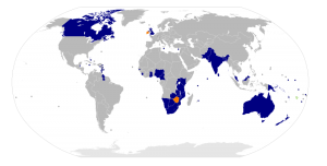
Language also plays in big role in the pattern of hits from Europe and Asia. There are many English speakers in western Europe, a very high population density, and so a lot of hits, but the British Isles, as might be expected, are particularly well represented. Similarly in Asia, the members of the Commonwealth are show up disproportionately.
From the middle east, there have been a several hits from the wealthy small states like Bahrain and Qatar, but also a number from Egypt. The Egyptian interest in particular seems to stem from my posts on the recent revolution. No-one from that part of the world has commented on any of it so far, so I have no idea if they find the posts positive, negative, indifferent or whatever. I’d be curious to find out, since even negative feedback is important.
On the note of current events, my post on the plate tectonics of the earthquake in Japan has engendered quite a number of hits, and some positive feedback in the comments section and via email (one from a Japanese reader). In the week since the earthquake more than half the hits to the Muddle have been to that post, largely because it’s been popping up on the front page of the Google search for “plate tectonics earthquake Japan”.

It has been fascinating seeing people from so many different countries hitting my blog. Since most don’t comment, or drop me a note, blogging often feels quite lonely, like I’m just talking to myself. Self-reflection was the original purpose for this blog, and I find that combining writing and graphics really works for me as a way of expressing myself.
Yet, this blog would not be public if I did not have an insatiable urge to share. So thanks for reading, and don’t be afraid to comment. I am a Montessori middle school teacher after all, so I tend not to bite. Although, if you do try to post a comment and it doesn’t show up it may be because it got caught in my spam filter; there is a 1000:1 ratio of spam to legitimate comments so it’s hard for me to catch any mistakes. Sending me an email should fix that though.
The Middle School Bank and Trust: A Personal Finance Simulation
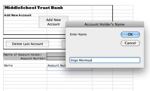
To get students a little more familiar with personal finance, we’re doing a little bank account simulation, and I created a little Excel program to make things a little easier.
It’s really created for the class where students can come up to the bank individually, and the banker/teacher can enter their name and print out their checks as they open their account.
The front sheet of the spreadsheet (called the “Bank Account” sheet) has three buttons. The first, the “Add New Account” button, asks you to enter the student’s name and it assigns the student an account number, which is used on all the checks and deposit slips. The other two buttons let you delete the last account you entered, and reset the entire spreadsheet, respectively.

Once you’ve created an account the spreadsheet updates the “Checks and Deposit Slips” sheet with the student’s name and account number. If you flip to that sheet you can print out eight checks and five deposit slips, which should be enough to get you through the simulation. The checks are numbered and have the student’s account number on them.
There are two other sheets. One is the “Checkbook Register”, which is generic and each student should get one, and the other is called “Customer Balances”. The latter is set up so you (the teacher) can enter all the deposits and withdrawals the students make, and keep track of it all on the same page.
Yes, it’s a bit of overkill, but I though that, since I was going through the effort, I should probably do a reasonable job. Besides, it gave me a chance to do a little Visual Basic programming to keep my hand in. While I teach programming using VPython (see this for example, but I’ll have to do a post about that sometime) you can do some very interesting things in Excel.
Note: I’ve updated the Excel file.
Human-Cyborg Relations
I’ve long thought that with all the things we can do with personal, handheld technology that we’re acceleratingly becoming cyborgs. And I don’t think it a bad thing. Consider how much cell phones and the internet helped in the Egyptian protests. Consider being able to look up maps and definitions when you need them, and being able to share them live in the classroom.
Garry Kasparov, the chess grandmaster who was the first to be defeated by a computer in 1998, adds another useful datapoint in an article on the human-machine partnerships in chess competitions:
The teams of human plus machine dominated even the strongest computers. The chess machine Hydra, which is a chess-specific supercomputer like Deep Blue, was no match for a strong human player using a relatively weak laptop. Human strategic guidance combined with the tactical acuity of a computer was overwhelming.
–Kasparov (2010): The Chess Master and the Computer
but also fascinating is this, after a tournament:
The winner was revealed to be not a grandmaster with a state-of-the-art PC but a pair of amateur American chess players using three computers at the same time. Their skill at manipulating and “coaching” their computers to look very deeply into positions effectively counteracted the superior chess understanding of their grandmaster opponents and the greater computational power of other participants.
The take home message is worth pondering:
Weak human + machine + better process was superior to a strong computer alone and, more remarkably, superior to a strong human + machine + inferior process.
–Kasparov (2010): The Chess Master and the Computer
iPod stands

I’ve been hoping for a wireless keyboard for the iPhone for quite a while, and Apple has finally produced one. As far as my students are concerned, with a full keyboard to write useful amounts of text, the iPhone is almost as good as having a “normal” computer. And the same applies to the iPad as well.
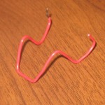
Once you have the keyboard, however, he next question is, how do you get the iPhone to sit at the correct angle for you to do your work. My students have dug up a couple solutions, starting with the paperclip version you see above. Simple, cheap, and elegant; I really like it.
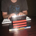
A couple days after seeing the paperclip stand in action, I came across the Lego stand.
“Why,” I asked.
“Because it’s awesome.”
“Oh,” I replied.
And it is.
Seismic vibrations of the heart

We were working on plate tectonics last week, and the conversation went from earthquakes to heartbeats.
I think it started with the question of, “How do we know what the inside of the Earth is like if no one’s been down to see it?”
I agreed that we’ve not even been down to the bottom of the crust because the heat and pressure would collapse any hole we tried to drill. I did not mention that terrible movie, “The Core”, because beyond maybe the first ten minutes where there is some actual speculative science fiction, it’s really not worth seeing.
But beneath the crust, how do we know how thick the mantle is? How do we know that the inner core is solid metal (mostly iron) while the outer core is liquid metal?
Not wanting to go into too much detail I tried to explain about seismic waves. Different types can go through different materials and if you monitor their reflections off different parts of the Earth’s interior you can puzzle out the layering and composition. I just gave the simplest demonstration: if you tap a piece of wood with you knuckle, could you tell that it was wood and not metal? What if you tapped a bucket, could you tell if it was full of water or not? Well seismic tomography work in much the same way, except that you’re usually picking up the reverberations from the earthquake rather than making it yourself by hitting the bucket. There’s also a bit more math involved.
But tapping the bucket gives a quick easy feel (pun intended) for the process. My students at least seemed satisfied.
So then I pointed out that you could use an app called iSeismo, to detect seismic waves. Both the iPhone (and its variants) and the iPad have accelerometers that can be used to pick up motion in all three dimensions. My students from last year remembered it, and at least one already had it loaded on his phone.
A quick test showed that the phone’s pretty sensitive. You can pick up two people jumping together all the way across the room. This part of the demo is nice because it helps prove that seismic waves from earthquakes can go very far. You can also see the little squiggles as the waves are picked up.
I did not try it this time, and I’ll need to confirm if it will work, but since the time on the phones should be well synchronized over the network, and iSeismo can output the actual data, we should be able to use three iPhones to triangulate the location of the jumpers. This might work in nicely with geometry now that I think about it.
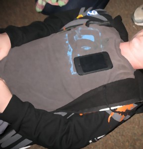
Anyway, finally, a student asked if the phone might be able to pick up his heartbeat if he lay on his back.
We tried it. Lying on his back on the floor while holding his breath, we could see his heartbeat quite clearly.
Student blog update
Well, I’ve made sure that everyone who wants one has a blog, and I’m still finding that the girls are the ones who’re updating them while the boys are not.
This is a small class, so we can’t have any statistical confidence in this observation, but for now at least, the trend continues.
I have also noticed that some of my bloggers are using their Personal World time to blog. I did not require this, or even suggest it, but I think this is great because they’re doing exactly the type of self-reflection that Personal World is intended to elicit.
