Urban planning with SimCity

The SimCity game is a wonderful model for urban planning. My class is using it to try to tie together the lessons on the Needs of People and the Themes of Geography.

I gave the small groups the game, two hours, and required them to take notes on why they made the choices they made.

SimCity regional view.

What we did

The game starts at the Region view, where you choose the location of the city. I was enthused to see the groups almost instinctively go for a location with good access to water. Of course almost all the places you can found a city are on a river or ocean, but more than one student specifically mentioned the water access as a reason for their choice.

To have them better think about the region, I also asked the students to think about, and report, on where in the world they thought their city might be, based on the topography and the vegetation. Most proposed the eastern U.S. seaboard.

After choosing a location the students could “terraform” it by raising mountains, making valleys, sculpting beaches and more. Some groups needed to be chivvied to move on, after all, they only had one two hour session to complete the assignment.

Then they got into the heart of the game, Mayor Mode (the terraforming session is called “God Mode”). The urban planning model is based on the land-use zoning strategy used by many, but by no means not all, U.S. cities. You have to mark cells on the city’s grid for residential, commercial or industrial/agricultural use. Then, if you’ve provided utilities and a transportation system “developers” will autonomously start to build houses, businesses and industry in these zones.
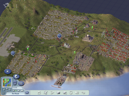
The great city of Da Hood. Note the different areas for urban, commercial and industrial development, and the seaport on the river.

Playing on “Easy”, the mayoral advisers would regularly pop up to suggest new amenities, like schools, police stations and parks that would attract more people to the city.

And students had to make choices. One of the first, for example, was about what type of power to provide their city. Coal plants are cheap but dirty, while windmills produce a lot less power so you have to build a lot of them.

A Little Discussion

The game worked remarkably well as part of the curriculum. SimCity is a potentially addictive game, the plea, “I really need to stop,” was heard repeatedly as I was trying to get the last group to come to our discussion. Yet, two hours was enough for students to get the gist of the game and think about its implications for geography. The final cities were not perfect (at least one was designed to be dysfunctional) and most of them were running a serious deficit, but when it came time to present, students were able to flesh out our information on the lessons quite nicely.

The game is also easy enough. The game’s internal model is quite sophisticated, but there’s enough in-game advice, that it took just some initial guidance about the basic premise of zoning, for students unfamiliar with the game to play it effectively. Some students were better prepared at the start than others. Some had played similar games in the past and one student had even read the instruction booklet that came with the game CD, but they were all able to get cities up and running in the allotted time.

Technical Difficulties

We’re a Mac school, but SimCity does not have a version that works with modern macs, so I had to use my old laptop that has Windows. That computer is a Mac that it uses Boot Camp to boot to Windows, and, perhaps for this reason, the first group that tried to use it had it crash on them a few times at the beginning of their game. They gave up and created their city in our sandbox, which turned out great in the end because it gave them more flexibility in the structures they could create and some interesting differences in perspectives from the game based presentations. I’ll post more about that later.

In Conclusion

I like the game because it lets the students provide the infrastructure while the game engine/model tests the infrastructure to see it if works and “predicts” development and population. The Needs of People and Themes of Geography contexts were useful ways of getting students into the game but struggling to get the city to work helped fill in a lot of things that students had not thought of previously.

One of those things was people’s need for safety. In our post-game discussion, safety from crime and from nature came up as additional needs of people we had not discussed. Successful cities in the game need police stations, and students had apparently been thinking hard about the array of natural disasters they could rain down on their cities when the assignment was over.
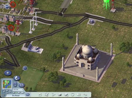
The Taj Mahal, soccer fields and a skate-park (of which some of us were inordinately proud) met the needs of citizens for recreation and understanding.

Finally, students presented their cities while Ms. Ann DeVore from the Deargorn Heights Montessori Center was observing the classroom. Ann is an enthusiastic user of SimCity. Her middle school uses it the initial part of the Future City competition, which is something I’d very much like to get my group involved in as soon as I can wrangle some technical advisers.
Topographic features: A Google Maps treasure hunt

[googleMap name=”Lake Titicaca” description=”Example of a lake.” width=”490″ height=”400″ mapzoom=”7″ mousewheel=”false”]Lake Titicaca, Peru[/googleMap]

Cuing off of a comment by EV from Somewhat Up in the Air, I finally found what I think is a decent alternative to the Island of Podiatry map exercise. Instead of them altering a map of their feet into a series of topographic features, I’m having them do a treasure hunt using Google Maps. The assignment is pretty straightforward, and students can choose either option:

Use Google maps to capture images (Apple-Shift-4) of the features on the topographic features list. Put all the images into a PowerPoint or similar presentation. You may choose features from anywhere in the world so make it interesting.

The features list consists of: 1. Plain; 2. Valley; 3. Plateau; 4. Archipelago; 5. Ocean; 6. Isolated Mountain; 7. Mountain Range; 8. Lake; 9. Delta; 10. Strait; 11. Gulf; 12. Isthmus; 13. River; 14. Peninsula; 15. Bay; 16. Island; 17. Cape; 18. Hills.

In addition, I’d like to set up one of those games where they get extra points if the location they choose for a particular feature is not the same as someone else’s.

Another addendum to this, which would make a great extension to the project, is to allow students to enter the geographic coordinates of their features on a webpage that then plots all the similar features on a Google Map. It shouldn’t be too hard to do but would take some time as I’d have to set up and program its own website for the project along the lines of the Mariner AO site described here.

Idea Sketch: Graphic organizer for the iPod

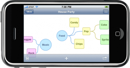
I’m quite happy for students to use their handheld devices if they’re being productive. They’ve used them to take text-based notes (I’m still not sure how they are able to type so fast), make flashcards (I need to find or make an app for notecards and bibliography cards for the IRP), and now they’ve discovered one for making graphic organizers called Idea Sketch (thanks go to J. for showing me, and M. for finding it).

Idea Sketch for the iPod.

I’ve been using graphic organizers (GOs) a lot at the beginning of the year and students are getting the idea that we will inevitably put one together to summarize the weekly themes. So today, during our Needs of People discussion/lesson, when I did a quick spot check to see what the the iPod users were doing with their devices, they showed me that they were already putting together GOs. Because I really want them to develop the skill themselves, I’ve not been giving them GOs ahead of time, and we’ve been practicing putting them together. I was quite happy to see them being proactive. Maybe the lesson helped after all.

Idea Sketch is simple, seems to work pretty well, and is a free download at least at them moment.

Financial reports and statistics

Sally, our school’s business manager, was kind enough to come in last month to help the financial department of the student run business organize its books. It was long overdue. We’d been improving our record keeping over the last couple years, but now we have much more detailed records of our income and expenses.

This is great for a number of reasons, the first of which is that students get some good experience working with spreadsheets. We use Excel, which in my opinion is far and away Microsoft’s best product (I’ve been using OpenOffice predominantly for the last year or so because, it improved quite a bit recently, and I’m a glutton for certain kinds of punishment.) I’ve been surprised by how many students get into college unable to do basic tables and charts, but hopefully this is changing.

The second reason is that the Finance committee can now use the data to give regular reports; income, expenses, profit, loss, all on a weekly basis. I expect the Bread division to benefit the most, since it has regular income and expenses, offering students frequent feedback on their progress. We’re now collecting a long-term, time-series data-set that will be very nice when we get to working on statistics in math later on.

In fact, we should be able to use this data to make simple financial projections. Linear projections of how much money we’ll have for our end-of-year trip will tie into algebra quite nicely, and, if we’re feeling ambitious, we can also get into linear regressions and the wave-like properties of the time series of data.

Enjoying the silence

That was one of the most poignant moments for me—conversations I had with a class of kids in a school in a tough neighborhood who simply had no positive associations at all with the idea of silence.
– George Prochnik (Gorney, 2010)

In constructing the Montessori classroom we aim for an open, uncluttered environment. George Prochnik has an interesting little interview in the Atlantic about the value of silence in our noisy world. He points out that there has been a movement away from the sound deadening carpets, tablecloths and wall hanging in the interior design of restaurants, in an effort to generate more energy. Of course that makes things louder. Thinking about the interior design of the classroom, I can see how there might be a trade-off between creating an uncluttered environment and designing for a quiet classroom.

Of course, in a classroom of adolescents, some prefer to work in quiet, while others favor the energy and noise in the background. I try to create nooks and crannies where students can get out of the noise but are still visible to the rest of the room. I also allow students to use headsets during individual work time.

Thinking about it now, the nooks were designed to fit small groups of three, but the students only really migrated toward them as individuals. So it may be that their primary value has been to provide small cones of silence and I should make more of them but smaller ones.

Website design

Teaching website design can be done in two ways. The easy way is to use one the the many, very good, software packages. Adobe Dreamweaver is a fairly popular commercial package, while Mozilla’s SeaMonkey (from the creators of Firefox) is a free, open-source alternative.

The longer way to teach web design, which I prefer, is to start with HTML and CSS and build a fundamental understanding of how webpages work.

Chakita J., who teaches technology at the Hazelwood School District in St. Louis and shares my approach to the subject recommends , “The Complete Reference HTML” by Thomas Powell.

Fractured thinking – How the internet affects how you think

While many people say multitasking makes them more productive, research shows otherwise. Heavy multitaskers actually have more trouble focusing and shutting out irrelevant information, scientists say, and they experience more stress.

And scientists are discovering that even after the multitasking ends, fractured thinking and lack of focus persist. In other words, this is also your brain off computers. Richtel, 2010

Matt Richtel has an intriguing article in the New York Times on how multitasking on computers is affecting the way people think. I don’t have a whole lot of time to get into it is a well resourced article citing work from researchers such as Clifford Nass, Eyal Ophir and Melina Uncapher at Stanford, Steven Yantis at Johns Hopkins, Daphne Bavelier at the University of Rochester, Gary Small at UCLA and Adam Gazzaley at UCSF.

Other choice quotes:

[Multi-taskers] had trouble filtering out … the irrelevant information.

multitaskers tended to search for new information rather than accept a reward for putting older, more valuable information to work.

that people interrupted by e-mail reported significantly increased stress compared with those left to focus. Stress hormones have been shown to reduce short-term memory

Finally, the article ends with a thought about how technology use affects our ability to relate to others.

Mr. Nass at Stanford thinks the ultimate risk of heavy technology use is that it diminishes empathy by limiting how much people engage with one another, even in the same room.

“The way we become more human is by paying attention to each other,” he said. “It shows how much you care.”

That empathy, Mr. Nass said, is essential to the human condition. “We are at an inflection point,” he said. “A significant fraction of people’s experiences are now fragmented.”

This work of course ties in with Nicholas Carr’s thesis that asks the question, “Is Google Making Us Stupid“. Carr’s book, “The Shallows” takes up the argument that we should spend less time online. While I tend to agree with Carr that we would benefit from more time offline, I really think his explanation that the invention of the press, and cheap books, lead to more deeper concentration (and that’s what we’re loosing now) needs a lot more evidence to back it up.

Playing with real economic data (FRED)

Long term unemployment

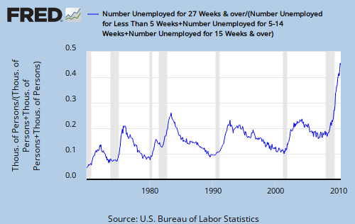
The Federal Reserve’s data website produces graphs using the same economic data that the Federal Reserve uses to make decisions about the nation’s economy. The above graph, showing long term unemployment in the U.S., combines the unemployment numbers based on how long people have been unemployed from four data series (<5 weeks, 5-14 weeks, >= 15 weeks, >27 weeks). You see howthe site makes the combinations you want, and produces the graph.