This cute, little, true story of how a bunch of kids (they look like adolescents) living on rafts in a lake built their own soccer field (on rafts), and eventually created the Panyee Football Club, is actually an advertisement for the Thai Military Bank (TMB), but it’s quite inspirational nonetheless. The setting and videography are also superb.
Editing and Reviewing
Even if seven editors and seven reviewers, marked it up for half a year, I doubt they’d be able to completely clean up the mess I post to this blog every day (and they’d be full of bitter tears). However, in case they were willing to try, I thought it would be useful to be clear about what I mean by editing and reviewing.
Editing is catching all the grammatical errors, loose spelling, punctuation and so on that the author is liable to miss. Usually it is because he or she is reading what they thought they wrote, not what they actually typed. It might also involve checking citations to make sure they are right. In this case, it does not involve extensive fact checking, though at a real newspaper it would. Partly that’s because facts can be so malleable, but mostly it’s because I believe that making sure the facts are right are the responsibility of the author.
Reviewing is a lot harder, largely because, since it primarily deals with style, it is extremely subjective. I will admit that an awful lot of people are likely to consider my writing boring and atrocious, but I will often disagree. Good review is a process of negotiation. The reviewer tells the author what they like, and why, and what they don’t like, and why. Then, instead of yelling, the author carefully considers the comments and adjusts their piece accordingly. The reviewer then looks it over again and gives the same type of feedback as before. Ultimately, what’s published remains the responsibility of the author; they make the final choice about which comments to accommodate and which to ignore, but good reviewers are invaluable if used well.
So, if you see a tag at the bottom of a post saying “Reviewed by So and So”, or “Edited by So and So”, or even, “Reviewed and edited by So and So”, please spare them a moment’s thought because they’re not an easy or trivial jobs. This is especially true for a blog where the author sets themself the task of posting something every day, and finds it hard to stop writing once they’ve started. Even when they know they should. Like now.
Peat Pellets
We just planted seeds using peat pellets. The students are always impressed by just how much they expand when you add water, so one student decided to record it on video. Since they recently acquired a new iPhone app that reverses the video, they posted the video played backwards.
Social Loafing Update: The Student Perspective
I presented my post on social loafing as a Personal World lesson. For the rest of the week students are supposed to reflect on their own habits, and think about when and why they loaf and how to avoid doing so.
We had a good discussion during the lesson. We’ve had a few obvious examples of social loafing over the year with soccer. We started off with one person versus the rest of the class, and every time one of the teams wins two games in a row, the losing team has to pick someone from the winning team for the next game.
In the first few games, the smaller team played their hearts out and was able to hold it’s own remarkably well, but as the year progressed, and students improved their technique and teamwork, the greater numbers began to tell. But as the teams grew it was pretty clear that some of the people who were working really hard before, were taking it easy.

So students are going through the list of reasons why people socially loaf and reflecting on which apply to themselves. Of course when I went over the list during the lesson, I asked if there were any other reasons they could think of based on their own experience. Our resident expert in social loafing had a very Montessori suggestion about why a student might “seem to be” loafing during group work, “What if you want the other students to learn more?”
Tsunami Geometry: Calculating the Height of a Tsunami using Basic Geometry
Since we’re working on geometry this cycle, I thought it would be an interesting exercise to think about how we could use geometry to think about how the strength of tsunamis decreases with distance from the source.
Of course, we’ll have to do this using some intense simplification so we can actually apply the tools we have available. The first is to approximate the tsunami as a circular wall of water centered on the epicenter of the earthquake.

This lets us figure out the volume of the wave pretty easily because we know that the volume of a cylinder is:
(1)

The size of the circular water wall we approximate from the reports from Japan. The maximum height of the wave at landfall was somewhere in the range of 14 m along the northern Japanese coast, which was about 80 km from the epicenter. Just as a wild guess, I’m assuming that the “effective” width of the wave is 1 km.
Typically, in deep water, a tsunami can have a wavelength greater than 500 km (Nelson, 2010; note that our width is half the wavelength), but a wave height of only 1 m (USSRTF). When they reach the shallow water the wave height increases. The Japanese tsunami’s maximum height was reportedly about 14 m.
At any rate, we can figure out the volume of our wall of water by calculating the volume of a cylinder with the middle cut out of it. The radius of our inner cylinder is 80 km, and the radius of the outer cylinder is 80 km plus the width of the wave, which we say here is 1 km.
Calculating the volume of the wave
However, for the sake of algebra, we’ll call the radius of the inner cylinder, ri and the width of the wave as w. Therefore the inner cylinder has a volume of:
(2)

So the radius of the outer cylinder is the radius of the inner cylinder plus the width of the wave:
(3)

which means that the volume of the outer cylinder is:
(4)

So now we can figure out the volume of the wave, which is the volume of the outer cylinder minus the volume of the inner cylinder:
(5)

(6)

Now to simplify, let’s expand the first term on the right side of the equation:
(7)

Now let’s collect terms:
(8)

Take away the inner parentheses:
(9)

and subtract similar terms to get the equation:
(10)

Volume of the wave
Now we can just plug in our estimates of width and height to get the volume of water in the wave. We’re going to assume, later on, that the volume of water does not change as the wave propagates across the ocean.
(11)

rearrange so the coefficients are in front of the variables:
(12)

So, at 80 km, the volume of water in our wave is:
(13)

(14)

Height of the Tsunami
Okay, now we want to know what the height of the tsunami will be at any distance from the epicenter of the earthquake. We’re assuming that the volume of water in the wave remains the same, and that the width of the wave also remains the same. The radius and circumference will certainly change, however.
We take equation (10) and rearrange it to solve for h by first dividing by rearranging all the terms on the right hand side so h is at the end of the equation (this is mostly for clarity):
(15)

Now we can divide by all the other terms on the right hand side to isolate h:
(16)

so:
(17)

which when reversed looks like:
(18)

This is our most general equation. We can use it for any width, or radius of wave that we want, which is great. Anyone else who wants to calculate wave heights for other situations would probably start with this equation (and equation (15)).
Double checking our algebra
So we can now figure out the height of the wave at any radius from the epicenter of the earthquake. To double check our algebra, however, let’s plug in the volume we calculated, and the numbers we started off with, and see if we get the same height (14 m).
First, we’ll use all our initial approximations so we get an equation with only two variables: height (h) and radial distance (ri). Remember our initial conditions:
w = 1000 m
ri = 80,000 m
hi = 14 m
we used these numbers in equation (10) to calculate the volume of water in the wave:
Vw = 7081149841 m3
Now using these same numbers in equation (18) we get:
(19)

which simplifies to:
(20)

So, to double-check we try the radius of 80 km (80,000 m) and we get:
h = 14 m
Aha! it works.
Across the Pacific
Now, what about Hawaii? Well it’s about 6000 km away from the earthquake, so taking that as our radius (in meters of course), in equation (20) we get:
(21)

which is:
h = 0.19 m
This is just 19 cm!
All the way across the Pacific, Lima, Peru, is approximately 9,000 km away, which, using equation (20) gives:
h = 0.13 m
So now I’m curious about just how fast the 14 meters drops off to less than 20 cm. So I bring up Excel and put together a spreadsheet of tsunami height at different distances. Plot on a graph we get:

So the height of the tsunami drops off relatively fast. Within 1000 km of the earthquake the height has dropped by 90%.
How good is this model
This is all very nice, a cute little exercise in algebra, but is it useful? Does it come anywhere close to reality? We can check by comparing it to actual measurements; the same ones used by NOAA to compare to their model (see here).

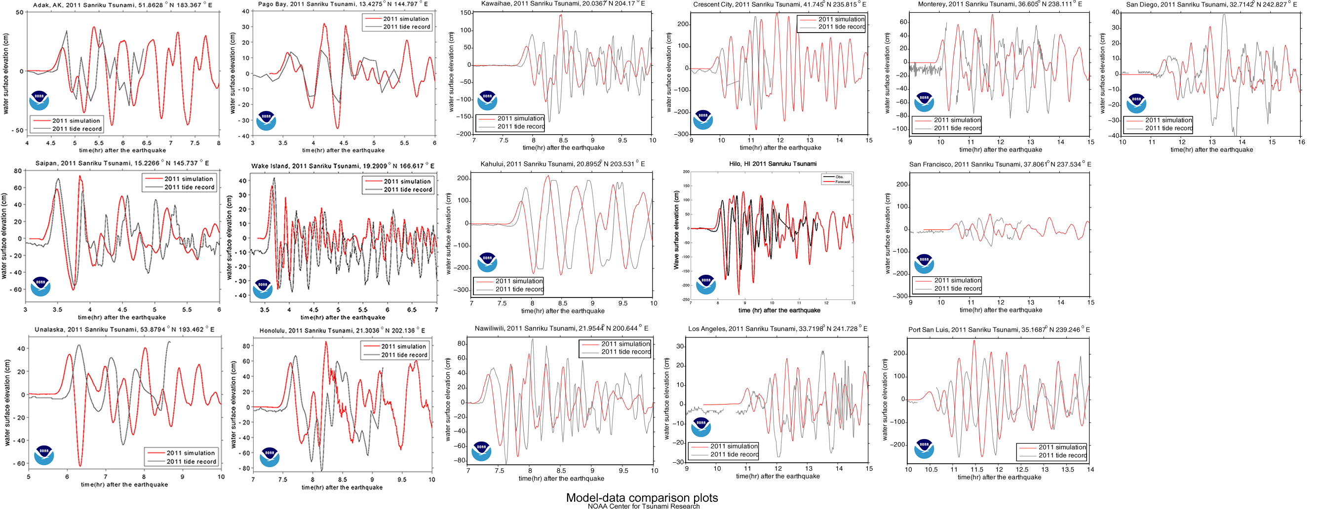

The graph shows a maximum height of about 60 cm, which is about three times larger than our model. NOAA’s estimate is within 20% of the actual maximum heights, but they’ve spent a bit more time on this problem, so they should be a little better than us. You can find all the gruesome details on NOAA’s Center for Tsunami Research site’s Tsunami Forecasting page.
Notes
1. The maximum height of a tsunami depends on how much up-and-down motion was caused by the earthquake. ScienceDaily reports on a 2007 article that tried to figure out if you could predict the size of a tsunami based on the type of earthquake that caused it.
2. Using buoys in the area, NOAA was able to detect and warn about the Japanese earthquake in about 9 minutes. How do they know where to place the buoys? Plate tectonics.

Update
The equations starting with (7) did not have the 2 on the riw term. That has been corrected. Note that the numerical calculations were correct so they have not changed. – Thanks to Spencer and Claude for helping me catch that.
Lets have a RATIONAL Argument

Brandon Scott Gorrell has produced a wonderful salvo for our never-ending efforts to promote rational discussion.
Diverse bedrooms


To supplement our work on the fundamental needs of humans, we can add James Mollison’s poignant pictures in his book, Where Children Sleep. It ties in well with the Diverse China pictures.
You can find more of his images in LIFE.
Even without the text descriptions, the pictures are wonderfully composed and evocative. I think I’m going to have to add this one to our library.
An interesting project would be to have my students take their own pictures of their rooms. Just in the book, some of the contrasts are quite startling.

Radiation dosages

xkcd has published an excellent graph showing where different dosages of radiation come from and how they affect health. It’s a complex figure, but it’s worth taking the time to look through. I find it easiest to interpret going backward from the bottom right corner that show the dosages that are clearly fatal.

One red square of 100 red blocks is equal to one seivert, which is the radiation dosage that will kill you if you receive it all at once. Note:
- If you were next to the reactor core during the Chernobyl nuclear accident, you would have gotten blasted by 50 Sv.
- 8 Sv will kill you, even with treatment.
- Getting 0.1 Sv over a year is clearly linked to cancer.
- One hour on the grounds of the Chernobyl nuclear plant (in 2010) would give you 0.006 Sv.
- Your normal, yearly dose is about 0.004 Sv, just about how much was measured over a day at two sites near Fukushima.
- Eating a banana will give you 0.000001 Sv.
While I did not find equivalent exposure levels, the nuclear bombs dropped on Hiroshima and Nagasaki lead to many deaths and sickness from radiation created by the explosions. Within four months, there were 140,000 fatalities in Hiroshima, and 70,000 in Nagasaki (Nave, 2010). The Manhattan Engineer District, 1946 report describes the radiation effects over the first month:

The effects were not limited to the explosion itself, though. There is one estimate, that 260,000 people were indirectly affected:
Radiation dose in a zone 2 kilometers from the hypocenter of the atomic bomb was the largest. Also, those who entered the city of Hiroshima or Nagasaki soon after the atomic bomb detonation and people in the black rain areas were exposed to radiation. … some people were exposed to radiation from black rain containing nuclear fission products (“ashes of death”), and others to radiation induced by neutrons absorbed by the soil upon entering these cities soon after the atomic bomb detonation.
— Hiroshima International Council for Health Care for the Radiation Exposed (HICARE): Global Radiation Exposures.
HICARE also has a good summary of what happened at Chernobyl, where 31 people died at the time of the accident, about 400,000 were evacuated, and anywhere between 1.6 and 9 million people were exposed to radiation. Modern pictures of the desolation of Chernobyl are here. The Wikipedia article has before and after pictures of Hiroshima and Nagasaki.