Least Squares Regression with Excel

Here I’ll go over how to do Least Squares Regression, as simply as possibly, using Excel and its Solver*. Least Squares Regression can be used to match pretty much any type of function to any type of data. Most spreadsheet programs, like Excel, will do some curve matching for you when you add trendlines to graphs, but for more sophisticated work — in pre-Calculus and beyond for example — you need a more general approach.
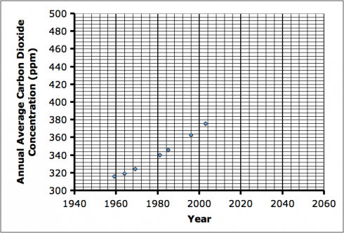
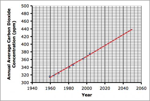
Figure 1. Selected annual average carbon dioxide concentrations since 1959 (see Table 1 for data). Data from NOAA.

We’ll start with a data set that we want to match. The atmospheric CO2 data from Mauna Loa is a convenient dataset. It’s also an important data set to model because matching a function to the data will allow us to predict the change in CO2 over the next 100 years, and those predictions are the ones the IPCC uses in their estimates of the impact of global climate change around the world. Billions, if not trillions of dollars depend on those predictions (and how governments decide to respond). For ease of demonstration, I’ve picked a few of the annual average CO2 concentration measurements at random to work with:

Table 1: CO2 Data

Year (x) CO2 concentration (ppm) (y)
1959 315.97
1964 319.62
1969 324.62
1981 340.10
1985 346.04
1996 362.59
2003 375.77

Now, looking at the data, we can see there is some sort of trend. Our first decision is about how to model it.

Straight Line Model

The simplest approach, and the one we’ll try first is to fit a straight line through the data. (The final spreadsheet is here).

The equation of a straight line is:

 y = mx + b

In this case, as we can see from the graph (Figure 1), the y axis is CO2 concentration, and the x axis is the year. m and b are our two unknown constants that set the slope of the line (m) and move it up and down (b). If you need to get a better feel for what this means, try changing the slope and intercept in the Straight Line Grapher (I used this in class to demonstrate).

To match our straight line model to the data we need to determine the values of m and b that give the best fit.
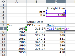
Figure 2. The formula ("=C$3*$A8+C$4") for our straight line model uses the year (column A) and the m and b coefficients (cells C3 and C4 respectively) . You'll note the $ signs in the C3 and C4 references in the formula (i.e. $C$3 and $C$4); these tell Excel to always refer to these specific cells when the formula is copied and pasted down the entire column.

So we create a spreadsheet with the data and in the adjacent column set up the straight line function by setting two cells to the values of the constants (m and b) and using those values to calculate the modeled CO2 concentration.
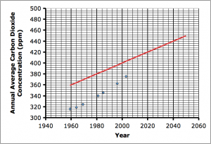
Figure 3. The initial values for m and b (1 and -1600 respectively) don't match the data very well.

You’ll notice that I have values of m = 1 and b = -1600 . These are just my initial estimates of these values. The initial values are not crucial, as you’ll see, but are just there for me to check that my formula is in right.

Once I have the correct formulas in, I can play around with these values until my line matches the data. However, this is where Solver comes in to save a lot of time.

Finding a match

First we need a quantitative way of telling if we have a good match or not. We can start by taking the difference between each real data point and the modeled value. We’ll call this the error.
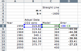
Figure 4. Calculating the error -- the difference between the actual and modeled data.

Now we could get a single value for the total error by adding up all the individual error values, or taking the average. However, as one of my students pointed out, we could end up with a case where the modeled line crossed through the data and we’d end up with positive differences of the data points above the line canceling out the negative differences of the data points below the line. His solution was to take the absolute value of the differences (errors) instead, which should actually work just as well in the method we’re taking here.

Instead of using the absolute value, however, we’ll square the errors instead. This achieves the same effect we need because the squares of both negative and positive numbers are positive. This approach is where the “squares” in Least Squares Regression comes from. The “Least” part comes from the fact that we’re now going to try adjusting our coefficients until we get the average of the squares of the errors to be as small as possible.
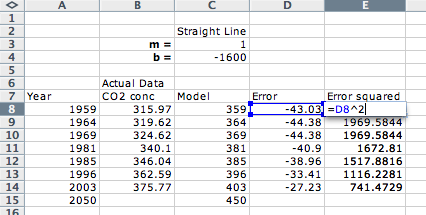
Figure 5. Calculating the square of the error.

Now we take the calculate the average of the errors (the sum of the errors would work just as well) using the spreadsheet’s “AVERAGE” function.
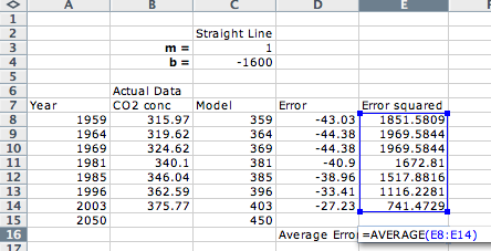
Figure 6. Calculating the average error using the "AVERAGE" function.

Now we can adjust m and b and not just see how they compare to the data points on a graph, but know that we have the best fit if we minimize the average error.

Solver

Instead of changing m and b by hand, we can use Excel’s Solver to minimize the average error for us. The matching of a straight line can be done using algebra (e.g. here and here) but that approach won’t help us when we get to more complex functions.

We select the average error cell (E16) and tell Solver to minimize its value by changing the values of m and b.
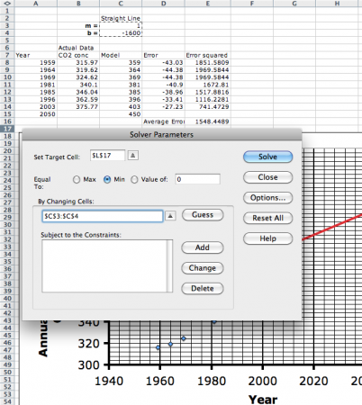
Figure 7. Setting up Excel's Solver.

When we hit solve, Solver should converge on a solution. Because of the way the problem is set up — using the square of the error for example — makes this a non-linear problem for the solver to solve. As of this writing, Excel is the only spreadsheet program I know of that has a built-in, non-linear solver.
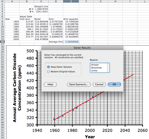
Figure 8. The Solver solution.

You’ll notice that Solver’s solution gives:

  • m = 1.360
  • b = -2351.9

So now we have the equation for the best fit line (our model) being:

 y = 1.360 x - 2351.9

Prediction

Using this model we can predict the atmospheric CO2 concentration for the year 2050 by setting x = 2050 in the modeled equation, which gives 436.5 ppm.
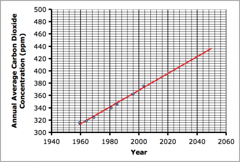
Figure 9. The straight line model matches the data very well and can be projected to predict atmospheric carbon dioxide concentrations in the future.

The final spreadsheet I used to do these calculations can be found here.

Parabolic Model

As good as the straight line model seems to be, it does not account for the slight upward curve the data seems to have (see Figure 1). So instead of a straight line, perhaps we could try a parabolic function. Just as before, we’ll need to figure out the coefficients for the parabolic function. In this case the general equation we’ll use is:

 y = ax^2 + bx + c

and we’ll need to find the coefficients a, b and c. To see how changing these coefficients change the curve, you can play around with the interactive parabola model.

We set up our spreadsheet in the same way as for the straight line, but with our new coefficients.
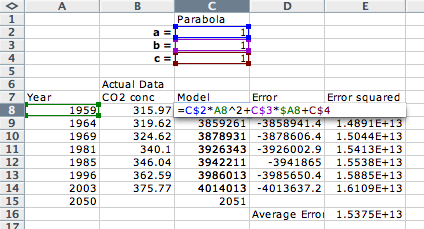
Figure 10. Setting the equation for a parabolic model.

Note that the only column that needs to change from the straight-line spreadsheet is the “Model” column (column C), to add the coefficients and to change the formula to that of a parabola.

Now we can use Solver to minimize the average of the squares of the errors, just as we did before, only having it change the three coefficients instead of two.

  • a = 0.00060091
  • b = -1.018
  • c = 0.9933

and a final equation:

 y = 0.00060091 x^2 + -1.018 x + 0.9933

Figure 11. Matching data using a parabolic function.

Prediction

The parabolic model predicts for the year 2050 (x = 2050) that the CO2 concentration will be 439.4 ppm.

The Excel spreadsheet for the parabolic model is here.

Which model is better?

The easiest way to compare the two models is to see which did better at minimizing the squared errors.

Table 2: Comparison of models.

Model Average Squared Error
Straight Line 4.94
Parabola 4.47

So the parabolic model does better, but not by much.

Conclusions

With this approach, you can use any type of function — exponential, sinusoidal etc. — or combination of functions to match any data, and be able to compare among the models. A better measure of how well the models match the data is the regression coefficient or coefficient of determination, but I’ll save those for another post.

Conclusions

* UPDATE (Dec 31, 2012): Gnumeric’s Solver works.
* You’ll need to use Microsoft’s Excel, or better yet Gnumeric for this because, as of this writing, none of the other common spreadsheet options — OpenOffice, Google Docs, and Mac’s Calc — have a non-linear solver built in — and even some of the newer versions of Excel seem buggy.
Curious Correlations

The Correlated website asks people different, apparently unrelated questions every day and mines the data for unexpected patterns.

In general, 72 percent of people are fans of the serial comma. But among those who prefer Tau as the circle constant over Pi, 90 percent are fans of the serial comma.

Correlated.org: March 23’s Correlation.

Two sets of data are said to be correlated when there is a relationship between them: the height of a fall is correlated to the number of bones broken; the temperature of the water is correlated to the amount of time the beaker sits on the hot plate (see here).

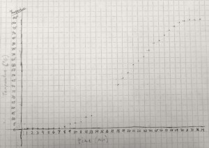
A positive correlation between the time (x-axis) and the temperature (y-axis).

In fact, if we can come up with a line that matches the trend, we can figure out how good the trend is.

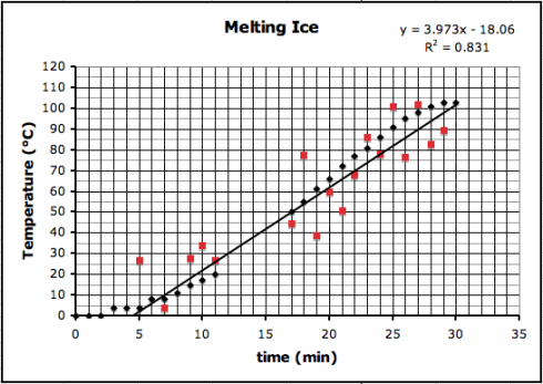
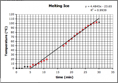
The first thing to try is usually a straight line, using a linear regression, which is pretty easy to do with Excel. I put the data from the graph above into Excel (melting-snow-experiment.xls) and plotted a linear regression for only the highlighted data points that seem to follow a nice, linear trend.

Correlation between temperature (y) and time (x) for the highlighted (red) data points.

You’ll notice on the top right corner of the graph two things: the equation of the line and the R2, regression coefficient, that tells how good the correlation is.

The equation of the line is:

  • y = 4.4945 x – 23.65

which can be used to predict the temperature where the data-points are missing (y is the temperature and x is the time).

You’ll observe that the slope of the line is about 4.5 ºC/min. I had my students draw trendlines by hand, and they came up with slopes between 4.35 and 5, depending on the data points they used.

The regression coefficient tells how well your data line up. The better they line up the better the correlation. A perfect match, with all points on the line, will have a regression coefficient value of 1.0. Our regression coefficient is 0.9939, which is pretty good.

If we introduce a little random error to all the data points, we’d reduce the regression coefficient like this (where R2 is now 0.831):

Adding in some random error causes the data to scatter more, making for a worse correlation. The black dots are the original data, while the red dots include some random error.

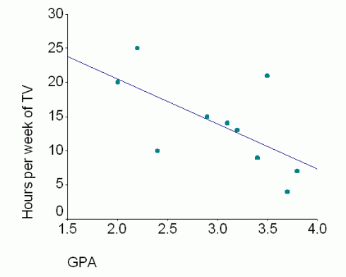
The correlation trend lines don’t just have to go up. Some things are negatively correlated — when one goes up the other goes down — such as the relationship between the number of hours spent watching TV and students’ grades.

The negative correlation between grades and TV watching. Image: Lanthier (2002).

Correlation versus Causation

However, just because two things are correlated does not mean that one causes the other.

A jar of water on a hot-plate will see its temperature rise with time because heat is transferred (via conduction) from the hot-plate to the water.

On the other hand, while it might seem reasonable that more TV might take time away from studying, resulting in poorer grades, it might be that students who score poorly are demoralized and so spend more time watching TV; what causes what is unclear — these two things might not be related at all.

Which brings us back to the Correlated.org website. They’re collecting a lot of seemingly random data and just trying to see what things match up.

Curiously, many scientists do this all the time — typically using a technique called multiple regression. Understandably, others are more than a little skeptical. The key problem is that people too easily leap from seeing a correlation to assuming that one thing causes the other.

Figuring Out Experimental Error

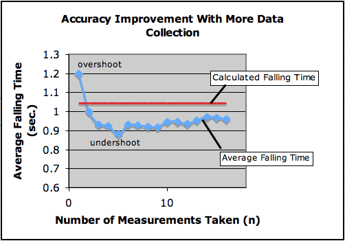
Using stopwatches, we measured the time it took for the tennis ball to fall 5.3 meters. Some of the individual measurements were off by over 30%, but the average time measured was only off by 7%.

I did a little exercise at the start of my high-school physics class today that introduced different types of experimental error. We’re starting the second quarter now and it’s time for their lab reports to including more discussion about potential sources of error, how they might fix some of them, and what they might mean.

One of the stairwells just outside the physics classroom wraps around nicely, so students could stand on the steps and, using stopwatches, time it as I dropped a tennis ball 5.3 meters, from the top banister to the floor below.

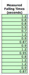
Students' measured falling times (in seconds).

Random and Reading Errors

They had a variety of stopwatches, including a number of phones, at least one wristwatch, and a few of the classroom stopwatches that I had on hand. Some devices could do readings to one hundredth of a second, while others could only do tenths of a second. So you can see that there is some error just due to how detailed the measuring device can be read. We’ll call this the reading error. If the best value your stopwatch gives you is to the tenth of a second, then you have a reading error of plus or minus 0.1 seconds (±0.1 s). And you can’t do much about this other than get a better measuring device.

Another source of error is just due to random differences that will happen with every experimental trial. Maybe you were just a fraction of a second slower stopping your watch this time compared to the last. Maybe a slight gust of air slowed the balls fall when it dropped this time. This type of error is usually just called random error, and can only be reduced by taking more and more measurements.

Our combination of reading and random errors, meant that we had quite a wide range of results – ranging from a minimum time of 0.7 seconds, to a maximum of 1.2 seconds.

So what was the right answer?

Well, you can calculate the falling time if you know the distance (d) the ball fell (d = 5.3 m), and its acceleration due to gravity (g = 9.8 m/s2) using the equation:

! t = \sqrt{\frac{2d}{g}}

which gives:

! t = 1.043 s

So while some individual measurements were off by over 30%, the average value was off by only 8%, which is a nice illustration of the phenomenon that the more measurements you take, the better your result. In fact, you can plot the improvement in the data by drawing a graph of how the average of the measurements improves with the number of measurements (n) you take.

The first measurement (1.2 s) is much higher than the calculated value, but when you incorporate the next four values in the average it undershoots the actual (calculated) value. However, as you add more and more data points into the average the measured value gets slowly closer to the calculated value.

More measurements reduce the random error, but you tend to get to a point of diminishing returns when you average just does not improve enough to make it worth the effort of taking more measurements. The graph shows the average slowly ramping up after you use five measurements. While there are statistical techniques that can help you determine how many samples are enough, you ultimately have to base you decision on how accurate you want to be and how much time and energy you want to spend on the project. Given the large range of values we have in this example, I would not want to use less than six measurements.

Systematic Error

But, as you can see from the graph, even with over a dozen measurements, the average measured value remains persistently lower than the calculated value. Why?

This is quite likely due to some systematic error in our experiment – an error you make every time you do the experiment. Systematic errors are the most interesting type of errors because they tell you that something in the way you’ve designed your experiment is faulty.

The most exciting type of systematic error would, in my opinion, be one caused by a fundamental error in your assumptions, because they challenge you to fundamentally reevaluate what you’re doing. The scientists who recently reported seeing particles moving faster than light made their discovery because there was a systematic error in their measurements – an error that may result in the rewriting of the laws of physics.

In our experiment, I calculated the time the tennis ball took to fall using the gravitational acceleration at the surface of the Earth (9.8 m/s2). One important force that I did not consider in the calculation was air resistance. Air resistance would slow down the ball every single time it was dropped. It would be a systematic error. In fact, we could use the error that shows up to actually calculate the force of the air resistance.

However, since air resistance would slow the ball down, it would take longer to hit the floor. Unfortunately, our measurements were shorter than the calculated falling time so air resistance is unlikely to explain our error. So we’re left with some error in how the experiment was done. And quite frankly, I’m not really sure what it is. I suspect it has to do with student’s reaction times – it probably took them longer to start their stopwatches when I dropped the ball than it did to stop them when the ball hit the floor – but I’m not sure. We’ll need further experiments to figure this one out.

In Conclusion

On reflection, I think I probably would have done better using a less dense ball, perhaps a styrofoam ball, that would be more affected by air resistance, so I can show how systematic errors can be useful.

Fortunately (sort of) in my demonstration I made an error in calculating the falling rate – I forgot to include the 2 under the square root sign – so I ended up with a much lower predicted falling time for the ball – which allowed me to go through a whole exercise showing the class how to use Excel’s Goal Seek function to figure out the deceleration due to air resistance.

My Excel Spreadsheet with all the data and calculations is included here.

There are quite a number of other things that I did not get into since I was trying to keep this exercise short (less than half an hour), but one key one would be using significant figures.

There are a number of good, but technical websites dealing with error analysis including this, this and this.

Global Temperature Model: An Application of Conservation of Energy

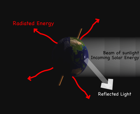
Energy cannot be either created or destroyed, just changed from one form to another. That is one of the fundamental insights into the way the universe works. In physics it’s referred to as the Law of Conservation of Energy, and is the basic starting point for solving a lot of physical problems. One great example is calculating the average temperature of the Earth, based on the balance between the amount of energy it receives from the Sun, versus the amount of energy it radiates into space.

The Temperature of Radiation

Anything with a temperature that’s not at absolute zero is giving off energy. You right now are radiating heat. Since temperature is a way of measuring the amount of energy in an object (it’s part of its internal energy), when you give off heat energy it lowers your body temperature. The equation that links the amount of radiation to the temperature is called the Stefan-Boltzman Law:

! E_R = s T^4
where:
ER = energy radiated (W/m-2)
T = temperature (in Kelvin)
s = constant (5.67 x 10⁻⁸ W m-2 K-4)

Now if we know the surface area of the Earth (and assume the entire area is radiating energy), we can calculate how much energy is given off if we know the average global temperature (the radius of the Earth = 6371 km ). But the temperature is what we’re trying to find, so instead we’re going to have to figure out the amount of energy the Earth radiates. And for this, fortunately, we have the conservation of energy law.

Energy Balance for the Earth

Simply put, the amount of energy the Earth radiates has to be equal to the amount of energy gets from the Sun. If the Earth got more energy than it radiated the temperature would go up, if it got less the temperature would go down. Seen from space, the average temperature of the Earth from year to year stays about the same; global warming is actually a different issue.

So the energy radiated (ER) must be equal to the energy absorbed (EA) by the Earth.

! E_R = E_A

Now we just have to figure out the amount of solar energy that’s absorbed.

Incoming Solar Radiation

The Sun delivers 1367 Watts of energy for every square meter it hits directly on the Earth (1367 W/m-2). Not all of it is absorbed though, but since the energy in solar radiation can’t just disappear, we can account for it simply:

  • Some if the light energy just bounces off back into space. On average, the Earth reflects about 30% of the light. The term for the fraction reflected is albedo.
  • What’s not reflected is absorbed.

So now, if we know how many square meters of sunlight hit the Earth, we can calculate the total energy absorbed by the Earth.

The solar energy absorbed (incoming minus reflected) equals the outgoing radiation.

With this information, some algebra, a little geometry (area of a circle and surface area of a sphere) and the ability to convert units (km to m and celcius to kelvin), a student in high-school physics should be able to calculate the Earth’s average temperature. Students who grow up in non-metric societies might want to convert their final answer into Fahrenheit so they and their peers can get a better feel for the numbers.

What they should find is that their result is much lower than that actual average surface temperature of the globe of 15 deg. Celcius. That’s because of how the atmosphere traps heat near the surface because of the greenhouse effect. However, if you look at the average global temperature at the top of the atmosphere, it should be very close to your result.

They also should be able to point out a lot of the flaws in the model above, but these all (hopefully) come from the assumptions we make to simplify the problem to make it tractable. Simplifications are what scientists do. This energy balance model is very basic, but it’s the place to start. In fact, these basic principles are at the core of energy balance models of the Earth’s climate system (Budyko, 1969 is an early example). The evolution of today’s more complex models come from the systematic refinement of each of our simplifications.

Advanced Work

If students do all the algebra for this project first, and then plug in the numbers they should end up with an equation relating temperature to a number of things. This is essentially a model of the temperature of the Earth and what scientists would do with a model like this is change the parameters a bit to see what would happen in different scenarios.

Feedback

Global climate change might result in less snow in the polar latitudes, which would decrease the albedo of the earth by a few percent. How would that change the average global temperature?

Alternatively, there could be more snow due to increased evaporation from the oceans, which would mean an increase in albedo …

This would be a good chance to talk about systems and feedback since these two scenarios would result in different types of feedback, one positive and one negative (I’m not saying which is which).

Technology / Programming

Setting up an Excel spreadsheet with all the numbers in it would give practice with Excel, make it easier for the student to see the result of small changes, and even to graph changes. They could try varying albedo or the solar constant by 1% through 5% to see if changes are linear or not (though they should be able to tell this from the equation).

A small program could be written to simulate time. This is a steady-state model, but you could assume a certain percent change per year and see how that unfolds. This would probably be easier as an Excel spreadsheet, but the programming would be useful practice.

Of course this could also be the jumping off point for a lot of research into climate change, but that would be a much bigger project.

References

Yochanan Kushnir has a page/lecture that treats this type of zero-dimesional, energy balance model in a little more detail.

The Middle School Bank and Trust: A Personal Finance Simulation

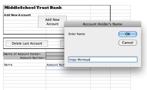
Excel program for running the Middle School Bank in the personal finance simulation. As you can see, I'm creating an account for my student, Inigo Montoya.

To get students a little more familiar with personal finance, we’re doing a little bank account simulation, and I created a little Excel program to make things a little easier.

It’s really created for the class where students can come up to the bank individually, and the banker/teacher can enter their name and print out their checks as they open their account.

Excel program for running the Middle School Bank in the personal finance simulation.

The front sheet of the spreadsheet (called the “Bank Account” sheet) has three buttons. The first, the “Add New Account” button, asks you to enter the student’s name and it assigns the student an account number, which is used on all the checks and deposit slips. The other two buttons let you delete the last account you entered, and reset the entire spreadsheet, respectively.

One of Inigo's checks (number 4).

Once you’ve created an account the spreadsheet updates the “Checks and Deposit Slips” sheet with the student’s name and account number. If you flip to that sheet you can print out eight checks and five deposit slips, which should be enough to get you through the simulation. The checks are numbered and have the student’s account number on them.

There are two other sheets. One is the “Checkbook Register”, which is generic and each student should get one, and the other is called “Customer Balances”. The latter is set up so you (the teacher) can enter all the deposits and withdrawals the students make, and keep track of it all on the same page.

Yes, it’s a bit of overkill, but I though that, since I was going through the effort, I should probably do a reasonable job. Besides, it gave me a chance to do a little Visual Basic programming to keep my hand in. While I teach programming using VPython (see this for example, but I’ll have to do a post about that sometime) you can do some very interesting things in Excel.

Note: I’ve updated the Excel file.

Financial reports and statistics

Sally, our school’s business manager, was kind enough to come in last month to help the financial department of the student run business organize its books. It was long overdue. We’d been improving our record keeping over the last couple years, but now we have much more detailed records of our income and expenses.

This is great for a number of reasons, the first of which is that students get some good experience working with spreadsheets. We use Excel, which in my opinion is far and away Microsoft’s best product (I’ve been using OpenOffice predominantly for the last year or so because, it improved quite a bit recently, and I’m a glutton for certain kinds of punishment.) I’ve been surprised by how many students get into college unable to do basic tables and charts, but hopefully this is changing.

The second reason is that the Finance committee can now use the data to give regular reports; income, expenses, profit, loss, all on a weekly basis. I expect the Bread division to benefit the most, since it has regular income and expenses, offering students frequent feedback on their progress. We’re now collecting a long-term, time-series data-set that will be very nice when we get to working on statistics in math later on.

In fact, we should be able to use this data to make simple financial projections. Linear projections of how much money we’ll have for our end-of-year trip will tie into algebra quite nicely, and, if we’re feeling ambitious, we can also get into linear regressions and the wave-like properties of the time series of data.