A wonderful website where you can peruse the world and hear local radio stations as you go.
Middle and High School … from a Montessori Point of View
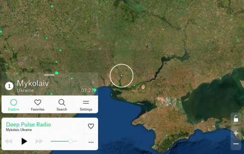
A wonderful website where you can peruse the world and hear local radio stations as you go.
Video by Tobais Friedrich out of the University of Hawaii. It’s based on a recent paper that suggests that the large fluctuations in climate over the last 120,000 years opened and closed green corridors that allowed multiple pulses of migration out of Africa.
He has some other excellent earth science scientific visualizations.
Randal T. Olson compares the sources of the petroleum the U.S.A. uses, to where people believe the oil comes from.

While Canada is our major supplier of oil, Americans tend to believe that the oil comes from Saudi Arabia and Iraq.
Naill Ferguson gives a provocative talk about his thesis that there are six “Killer Apps” that made western civilization so successful over the last five centuries.
The killer apps he suggests are:
There’s a PBS series about it as well.
The Intelligence2 podcast, recommended by Mr. Schmidt, is a great resource for talks like this one. They have a nice archive.
Impressive footage of a storm near Booker Texas, by Mike Olbinski.

One of the games Dr. A. plays with the middle school geography class is to have them use the soccer field as a large map. They chose a place and someone runs to its location on the field. What I like is that he insists that the map be all in their heads. They might have one or two control points, but they have to visualize the map mentally.
I saw them out on the soccer field today, and I thought I’d make their imaginary map a little more literal in Gimp.
UPDATE: Dr. A[ustin] clarifies the rules of the competitive game they were playing in the comments below, in case anyone wants to try it.
Update 2: Move your mouse over the image below to see the picture with or without the map (larger version here).

The Shaded Relief Archive is a great source of continental scale shaded relief maps. Dr. A. used them when the middle-schoolers built their 3d models of Australia and Antarctica for geography.

NASA’s Earth Observatory is another great source.

Dr. Austin has the middle school students build physical models of the continents as an exercise in geography. They use some type of cellulose clay to shape the topography then paint on or apply other icons to represent other types of spatial data; one group, for example, used sparkles to represent population.
The final models are nice for trying stop-motion fly-throughs.