Uprising in Egypt

(via The Daily Dish)

What protests look like:

See also:

  • Summary of the last two days’ protests.
  • The United States’ support for Egypt.
  • What happens when you’re arrested by the state security service. (warning: contains one quote with vulgar language)

UPDATE: We just watched the video over lunch, and it actually resulted in a very good discussion. Our morning novel discussions have been useful here, in helping us see the multiple perspectives of the actors in the street protests: the protesters and the police. After all, the police have families too.

I gave a little spiel at the beginning, to set the stage and to point out the potentially historical nature of these protests. Democracy spreading through the middle east has huge implications for a country fighting two wars in the region; not to mention the blowback from these conflicts.

The truth of the anger of the protesters in the video seemed to resonate, making poignant what could have appeared farcical. The music and the Kennedy quote also helped my students identify with these events in such a far off place.

We also touched on the role of the U.S. in supporting the Mubarak government, and the potential of the uprising to lead to an anti-US, muslim fundamentalist government (via the Muslim Brotherhood). We still need to talk about what the US should and can do to support democracy in this situation, which is so full of conflicting imperatives.
Tunisian revolution

NPR had a great article today summarizing what’s been going on in Tunisia.

I played the article this morning. We had a little discussion about the conflicting groups in Tunisia and the possible causes of the revolution. It would be nice to be able to follow the emergence of a democracy in real-time.

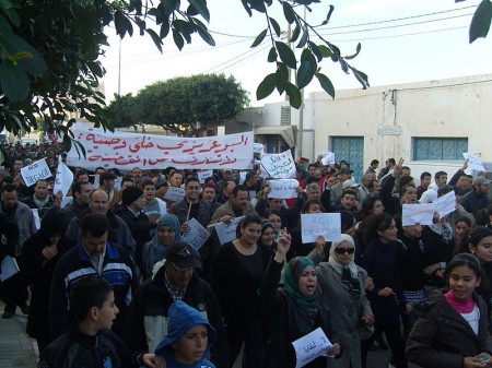
Protests in Tunis. (Image by Habib M’henni, via Wikipedia).

U.S. Immigration Data

Raymond Cohn has a great table of immigration data on the Economic History Association website.

This data ties very nicely into the work we’re doing on graphing. The Excel file with the post 1820 data, and another with pre-1790 data, make it easier to work with (note the pre-1970 data comes from the Wikipedia page on the history of immigration; it was the easiest source to find a table of data).

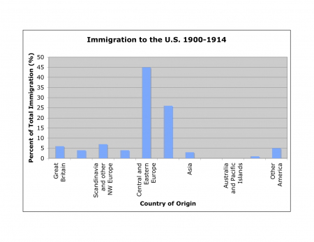
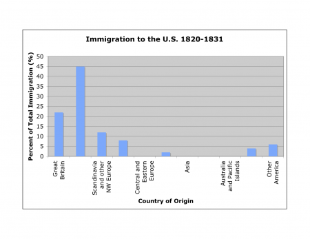
Since each small group of students is responsible for a different wave of immigration, the groups will create bar graphs showing the countries of origin for each wave. They should look like these:

U.S. Immigration from 1820 to 1831. Data from Cohn (2010).

and,

U.S. Immigration from 1900 to 1914. Data from Cohn (2010).

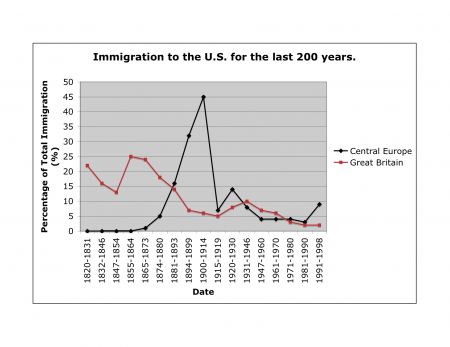
Plotting the time series as a line graph would be another great way to slice the data:

Comparison of U.S. Immigration Rates from Great Britain and Central Europe. Data from Cohn (2010).

Note that the data in the table is as a percentage of total immigration, so the numbers do not compare directly from one time period to the next; however, the proportions still work to show the same patterns.

Voyage of the Beagle

Wired has a brief but excellent article on the voyage of the Beagle.

Its goal was to survey the South American coastline. The captain invited along a young man named Charles Darwin, whose father thought the voyage would just be another excuse for him to slack off. The trip ended up taking five years.

This article would be a wonderful addition to our work on exploration of the Americas next time it comes around; however, it’ll also be a neat little footnote because we’ll be delving into evolution next cycle.

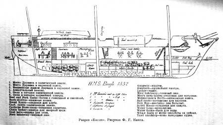
Wikipedia’s entry on the ship produced this wonderful cross-section. I particularly like the sketches of people and casks showing the use of of different cabins and spaces.

Cross-section through the HMS Beagle.

Ngram: The history of words

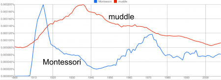
Graphs of the words Montessori and muddle created with Google Ngram.

If you take all the books ever written and draw a graph showing which words were used when, you’d end up with something like Google’s Ngram. Of course I thought I’d chart “Montessori” and “muddle”.

The “Montessori” graph is interesting. It seems to show the early interest in her work, around 1912, and then an interesting increase in interest in the 1960’s and 1970’s. Like with all statistics, one should really be cautious about how you interpret this type of data, however, I suspect this graph explains a lot about the sources of modern trends in Montessori education. I’d love hear someone with more experience thinks.

Alexis Madrigal has an interesting collection of graphs, while Discover has an article with much more detail about what can be done with Google’s database.

Perusing Wikileaks’ Cables

Wikileaks’ recent leak of U.S. State Department cables offers the student with a politics/geography interest an amazing glance into the role of U.S. diplomats. There are however, a lot of cables.

The Atlantic magazine has come up with an interesting way of perusing the information. Their Cablegate Roulette webpage puts up a random cable every time you press the “Load a new story” button.

What’s also nice is that they provide a sentence or two that gives the context of the cable so you don’t have to puzzle it out on your own.

The cable excerpts are brief, well written and quite informative about the political goings-on in different parts of the world. They could make an interesting supplement to the geography curriculum. The self-motivated student with a geography interest would find these quite fascinating because you have to have a basic knowledge of the world and recent history to understand what’s going on.

An example:

An executive with Kazakhstan’s national gas company has dinner with the U.S. ambassador at the Radisson hotel in Astana, the capital of Kazakhstan.

FROM: ASTANA, KAZAKHSTAN
TO: STATE DEPARTMENT
DATE: JANUARY 10, 2010
CLASSIFICATION: SECRET
SEE FULL CABLE

¶7. (S) The Ambassador asked if the corruption and infighting are worse now than before. Idenov paused, thought, and then replied, “No, not really. It’s business as usual.” Idenov brushed off a question if the current maneuverings are part of a succession struggle. “Of course not. It’s too early for that. As it’s always been, it’s about big money. Capitalism — you call it market economy — means huge money. Listen, almost everyone at the top is confused. They’re confused by their Soviet mentality. They’re confused by the corrupt excesses of capitalism. ‘If Goldman Sachs executives can make $50 million a year and then run America’s economy in Washington, what’s so different about what we do?’ they ask.”

Water for life; for civilization

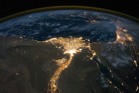
The Nile and its delta (image from NASA).

This nighttime photograph of the Nile River and its delta from the International Space Station beautifully illustrate the importance of water for life and civilization. The city of Cairo is at the neck of the delta; the brighter spot where the distributaries diverge.

Spaceflight Now has other really cool photos. Bad Astronomy has an interesting post on the logistics of this particular photo, while Heather Pringle has a very interesting post on how the desert may have aided the ancient Egyptian’s civilization.

Letter from a dying explorer

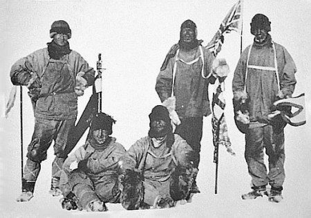
While discussing polar exploration, I mentioned the story of Amundsen and Scott’s race for the south pole. The fascinating blog, Letters of Note, has Scott’s last letter, written bit by bit, on the ice, to his wife back home. It starts, “To: my widow.”

Photograph of Scott's (far left) expedition at the South Pole, on 17 January 1912, the day after they discovered Amundsen had reached the pole first. (Photo via Wikimedia Commons)

P.S. Letters of Note is a great resource for examples of great letter writing.